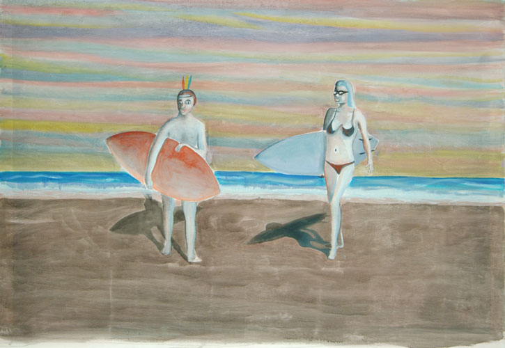
Turkey feather headress - I remember that. Can't do that s'much now - not PC to havew the kids whoo whoo whooing around the yard with all the multicultis in the hood. Not that there are any "indians" within ten miles of here.
It goes in phases - sometimes its cool to be a cowboy, othertimes, indians - they are the underdog, but they taught the pilgrims to farm, because before the pilgrims learned to farm they had to eat canned spam and shit. Ugly. Actually there was a drought from 1494-1629 A.C.E. (after the common era) or so.
COunting coup. You get a feather for each coup. That surfer babe is out of your league, dude (but not really) - plus you are dangerous out there on the wazves. Better learn to surf, clown.
Black and red butt floss - shes an anarchist, no doubt. If he was with her his bananna hammock would be black too.
Figure ground integration - shadows, but the BG is flat, abstract, muddy. deliberately overworked. Wrong.
What else?
Shes got swim goggles - speedos. Hes been up all night on acid. Wanna come down right now. Major Barney - a Burt.
This painting would be great to augment a serious collection. Hung unobtrusively in a vestibule, the home office, or perhaps in the media room.
Art in America has been sold by Whitney Communications to Brant Publications Inc., which also owns the magazine Antiques. Peter Brant, president of Brant, said that Art in America would retain its present editor, publisher and staff.
The magazine was formerly part of Whitney Communications, which also owns a string of newspapers and is the operating partner of the International Herald Tribune.
I dunno, thought it was interesting, you know, how stuff gets printed and stuff.
maybe the jpeg gives it too much credit (havent seen it in person) but I'm enjoying the tonalities along side the mission school feel. His portraits are kind johansen-esque but dont really stack up as well. I buy the quirky secondrate feel of his work, though I cant figure out where hes coming from--born in 64 so I guess he relates more to Jim Shaw and early Scharf? Tonal seascapes always harken back to Albert Marquet for me. whose work sucks on the net but this one reminds me of Stefan Kürten if that means anything. If you see him in European collections at times he really goes nuts with the tonalities. Interesting that Marquet, Matisse and Roualt I believe were all in the same class under Moreau as students.
Also hints of Ensor in this ouvre if you want to stretch. the rest of his stuff on the Kern website website looks like Daniel Richter and Peter Doig + Laura Owens but more low key so I would think that this audience would cream their pants over those...wait this site is anti-Owens right? anyways I like the ones on the website, I'm surprised I didnt see him on the Saatchi site or in Kern at one point.
i am not sure about these - saw the work at kern last May the "melvins" show was in the back room... none of them really popped and fell somehwere east of both the titallating and sublime.
i sort of like it, the washy drab beach and the pretty sky, and the ufo shadows. but the lone ranger + tonto... no.
did he do one with someone surfing with two planets in the background.. i am seeing that image in my mind but can't remember where. maybe on somebody's blog.
I think the author knows where he's going, those feathers are like those things, you know like fairies, little things you can't see but are there all the same. The woman has got the stride. She's got the blue board and she is swinging it along with her body fully in view. Gawky guy carries red and here reads embarrassment. His body a little shaky in the rendering is mostly covered by the red. He's coming kind of straight for us but in no real hurry. The gal is on the diagonal. She'll be crossing right through and on past. The thin bands in the sky read blanket, robe, or towel--Hues' towel in the sky? Cute, drab, and drama stuff that can play with your head
one time I was on the beach - bug sur I think, and i was woken up with the sun in my eyes. Drugged out hippies were sitting on the dunes or bluffs or whatever and one of them said in this dreamy acid casualty voice "Isnt the sunrise beautifull?"
OK I'm going to say something that will piss offf some people but, here goes:
If one goes to Artnet.com and clicks on People/Out With Mary you come to the Hunter college MFA show...
I have to say I am now really sick of paintings that mix decrotive elements say from bad yard sale paintings, and or wavy motifs as if they are hanging on some ol hippys yurt, 70's design color swatches as well as cartoony silly stuff that has all of the above thrown in for good messsure
There, now I feel better, if I have offened anyone sorry but I had to say it.
I don't know them and I have nothing bad to say about the program, or them for that matter. I was just using what I saw in the photos as a base for my argument.
What bothers me is that it seems so lazy. You have your color swatchs, add some decrotive textures, maybe from 60's psychedelic posters, or victorian patterns, then put in some figure standing by the water or something to that effect.
There seems to ba a lot of this around, I guess its in the air. 70's pastel color swatches...
Maybe its a converstaion you are not part of. I allways feel like that. Its paranoia? I know I have these sorts of conversations with myself.
FOr example, what if art is just a way to make youself sick, yet in controll?
People have had that conversation for a while. I think its called "derangement of the sensese. or as someone wittily modified a paper I wrote "deregulement de thus le seas".
I dont speak french much.
But Hunter grads may be trying to speak esperanto without the requisite knowledge.
Its hard to speak unless you get it from the source.
Or they may think they know what the "game" is and be "playing it."
THats an awesome thing. I played "Metal Slug" last night and the art is sort of Zapp Comics meets Spy vs spy. Pretty cool. I just kept hitting six and one - six is quarters and one is start, usually - on metal slug i think ctrl is start.
Where is the souce? I'm glad you asked. I dont know. Like I said Im an outsider, outside of everyhting. But I read and from what Ive observed theres some idea of the artist as diletant, flaneur, dandy.
Why? TO what end? Seems like a fantasy to me.
Is art just a state of mind?
I looked at your work painter and it looks like you are TRYING TOO HARD.
Hows that?
Look at Hallmark. Look at the Covers to the New YOrker. People dont want serious. THey want fun, light, airy.
And why not? WHy all the doom and gloom, even if its just a landscape? Why does it have to be work? Im lazy. Sue me.
I don't try to hard. I do have fun when I work, but I also have a hard time. to me that's what painting is about. Not some easy paint by numbers thing for people to have fun with.
Pdog Zip is just ruminating but it does say something that this painting got a total pass considering some of the things people have hated. I guess people thought Neil Jenney was bad painting but that was more inventive than just bad.
Neil Jenny? You mean Dan McCarthy, the painting with the surfer and girl.
Its not my cup of tea, on a basic level, this painting is just not well done. The color is muddy, the drawing is not very good, no its real bad.
Look at Saville, good toneality, good drawing, the technique is good. You can get beyound that basic of what makes a painting good, and get into the substance of the piece. Schutz does that, you can tell she knows how to handle the medium.
For me this is crutial. I mean if I am hung up on the way its done, and can't get beyound that than I think the painting fails. Do you know what I mean?
As far as the comments on why does it have to be hard work, well for painting is that. There are so many choices, you don't have to like my work, hell I don't like most of the stuff I did a few years ago. I know the basics of color theory, one would think its kind of essential to being a painter, so you don't end with mud, as this chap has done.
Pdog I was just referring to the whole genre of intentional bad painting. A lot of people think Jenney started it but he was subversive and actually pretty good. I'm dubious about the genre.
There are a lot of "Indians" within a ten mile radius of you. NYC and other urban centers are full of Native Americans from many different tribes. Look around you. They're there. They're probably having a Pow Wow in Greenpoint right now. Last time I was in Williamsburg there was a Pow Wow. We are all over the effin map. There's nothing wrong with throwing feathers, regalia, and headdresses into paintings. It's all part of our history. Over half of African Americans in the US are part Native American, by the way. I'd love it if Native themes showed up in the artworld, regardless of the color of the skin of the painter.
It's a really good painting. The surfboards are like big feathers, flotillas for two upside-down questionmarks (the figures), and the backdrop is like a washy theater scrim. It speaks wet laughter with it's light application and smart humor. It's about to float away, which seems appropriate to the subject matter.
39 comments:
yikes!
Kern. whats up with the fish?
figure ground
Turkey feather headress - I remember that. Can't do that s'much now - not PC to havew the kids whoo whoo whooing around the yard with all the multicultis in the hood. Not that there are any "indians" within ten miles of here.
It goes in phases - sometimes its cool to be a cowboy, othertimes, indians - they are the underdog, but they taught the pilgrims to farm, because before the pilgrims learned to farm they had to eat canned spam and shit. Ugly.
Actually there was a drought from 1494-1629 A.C.E. (after the common era) or so.
COunting coup. You get a feather for each coup. That surfer babe is out of your league, dude (but not really) - plus you are dangerous out there on the wazves. Better learn to surf, clown.
Black and red butt floss - shes an anarchist, no doubt. If he was with her his bananna hammock would be black too.
Figure ground integration - shadows, but the BG is flat, abstract, muddy. deliberately overworked. Wrong.
What else?
Shes got swim goggles - speedos. Hes been up all night on acid. Wanna come down right now. Major Barney - a Burt.
This painting would be great to augment a serious collection. Hung unobtrusively in a vestibule, the home office, or perhaps in the media room.
COBRA kai, motherfuckers!
Art in America has been sold by Whitney Communications to Brant Publications Inc., which also owns the magazine Antiques. Peter Brant, president of Brant, said that Art in America would retain its present editor, publisher and staff.
The magazine was formerly part of Whitney Communications, which also owns a string of newspapers and is the operating partner of the International Herald Tribune.
I dunno, thought it was interesting, you know, how stuff gets printed and stuff.
That was in 84 though. Go eighties!
Time capsules are interesting.
Zip, that link rocks! Rad baby, Cru Jones is the man! Send me an angellllll!
lone ranger & tonto but so what
maybe the jpeg gives it too much credit (havent seen it in person) but I'm enjoying the tonalities along side the mission school feel. His portraits are kind johansen-esque but dont really stack up as well. I buy the quirky secondrate feel of his work, though I cant figure out where hes coming from--born in 64 so I guess he relates more to Jim Shaw and early Scharf? Tonal seascapes always harken back to Albert Marquet for me.
whose work sucks on the net but this one reminds me of Stefan Kürten if that means anything. If you see him in European collections at times he really goes nuts with the tonalities. Interesting that Marquet, Matisse and Roualt I believe were all in the same class under Moreau as students.
Also hints of Ensor in this ouvre if you want to stretch.
the rest of his stuff on the Kern website website looks like Daniel Richter and Peter Doig + Laura Owens but more low key so I would think that this audience would cream their pants over those...wait this site is anti-Owens right? anyways I like the ones on the website, I'm surprised I didnt see him on the Saatchi site or in Kern at one point.
I'm not anti-Owens. She fits into a genre I don't always like but I think her work is beautiful and inventive within the genre.
i enjoy owens work,
i am not sure about these - saw the work at kern last May the "melvins" show was in the back room... none of them really popped and fell somehwere east of both the titallating and sublime.
i sort of like it, the washy drab beach and the pretty sky, and the ufo shadows. but the lone ranger + tonto... no.
did he do one with someone surfing with two planets in the background.. i am seeing that image in my mind but can't remember where. maybe on somebody's blog.
I think the author knows where he's going, those feathers are like those things, you know like fairies, little things you can't see but are there all the same. The woman has got the stride. She's got the blue board and she is swinging it along with her body fully in view. Gawky guy carries red and here reads embarrassment. His body a little shaky in the rendering is mostly covered by the red. He's coming kind of straight for us but in no real hurry. The gal is on the diagonal. She'll be crossing right through and on past.
The thin bands in the sky read blanket, robe, or towel--Hues' towel in the sky?
Cute, drab, and drama stuff that can play with your head
one time I was on the beach - bug sur I think, and i was woken up with the sun in my eyes. Drugged out hippies were sitting on the dunes or bluffs or whatever and one of them said in this dreamy acid casualty voice "Isnt the sunrise beautifull?"
California is A-OK.
Gliclee!
home page
OK I'm going to say something that will piss offf some people but, here goes:
If one goes to Artnet.com and clicks on People/Out With Mary you come to the Hunter college MFA show...
I have to say I am now really sick of paintings that mix decrotive elements say from bad yard sale paintings, and or wavy motifs as if they are hanging on some ol hippys yurt, 70's design color swatches as well as cartoony silly stuff that has all of the above thrown in for good messsure
There, now I feel better, if I have offened anyone sorry but I had to say it.
Well pdog, what about it bothers you?
I'm offended by the price tag. hey galleries: please use the pricing gun on the back of the painting.
Aw Pdog the Hunter kids are so sweet. Not a lot of backstabbing and some of them are really good.
I don't know them and I have nothing bad to say about the program, or them for that matter. I was just using what I saw in the photos as a base for my argument.
What bothers me is that it seems so lazy.
You have your color swatchs, add some decrotive textures, maybe from 60's psychedelic posters, or victorian patterns, then put in some figure standing by the water or something to that effect.
There seems to ba a lot of this around, I guess its in the air. 70's pastel color swatches...
I'm not sure, its just something I noticed.
Maybe its a converstaion you are not part of. I allways feel like that. Its paranoia? I know I have these sorts of conversations with myself.
FOr example, what if art is just a way to make youself sick, yet in controll?
People have had that conversation for a while.
I think its called "derangement of the sensese. or as someone wittily modified a paper I wrote "deregulement de thus le seas".
I dont speak french much.
But Hunter grads may be trying to speak esperanto without the requisite knowledge.
Its hard to speak unless you get it from the source.
Or they may think they know what the "game" is and be "playing it."
THats an awesome thing. I played "Metal Slug" last night and the art is sort of Zapp Comics meets Spy vs spy. Pretty cool. I just kept hitting six and one - six is quarters and one is start, usually - on metal slug i think ctrl is start.
Where is the souce? I'm glad you asked. I dont know. Like I said Im an outsider, outside of everyhting. But I read and from what Ive observed theres some idea of the artist as diletant, flaneur, dandy.
Why? TO what end? Seems like a fantasy to me.
Is art just a state of mind?
I looked at your work painter and it looks like you are TRYING TOO HARD.
Hows that?
Look at Hallmark. Look at the Covers to the New YOrker. People dont want serious. THey want fun, light, airy.
And why not? WHy all the doom and gloom, even if its just a landscape? Why does it have to be work?
Im lazy. Sue me.
Whatever
I don't try to hard.
I do have fun when I work, but I also have a hard time. to me that's what painting is about. Not some easy paint by numbers thing for people to have fun with.
Go to the movies or go dancing.
If your lazy, that's not my problem.
Hallmark??? Are you trying to insult me?
Pdog Zip is just ruminating but it does say something that this painting got a total pass considering some of the things people have hated. I guess people thought Neil Jenney was bad painting but that was more inventive than just bad.
Neil Jenny? You mean Dan McCarthy, the painting with the surfer and girl.
Its not my cup of tea, on a basic level, this painting is just not well done. The color is muddy, the drawing is not very good, no its real bad.
Look at Saville, good toneality, good drawing, the technique is good. You can get beyound that basic of what makes a painting good, and get into the substance of the piece. Schutz does that, you can tell she knows how to handle the medium.
For me this is crutial. I mean if I am hung up on the way its done, and can't get beyound that than I think the painting fails. Do you know what I mean?
As far as the comments on why does it have to be hard work, well for painting is that. There are so many choices, you don't have to like my work, hell I don't like most of the stuff I did a few years ago. I know the basics of color theory, one would think its kind of essential to being a painter, so you don't end with mud, as this chap has done.
Pdog I was just referring to the whole genre of intentional bad painting. A lot of people think Jenney started it but he was subversive and actually pretty good. I'm dubious about the genre.
Ohhhhh...
OK, but that's like a bad joke. The first time you here it its funny in a way. After a while it eocmes not so funny anymore.
I'm kind of a tradionalist on this one,
lifes to short to look at bad painting and realy deal with whatever it is the person is trying to say.
http://www.thecityreview.com/f00scon17.jpg
1969
intentional bad painting has gotten worse.
oh boy that was bad...
but smart bad! badass bad! Not half-assed bad.
hehe I guess.
There are a lot of "Indians" within a ten mile radius of you. NYC and other urban centers are full of Native Americans from many different tribes. Look around you. They're there. They're probably having a Pow Wow in Greenpoint right now. Last time I was in Williamsburg there was a Pow Wow. We are all over the effin map. There's nothing wrong with throwing feathers, regalia, and headdresses into paintings. It's all part of our history. Over half of African Americans in the US are part Native American, by the way. I'd love it if Native themes showed up in the artworld, regardless of the color of the skin of the painter.
its still a bad painting even with the feathers.
It's a really good painting. The surfboards are like big feathers, flotillas for two upside-down questionmarks (the figures), and the backdrop is like a washy theater scrim. It speaks wet laughter with it's light application and smart humor. It's about to float away, which seems appropriate to the subject matter.
that's good, I can't get past the muddy colors. I just can't stand muddy colors.
Post a Comment