Well there is a history to this. Minimalism was supported by a small group og collectors who funded DIA. AbEx was set up as an American art movement even though it included Europeans and owed a lot to Matta and others. I really only have love for the freaks like Warhol. More freaks please.
It was less of a created art movement than minimalism which really was funded and promoted by a few people. I meant that more in terms of the cultural zeitgeist of postwar America. This painting is fine. Still I like freaks better.
"Every decoding is an encoding," so I'm asking why all the checker boards? Because as the man says "the sum of man is his inability to be alone in a silent room," and "every CIA mole has a hidden agenda in plain sight," and "it is not the thing you fear that you must fear, but the mother of the thing you fear," and tautologicly speaking - "mirrors leak light," so "lets have a war, and blame it on the middle class."
This monkey's gone to heaven, because the devil is 6, man is five, 11 is part of seven-eleven and I like nachos. Can you dig it?
I like this painting, partly because "Pablo Picasso was never called an asshole, not like you." But also, what do harlequins symbolize? I forget.
i can see some of the metaphysical painters in this fellows work (this work and others)- i quite fuckn like it... you know the stuff we look at in history books and think is ugly as all hell? i love what this painter embraces.. KELLI- if warhol is a freak, who were his freak buddies?
whoever said it was right about movements and what happens under the surface that many people dont know about.. the politics behind moves etc.. Jackson Pollock
Movement-- i wouldn't call something that just because a tone is being set
Poppy that's sort of my point. What Warhol did was radical and strange. I think it's a mistake to view him as a commercial artist because he fits into fine art traditions of political art and also an American sublime ( Inness ) but then made it into something new. I just think his work had more pathos than other pop artists and calling him a freak is a compliment.I guess there are different kinds of artists but the problem with schools is there are a few leaders and a lot of followers. I don't know which this artist is. Maybe it is too soon to tell with this group.
Funny how all u NYers like the Germans. I can't say I like--or understand--any of it. I like all theEnglish, though.
Anyway, with this painting, note the Western landscape in the distance. Everytime I go to the Southwestern desert, its crawling with Germans. They take their loooong vacations out here. They rent Harleys, and Biker costumes and horses, and do a Wild West thing. Kind of a Paris, Texas thing? I hate that movie.
I think Germany is one of the vanguards for contemporary art now. Asides from painting, some of the the best photographers working right now are German as well
hi kelli i knew freak was compliment... like saying we're such dorks but we like being dorks.. the thing about 'freak' is i think of it as having a certain sense of irrationality.. and warhol i believe to be the most rational artist around at the time... if he wasn't rational, he could never have been perceived of as a freak.
I heard Phillip Pearlstein talk once and two things stuck out. He said Warhol was doing all commercial work ( he illustrated some Truman Capote too) and the other artists they knew looked down on him and thought of him as naive and crass. Pearlstein was kind of dismissive. The second thing was he was totally jealous. I guess I just respect idiosyncratic people more than the whole "company man" approach. Somebody brought up the idea that this whole school of painting looks traditional as though it skipped parts of 20th century art. That was interesting. Could anybody articulate what it skips?
If this work was done by someone in indiana it wouldnt get a second glance. The idea that the artists are unschooled, or are imitating a naive style, deliberately, and that this is somehow interesting, because they are Germans from Leipzig is interesting.
If the Leipsigers are advocating a certain loss of memory, I could go along with that. History is a burden. I don't know all the US presidents, and after the Rapture, will anyone need to know?
Maybe we should all go back to 1934 when art was easier to remember.
"In a series of articles written from 1989 to this year, Cal Arts, UCLA, and the Art Center College of Design have been singled out: beginning with Ralph Rugoff's "Liberal Arts" published in Vogue in 1989 about Cal Arts; to Dennis Cooper's "Too Cool for School," which was published in the music magazine Spin in 1997, about UCLA, to "Surf and Turf" by Andrew Hultkrans published in Artforum in 1998 about UCLA and Art Center; to Deborah Solomon's New York Times magazine article on "How to Succeed in Art" from 1999."
yes you are right most people would spend their time playing catch-up! when straying far from the norm you can be either extremely rational or completely insane.. My earlier definition was one sided.. A little of both in my cup of tea please
Whenever I look at a Pearlstein I can allways hear myself wondering what its supposed to make me feel or think, but I never come up with anything. But also, with a Robert Ryman I never come up with anything either. Sort of refreshing, like cheese.
Oh and the whole idea that Warhol, Johns and Rauchenberg had a "camp" or "subversive" aesthetic as a subtle way of saying gay was not what I meant. I don't think it's insignificant but it marginalizes their work. I was pointing to Warhol as someone who stood out from all the sheeplike people doing AbEx 10 or 20 years after it was over. Well I guess some people are still heating up those leftovers today. Is that one of the historical moments this painting skips?
How 'bout Dresden vs Leipzig? The Havekost, Scheibitz and Knobloch, Nitsche et al.. Someone wrote of a distinction between the two -- social-realism vs camp or kitch. Or perhaps Dresden operates within wider historical frames of reference.
Also, there was a nyt mention months ago mentioning Leipzig as the new Williamsburg? Cheap rent for gallery space and studios?
zip I think that comment about Indiana is bs..I would be interested in these last two paintings regardless of where they came from. When I first saw Christoph's work, because it was in LFL I first associated it with Schutz and thought he was American,... as they were some similarities in their acerbic choices. He immediately held my attention without knowing his background. Regarding Loy's seemingly meandering perception of art history,..its a hard quality to pin down. I think it has something to do with her painthandling, which appears quite unselfconscious in its technique, even if her narratives and figuration can be heavyhanded. There is a hint of PIcabia to it, but that reference may or may not be present, as opposed to someone like 80s salle where you could really feel the distance between painter and markmaking. With Christoph, his particular dialogue feels more contemporary and "hot". I kind of see a relation to someone like Anselm Reyle, ..contemporary artists who gain inspiration from the failings/paradoxes of modernism. Christoph series of oceanic(?) masks are interesting in this sense, with their exploration of colonial formalism and all that jazzzzz
i am not sure but i think i got that out of "The Life and Death of Andy Warhol: Books: Victor Bockris" i can look it up later - madonna tonight!
i see your point but i do think it is significant that they were gay, lovers and worked in the commercial field in an aesthetic mode that informed there work. It may have = marginalisation from the matcho academic gallery art world but it ment day to day contact with people in other creative fields like fashion, music and film.
it is not easy to stay viable in a commercial capacity while maintaining personal idenity and in Warhols case baby-sitting a den of dilettantes collaborators and junkeys. - i am sure it would have been far "easier" to just paint.
@ kelli, its very cheesy to say this but when I see the drips in this painting I kind of get an immediate acknowledgement of ab-ex, at least that the artist has mulled over it at one point.... goes without saying that that's not what this painting is about. In Loy's and Rauch's works you dont see these kind of drips I think
I guess I'm thinking of the Finch review of Johns where he used it to dismiss him. I'm all for both queer and feminist readings of art history. Last bit of geek trivia: Florentiner was German slang for gay in the Renaissance. Speaking of which: http://www.gayheroes.com/leonangel.htm
I think it's the centrality/symmetry of this image lends to a kind stasis that is disappointing. R is one of my favs, but not this painting. The devices are all there to make it, but I think he's more talented as a designer what this image intimates. His paintings of groups are very well designed indeed!
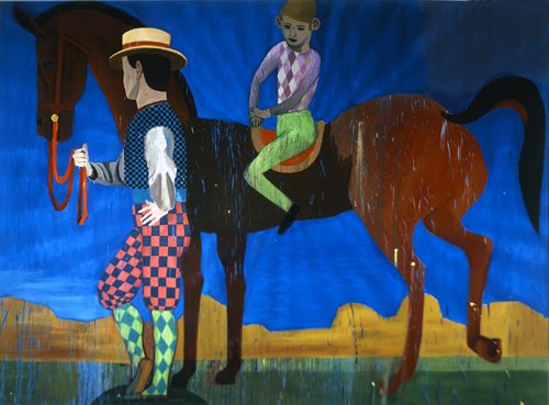
The half-standing-half-walking horse with the guys legs mirroring the hind legs of the horse a little interest, but it's like a formal one-liner. The tail and the head-- what does this symmetry symbolize?
cooky, This is a deliberately bad or kitchy painting - the bombastic circus sideshow swath of ultramarine blue kind of clues me in. THen theres the Picaso/vintage harlequin imagery, the susan "bad painter" rothenberg/picaso horse (a clusterfuck of references)blue period etecetera, who cares.
But I can dig it. I also like John "cougar" meloncamp and Paul "melonhead" McCartney, because they seem to share the sack to paint badly, although maybe not deliberately so. I don't know them so I can't tell for sure, but they have coffee table books out right?
"I realize that there are probably hundreds of people who deserve to have a book of their paintings published before I do, but because of my celebrity I've been given this great opportunity to show off my 'hobby' and, in turn, make money for charity. It isn't about how great I think I am at paining or music, but rather a reminder to people how great it can feel to just try." -- John Mellencamp
I completely don't think this is a deliberately bad painting. The kitsch reference is done in a very subtle and roundabout manner: by using the Harlequin, he suggests its (and other modernist cliches') degeneracy into kitsch after the effects of history. This is however a very solid painting formally, and one that obviously took a lot of skill, foresight and intelligence to make. Because of this, I think one can sense an attraction and repulsion to his subject, so I think its wrong to label it distinctly to one side; it kind of doesn't give it enough credit. Hes obviously fascinated by exploring this specific aesthetic I also dont think this is his best work And sure, mellencamp and Mcartney make paintings, but did you know Swizz Beats studies under Peter Max? jjiiggaaaaaa
E, I think that compostion-as-design is ultimately subjective -- depending on what the viewer is into. When it comes to viewing paintings with small groups of people, I get off on the innovative dynamic arrangements of the flat two dimensional shapes -- When an artist manages to balance patternmaking with the mimetic problem of having subjects occupy 3d space, me likey. Degas comes to mind with small groups. Balthus' frieze-like groups seem to use the 2nd-dimension as a psychological stage. Piero della Francesca, the same. I'd put 15th cent indian miniatures in there for the impressive pattern makeing, but they don't seem to have the same psychological space as the former. Of the contemporaries, I like adam adach's gropings of people; Kaye Donachie does really well; But especially Ruckhäberle, who's pattern like treatment of painting does indeed remind me of Matisse (2nd to Balthus).
While the historical artist most referred-to when it comes to people and compostion would be Poussin, I never got him. That whole balance thing -- perhaps I never really paid attention.
the tension in this painting comes from some areas of dead weight - around feet etc..face of boy on horse etc...- seems to be trying to bring more light into his work with this painting but is still using deadpan skintones from previous designy type work.. shouldn't be too hard to fix:0 that my schoolyard critique.
dkweed, here's a tip on getting this one to canter for you.
"...relax your hips and move them with the motion. Imagine your hips going in a circle, instead of moving your whole body, just allow your hips to rock back and forth with the motion. Don't force your hips to gyrate either, most horses will match pace with the movement of your body..."
That's obviously awful No-Where. Some people suck all the sex out of art history and replace it with gender. Laura Mulvey cleaned up Foucault and we all accept it as gospel. Don't clean anything up. Throw that one out. Jpeg: that was a really good statement.
43 comments:
Lives and works in Leipzig, Germany
my god painter has been duped into thinking they're a school too...how vast this magic conspiracy...how dark the con of mannnnnnn
Well there is a history to this. Minimalism was supported by a small group og collectors who funded DIA. AbEx was set up as an American art movement even though it included Europeans and owed a lot to Matta and others. I really only have love for the freaks like Warhol. More freaks please.
I was being facetious.. I like this painting. Who set up ab-ex? please dont tell me the CIA
It was less of a created art movement than minimalism which really was funded and promoted by a few people. I meant that more in terms of the cultural zeitgeist of postwar America. This painting is fine. Still I like freaks better.
"Every decoding is an encoding," so I'm asking why all the checker boards? Because as the man says "the sum of man is his inability to be alone in a silent room," and "every CIA mole has a hidden agenda in plain sight," and "it is not the thing you fear that you must fear, but the mother of the thing you fear," and tautologicly speaking - "mirrors leak light," so "lets have a war, and blame it on the middle class."
This monkey's gone to heaven, because the devil is 6, man is five, 11 is part of seven-eleven and I like nachos.
Can you dig it?
I like this painting, partly because "Pablo Picasso was never called an asshole, not like you."
But also, what do harlequins symbolize? I forget.
Who rides the pale horse?
i find my self thinking fetish again. is it just me or does everything about Germany screams fetish?
ooh shit KJ got it like thaat:::!
i can see some of the metaphysical painters in this fellows work (this work and others)- i quite fuckn like it...
you know the stuff we look at in history books and think is ugly as all hell?
i love what this painter embraces.. KELLI- if warhol is a freak, who were his freak buddies?
whoever said it was right about movements and what happens under the surface that many people dont know about.. the politics behind moves etc.. Jackson Pollock
Movement-- i wouldn't call something that just because a tone is being set
Poppy that's sort of my point. What Warhol did was radical and strange. I think it's a mistake to view him as a commercial artist because he fits into fine art traditions of political art and also an American sublime ( Inness ) but then made it into something new. I just think his work had more pathos than other pop artists and calling him a freak is a compliment.I guess there are different kinds of artists but the problem with schools is there are a few leaders and a lot of followers. I don't know which this artist is. Maybe it is too soon to tell with this group.
Funny how all u NYers like the Germans. I can't say I like--or understand--any of it. I like all theEnglish, though.
Anyway, with this painting, note the Western landscape in the distance. Everytime I go to the Southwestern desert, its crawling with Germans. They take their loooong vacations out here. They rent Harleys, and Biker costumes and horses, and do a Wild West thing. Kind of a Paris, Texas thing? I hate that movie.
I think Germany is one of the vanguards for contemporary art now. Asides from painting, some of the the best photographers working right now are German as well
hi kelli
i knew freak was compliment... like saying we're such dorks but we like being dorks..
the thing about 'freak' is i think of it as having a certain sense of irrationality.. and warhol i believe to be the most rational artist around at the time... if he wasn't rational, he could never have been perceived of as a freak.
Some of these struths were powerful in a painterly way.
online they look crappy
Ruff does nice stuff sometimes
too vapid for ya?.
In Andy's day--being a "freak" could get u killed. Like being a woman in Pakistan today.
whats not to like?
I heard UCLA was too cool for school in 1997. How about UCLA vs Leipzig?
Spin it.
I heard Phillip Pearlstein talk once and two things stuck out. He said Warhol was doing all commercial work ( he illustrated some Truman Capote too) and the other artists they knew looked down on him and thought of him as naive and crass. Pearlstein was kind of dismissive. The second thing was he was totally jealous. I guess I just respect idiosyncratic people more than the whole "company man" approach.
Somebody brought up the idea that this whole school of painting looks traditional as though it skipped parts of 20th century art. That was interesting. Could anybody
articulate what it skips?
If this work was done by someone in indiana it wouldnt get a second glance. The idea that the artists are unschooled, or are imitating a naive style, deliberately, and that this is somehow interesting, because they are Germans from Leipzig is interesting.
If the Leipsigers are advocating a certain loss of memory, I could go along with that. History is a burden. I don't know all the US presidents, and after the Rapture, will anyone need to know?
Maybe we should all go back to 1934 when art was easier to remember.
"In a series of articles written from 1989 to this year, Cal Arts, UCLA, and the Art Center College of Design have been singled out: beginning with Ralph Rugoff's "Liberal Arts" published in Vogue in 1989 about Cal Arts; to Dennis Cooper's "Too Cool for School," which was published in the music magazine Spin in 1997, about UCLA, to "Surf and Turf" by Andrew Hultkrans published in Artforum in 1998 about UCLA and Art Center; to Deborah Solomon's New York Times magazine article on "How to Succeed in Art" from 1999."
yes you are right
most people would spend their time playing catch-up!
when straying far from the norm you can be either extremely rational or completely insane.. My earlier definition was one sided.. A little of both in my cup of tea please
Thanks No-Where. I've always wondered about the Capote drawings
Whenever I look at a Pearlstein I can allways hear myself wondering what its supposed to make me feel or think, but I never come up with anything. But also, with a Robert Ryman I never come up with anything either. Sort of refreshing, like cheese.
"straying from the norm, idiosyncratic, elitist snobs"
these are choices. real freaks have no choice
Oh and the whole idea that Warhol, Johns and Rauchenberg had a "camp" or "subversive" aesthetic as a subtle way of saying gay was not what I meant. I don't think it's insignificant but it marginalizes their work. I was pointing to Warhol as someone who stood out from all the sheeplike people doing AbEx 10 or 20 years after it was over. Well I guess some people are still heating up those leftovers today.
Is that one of the historical moments this painting skips?
How 'bout Dresden vs Leipzig?
The Havekost, Scheibitz and Knobloch, Nitsche et al..
Someone wrote of a distinction between
the two -- social-realism vs camp or kitch. Or perhaps
Dresden operates within wider historical frames
of reference.
Also, there was a nyt mention months ago mentioning
Leipzig as the new Williamsburg? Cheap rent for gallery
space and studios?
zip I think that comment about Indiana is bs..I would be interested in these last two paintings regardless of where they came from. When I first saw Christoph's work, because it was in LFL I first associated it with Schutz and thought he was American,... as they were some similarities in their acerbic choices. He immediately held my attention without knowing his background.
Regarding Loy's seemingly meandering perception of art history,..its a hard quality to pin down. I think it has something to do with her painthandling, which appears quite unselfconscious in its technique, even if her narratives and figuration can be heavyhanded. There is a hint of PIcabia to it, but that reference may or may not be present, as opposed to someone like 80s salle where you could really feel the distance between painter and markmaking.
With Christoph, his particular dialogue feels more contemporary and "hot". I kind of see a relation to someone like Anselm Reyle, ..contemporary artists who gain inspiration from the failings/paradoxes of modernism. Christoph series of oceanic(?) masks are interesting in this sense, with their exploration of colonial formalism and all that jazzzzz
i am not sure but i think i got that out of "The Life and Death of Andy Warhol: Books: Victor Bockris" i can look it up later - madonna tonight!
i see your point but i do think it is significant that they were gay, lovers and worked in the commercial field in an aesthetic mode that informed there work. It may have = marginalisation from the matcho academic gallery art world but it ment day to day contact with people in other creative fields like fashion, music and film.
it is not easy to stay viable in a commercial capacity while maintaining personal idenity and in Warhols case baby-sitting a den of dilettantes collaborators and junkeys. - i am sure it would have been far "easier" to just paint.
@ kelli, its very cheesy to say this but when I see the drips in this painting I kind of get an immediate acknowledgement of ab-ex, at least that the artist has mulled over it at one point....
goes without saying that that's not what this painting is about. In Loy's and Rauch's works you dont see these kind of drips I think
youre right cookie, John Mellencamp has something going on.
I guess I'm thinking of the Finch review of Johns where he used it to dismiss him. I'm all for both queer and feminist readings of art history. Last bit of geek trivia: Florentiner was German slang for gay in the Renaissance. Speaking of which:
http://www.gayheroes.com/leonangel.htm
zip whats your point? that painting is atrocious..worse than the M Davis they had in the Whitney.
I think it's the centrality/symmetry
of this image lends to a kind stasis
that is disappointing. R is one of my
favs, but not this painting. The devices
are all there to make it, but I think he's
more talented as a designer what this
image intimates. His paintings of groups
are very well designed indeed!
The half-standing-half-walking horse
with the guys legs mirroring the hind
legs of the horse a little interest, but
it's like a formal one-liner. The tail and
the head-- what does this symmetry
symbolize?
cooky, This is a deliberately bad or kitchy painting - the bombastic circus sideshow swath of ultramarine blue kind of clues me in. THen theres the Picaso/vintage harlequin imagery, the susan "bad painter" rothenberg/picaso horse (a clusterfuck of references)blue period etecetera, who cares.
But I can dig it. I also like John "cougar" meloncamp and Paul "melonhead" McCartney, because they seem to share the sack to paint badly, although maybe not deliberately so. I don't know them so I can't tell for sure, but they have coffee table books out right?
"I realize that there are probably hundreds of people who deserve to have a book of their paintings published before I do, but because of my celebrity I've been given this great opportunity to show off my 'hobby' and, in turn, make money for charity. It isn't about how great I think I am at paining or music, but rather a reminder to people how great it can feel to just try."
-- John Mellencamp
Isnt that sweet?
i wasn't into this painting at all either, but liked the last show very much, much more than the earlier stuff i saw in the leipzig show at mass moca.
i liked the dirtiness.
I completely don't think this is a deliberately bad painting. The kitsch reference is done in a very subtle and roundabout manner: by using the Harlequin, he suggests its (and other modernist cliches') degeneracy into kitsch after the effects of history. This is however a very solid painting formally, and one that obviously took a lot of skill, foresight and intelligence to make. Because of this, I think one can sense an attraction and repulsion to his subject, so I think its wrong to label it distinctly to one side; it kind of doesn't give it enough credit. Hes obviously fascinated by exploring this specific aesthetic
I also dont think this is his best work
And sure, mellencamp and Mcartney make paintings, but did you know Swizz Beats studies under Peter Max?
jjiiggaaaaaa
E,
I think that compostion-as-design is ultimately
subjective -- depending on what the viewer is into.
When it comes to viewing paintings with small groups
of people, I get off on the innovative dynamic
arrangements of the flat two dimensional shapes --
When an artist manages to balance patternmaking with
the mimetic problem of having subjects occupy 3d space,
me likey. Degas comes to mind with small groups. Balthus'
frieze-like groups seem to use the 2nd-dimension as
a psychological stage. Piero della Francesca, the same.
I'd put 15th cent indian miniatures in there for the
impressive pattern makeing, but they don't seem to
have the same psychological space as the former.
Of the contemporaries, I like adam adach's gropings
of people; Kaye Donachie does really well; But especially
Ruckhäberle, who's pattern like treatment of painting
does indeed remind me of Matisse (2nd to Balthus).
While the historical artist most referred-to when it
comes to people and compostion would be Poussin,
I never got him. That whole balance thing -- perhaps
I never really paid attention.
I think he's really playful with pattern.
But perhaps its's just me likin the panty flashes.
But fair enough. Each to his own.
Hmm is this thing working?
the tension in this painting comes from some areas of dead weight - around feet etc..face of boy on horse etc...- seems to be trying to bring more light into his work with this painting but is still using deadpan skintones from previous designy type work.. shouldn't be too hard to fix:0
that my schoolyard critique.
Let's not forget the tension in the horse.
dkweed, here's a tip on getting this one
to canter for you.
"...relax your hips and move them with the motion. Imagine your hips going in a circle, instead of moving your whole body, just allow your hips to rock back and forth with the motion. Don't force your hips to gyrate either, most horses will match pace with the movement of your body..."
I see it on a biscuit tin lid... and yes, nice light in part...
That's obviously awful No-Where. Some people suck all the sex out of art history and replace it with gender. Laura Mulvey cleaned up Foucault and we all accept it as gospel. Don't clean anything up. Throw that one out. Jpeg: that was a really good statement.
toungue in cheek - schoolyard critique!
over
out
Post a Comment