Yes, yes. LOVE. The weird baby nursery palette, the inexplicable symmetries, the sinuous line. Did anyone see the show of his work from the Sixties? I think it was last winter sometime.
Maximizes visual impact and resonance with minimal painterly effects. This is challenging work from the point of view of an expressionist. Thanks for showing this and I think that the multiple image format is very helpful. What else can you say about John Wesley, he's one of Dave Hickey's favorite painters. I'll keep looking. Only wish that I could see these in person.
Someone said that these were bad drawings. I think that makes a point which is important even if the author of that comment is ignorant of it. The handling of color, form, line and surface is PRECISE. And yet the drawings are a little off. At first look, a little goofy. But I don't think that anything that Wesley does is accidental. Look at the shapes of the character's mouths. The shapes of noses and knees. He creates awkward relationships which belie the simple statement. His pictures offer more than what is seen at first glance. He invites closer attention by the intense application of his craft and then twists things with the curve of a lip or the shape of a shoe. I'm not a disciple but there's is more here than a copy of Lichtenstein or Wesselmann. These pieces are more than Pop.
An acquired taste for me. I remember really disliking John Wesley's paintings upon first encountering them years ago at Fredericks Freiser... I dismissed them as a re-hash of Wesselman via Lichtenstein. But they've grown on me in a major way since then; their weirdness is always surprising & unsettling in a good way. The powdery color, the odd & awkward drawing, the twisty flatness and an absolute mastery of technique and consistent delivery of the goods won me over.


17 comments:
(left) Mexican Movie, 2002
Acrylic on canvas
51 x 65 inches
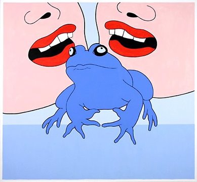
(right) Blue Frog, 1998
Acrylic on canvas
46 x 50 inches
(bottom) Rugby Players, 1982
Acrylic on canvas
60 x 72 inches
Yes, yes. LOVE. The weird baby nursery palette, the inexplicable symmetries, the sinuous line. Did anyone see the show of his work from the Sixties? I think it was last winter sometime.
All these cartoon paintings. Yet not one of them is a tenth as good as a Hernendez Bro. comic. None of these painters can draw.
Maximizes visual impact and resonance with minimal painterly effects. This is challenging work from the point of view of an expressionist.
Thanks for showing this and I think that the multiple image format is very helpful.
What else can you say about John Wesley, he's one of Dave Hickey's favorite painters.
I'll keep looking. Only wish that I could see these in person.
Bsch: you can see "Rugby Players" at Zwirner & Wirth uptown, along with other "vintage" Wesley paintings.
benevolent, John Wesley long live the Armory.
oily: that's what we were shooting for in our guest-hosting efforts this week. Just an experiment...
http://www.tcj.com/258/beto.jpg
wow, I thought roy lichenstein died already. was this guy one of his assistants? did someone say tom wesselman?
Someone said that these were bad drawings. I think that makes a point which is important even if the author of that comment is ignorant of it. The handling of color, form, line and surface is PRECISE. And yet the drawings are a little off. At first look, a little goofy. But I don't think that anything that Wesley does is accidental. Look at the shapes of the character's mouths. The shapes of noses and knees. He creates awkward relationships which belie the simple statement. His pictures offer more than what is seen at first glance. He invites closer attention by the intense application of his craft and then twists things with the curve of a lip or the shape of a shoe. I'm not a disciple but there's is more here than a copy of Lichtenstein or Wesselmann. These pieces are more than Pop.
An acquired taste for me. I remember really disliking John Wesley's paintings upon first encountering them years ago at Fredericks Freiser... I dismissed them as a re-hash of Wesselman via Lichtenstein. But they've grown on me in a major way since then; their weirdness is always surprising & unsettling in a good way. The powdery color, the odd & awkward drawing, the twisty flatness and an absolute mastery of technique and consistent delivery of the goods won me over.
agreed about the drawing, bsch. very deliberate.
pop is pure
speaking of deliberate the top 3 jpegs hold a spot on layout.
I think he is fair at best. It feels like he is going through the motions. At least early Lichtenstein had some feel and punch to it.
seminal
Dagwood.
Post a Comment