Normally I like red and black, but the additons of blue green and yellow just add up to bad eighties graphic design - and the signs are of the ryan McGuiness school but not as good, ad Ryan McGuiness is just a knock off of better designers because he was heavily influenced by Razorfish type people, who were in turn influenced by art including, but not limited to, Warhol, who was in turn influenced by graphic design.
So I am left with the sign, the message, and to me, it is indecipherable. Sure I can penetrate the drug references, the music references, the japinese animation, - basicly pop culture - but because the image is so dreary I wonder, why bother, why not just read a good book?
Banal. Null. Void. I hope thats the idea.
Im going to the hundred acre woode and try to pin the tail on my own donkey, thank you.
The mirakami sculpture. Amazing stuff. Then there was the still of the cum shot on black. Then there was dried semen on black velvet (does it glow under black light?)
Frozen blood. Shit. Spit bubbles. No one has done boogers that I know of. Tom Friedman?
Bloody spit bubbles? Shitty blood bubbles? Document your disease - cancer, aids...has leprosy been done?
"influenced" or "was a graphic" designer? warhol and R.M. to boot it is a natural part of there there lexicon, maybe it takes doing commercial work to read it, Murakami is a genius talk about viral.
Inside, Kehinde Wiley performed with Shaquita, backup singers, and four manservants. They were dressed in Beethoven-esque outfits (white wigs, frilly tops) and retooled modern songs as dirty, classical romps. At the end, they busted out mid-'80s dance moves to the strains of Salt-n-Pepa's "Push It." I believe they did the headache, the cabbage patch, and the Roger Rabbit. They also brought the house down. That is certain.
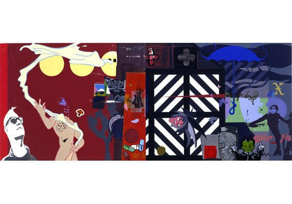
seeing this reminds me I need to pull out and listen to X's album, Under The Big Black Sun, whose font I see here in this posted image from Michael's show, and the cover of said record was designed right here in Seattle by Alfred Harris, so cudos to him and the quote in this one painting, now, go steal the Sotck Car from the show a Dietch, and run it through NYC at speed! Just do it!
16 comments:
oh fun.
wow he actually got worse
Normally I like red and black, but the additons of blue green and yellow just add up to bad eighties graphic design - and the signs are of the ryan McGuiness school but not as good, ad Ryan McGuiness is just a knock off of better designers because he was heavily influenced by Razorfish type people, who were in turn influenced by art including, but not limited to, Warhol, who was in turn influenced by graphic design.
So I am left with the sign, the message, and to me, it is indecipherable. Sure I can penetrate the drug references, the music references, the japinese animation, - basicly pop culture - but because the image is so dreary I wonder, why bother, why not just read a good book?
Banal. Null. Void. I hope thats the idea.
Im going to the hundred acre woode and try to pin the tail on my own donkey, thank you.
Anyone see the moo0veee at Elizabeth Dee? Vaudeville, mimes, angst, biopic, art film, and "Up Against the Wall, Motherfuckers"
All in one. Dont miss the hot sex on the stairs of the Met.
zip, people thinks its cute cause he includes the Murakami cummer
earlier he did cremaster riffs
that makes it hip I guess
Thank you, zipthwung. What you said. Except that I like the blue umbrella. I'll take the blue umbrella, and leave the rest.
The mirakami sculpture. Amazing stuff. Then there was the still of the cum shot on black. Then there was dried semen on black velvet (does it glow under black light?)
Frozen blood. Shit. Spit bubbles. No one has done boogers that I know of. Tom Friedman?
Bloody spit bubbles?
Shitty blood bubbles?
Document your disease - cancer, aids...has leprosy been done?
Hey, did you see Tom Friedman's sculpture, the flea-sized turd, at PS1? That was a hoot.
Boogers aren't archival, so bad for collectors.
"influenced" or "was a graphic" designer?
warhol and R.M. to boot it is a natural part of there there lexicon, maybe it takes doing commercial work to read it, Murakami is a genius talk about viral.
No where I like your blog
Who was that performing the Lil Kim operatics?I'm pissed I missed that.
thx!
Inside, Kehinde Wiley performed with Shaquita, backup singers, and four manservants. They were dressed in Beethoven-esque outfits (white wigs, frilly tops) and retooled modern songs as dirty, classical romps. At the end, they busted out mid-'80s dance moves to the strains of Salt-n-Pepa's "Push It." I believe they did the headache, the cabbage patch, and the Roger Rabbit. They also brought the house down. That is certain.
seeing this reminds me I need to pull out and listen to X's album, Under The Big Black Sun, whose font I see here in this posted image from Michael's show, and the cover of said record was designed right here in Seattle by Alfred Harris, so cudos to him and the quote in this one painting, now, go steal the Sotck Car from the show a Dietch, and run it through NYC at speed! Just do it!
this painting is like the pop-pomo version of the nicole eisenman painting
I do like the crosswalk, naturally, and as I said I crave redundancy, so the x is great. take the skinheads bowling, take them bowling.
I do like the crosswalk, naturally, and as I said I crave redundancy, so the x is great. take the skinheads bowling, take them bowling.
Post a Comment