Elmer Bischoff brought me into his office to show me this painting. May have been one of 3 times he actually talked to me. Anyway, for a painter, there's always something to learn when looking at an Ellsworth.
i am super into the profiles, + the conversations they have with each other and space they are in, - check the Guggenheim’s Peter B. Lewis Theater "shark fin"...
interesting choice for posting after one below,... its always nice to see paintings that is next to impossible to improve upon for what they are.. except for putting an elbow or knife or ruler through it, but that wasn't the artists intention so we won't go there.. Is it not yet time for some barnett newmans? I heard his paintings managed to provoke violence against them. I would like to see some online images of Duchamps Op art if anyone can find them....
Weights and Speeds: A little busy at the moment but would love to comment. This one, or the black and white ones, attach themselves to, though don't overshadow, John McLaughlin. Many people think Kelley is an upfront artist. Well he is to a degree--but it's the between, the sense, which, for lack of a better, or more durable word, is space, but between, if we get the semantics, 'between the two of us'.
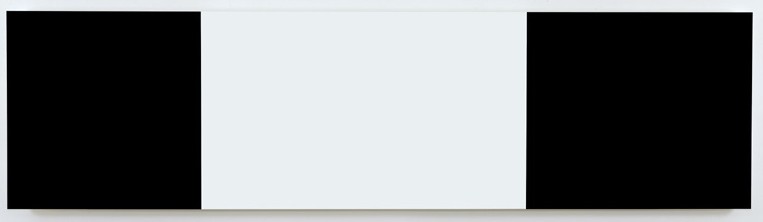
i like how this feels centered yet one of the black rectangles is wider than the other, making this actually an asymetrical composition. or i could be seeing things that aren't there.
I never liked Kelly until one was hung directly across from my desk for about six weeks. It breathed. It had personalities. It disappeared under the light of day, and glowed during the darkness of night. Now I can't stop looking. I think he has perfected Rothko and was the painter Clifford Still wanted to be. Elegance and simplicity. Balance and power. That's how I see Ellsworth Kelly.
pretty sure one is bigger than other, appears that one advances, one on right,. i could just have a smudge on my left lense,.. is it the same black for both?,..i assume it is..
Negative space isn't the place your mind retreats to when a painting isn't going well. Negative space is the space between objects or parts of an object, or around it. Studying this can have a surprisingly positive effect on a painting.
I have a bicycle. And some round me have these really long ones. Just because they are long I'm not going to shout out to the symmetrical police that there is an asymmetrical bicycle on the loose. No! I know the asymmetric is symmetric from a certain perspective, especially when it's this long German tandem coming head on, or witness it at the crossroad. I need to take care. That's all I think: think like crossing a bridge that is fragile, or one that is very old, or one that hasn't been crossed for quite awhile. It becomes a problem of a different navigation to understand the distance and the treachery between two things or points without actually seeing them!
While the greater the distance between things the more likely it is that we are to take lesser care--as with, kind of like, life--leaving it up to others, to complain about choices that appear dominant.
I guess this is a painting about life and the greater distance between things, or from the German bicycle analogy and perspective, the greater the length the harder the vision and the better the distance from start and the end the greater it is the joy to navigate.
I don't understand this world, but figure it's something about, or akin to, a tattoo, we celebrate and brand ourselves, and enjoy the balance or imbalance of it in relation to other brands.
I like the painting because it gives me a good headache!
Once I rose above the noise and confusion Just to get a glimpse beyond this illusion I was soaring ever higher, but I flew too high Though my eyes could see I still was a blind man Though my mind could think I still was a madman I hear the voices when I'm dreamin' I can hear them say
Chorus
Masquerading as a man with a reason My charade is the event of the season And if I claim to be a wise man, it surely means that I don't know On a stormy sea of moving emotion Tossed about, I'm like a ship on the ocean I set a course for winds of fortune, but I hear the voices say
Abstract I think it is more interesting to see Kelly [spelt properly--I always do that] as 'how is he thinking' at this late stage in the game: what he goes back to, modifies, shifts, with such spare room. What risks should he take? for instance! Would like your input:)
What I mean by the last ramble amble post is there is no diagonal so the parts in themselves are symmetrical, and the different distances each relates to the other makes it look like there is an asymmetric shift. It's not balanced nor does it try.We try to balance it because that's what we expect. Expectation vs what's there--it's always fun if you don't mind the labor. That's what I see Kelly doing here, letting things be, allowing the viewer to cope with [is]. It a sort of relinquishment. It tells me all sort of things. Personally I go for the shaped monochromes sequenced by color because...well...
there's a tension related to volume--the amount of black versus white--as well as the positional relation of the white middle to the black bookends, that's interesting to me. i don't mean in a political sense necessarily. but for some reason it reminds me of when my little brother and i used to argue over who got to sit in the front passenger seat of the car when we were kids. what is central here: the ends or the middle? not that there's an answer. it also reminds me of those little bars you see stuck on the chest of military dress uniforms.
P or not P, that is the tautology. WHether tis better to suffer the zenos paradoxes of outrageous logic, or to kill, and be killed.
In death, there is renewal, and in time, there is a watch band. A false dilema, time, with its discrete mathematical crocodiles. Greenwich mean time, Ill be painting a wall. But not a striped light wall, just a utilitarian white wall. The median is the message.
The mathematics of taste. The calculus of fashion. The Tensor mathematical high road. The quantum ambiguity.
"It is impossible, then, that 'being a man' should mean precisely 'not being a man', if 'man' not only signifies something about one subject but also has one significance. …
And it will not be possible to be and not to be the same thing, except in virtue of an ambiguity, just as if one whom we call 'man', and others were to call 'not-man'; but the point in question is not this, whether the same thing can at the same time be and not be a man in name, but whether it can be in fact.
The Bullwhip Effect (or Whiplash Effect) is an observed phenomenon in forecast-driven distribution channels. The concept has its roots in J Forrester's industrial dynamics (1961). Because customer demand is rarely perfectly stable, businesses must forecast demand in order to properly position inventory and other resources. Forecasts are based on statistics, and they are rarely perfectly accurate. Because forecast errors are a given, companies often carry an inventory buffer called "safety stock". Moving up the supply chain from end-consumer to raw materials supplier, each supply chain participant has greater observed variation in demand and thus greater need for safety stock. In periods of rising demand, down-stream participants will increase their orders. In periods of falling demand, orders will fall or stop in order to reduce inventory. The effect is that variations are amplified as one moves upstream in the supply chain( further from the customer).
The latest I've heard is that Steve Wynn is locked in a battle with his insurance company to pay off on the painting. Earlier, I read that he planned to keep the painting and have it restored.
My guess is that they will eventually pay; and then watch for the restored piece to be auctioned off by the insurance folks... probably at a higher price than before. The rich get richer you know... nudge nudge wink wink.
The following definitions are copied from a web site – original URL has been lost. They are shown here for study.
Visual Puns: Visual pun is the use of symbols to suggest two or more meanings or different associations. Visual puns combine two or more symbols (picture and/or text) to form a new meaning. The viewer must mentally elaborate on the visual stimulus to interpret the message –
Visual Puns: Creating an artwork in which several visual forms which look alike (thinking by appearance in the right hemisphere) are connected and combined so as to bring out two or more possible meaningful ideas in a humorous way. Because of the obviously separate nature of the two forms being humorously combined, visual puns are a lower form of visual metaphor.
Visual Satire: Art forms that use bisociation in an intentional way to make visual "look alike" comparisons between unlike objects to make meaningful exposures of vices, follies, stupidity, abuses, or hidden character. A more sophisticated form of bisociation than visual puns, works of visual satire imply that serious purpose is intended, even when it is communicated in a humorous way. Caricature is a form of visual satire.
Bisociation: The mixture in one human mind of visual physiognomies from two contexts or categories of objects that are normally considered separate categories by the literal processes of the mind. The thinking process that is the functional basis for metaphoric thinking. This is a term coined by the author Arthur Koestler in his book "The Act of Creation." Koestler invented this term to distinguish the type of analogical thinking that leads to the acts of great creativity from the more pedestrian associative (purely logical) thinking, with which we are so familiar in our everyday lives.
Visual Merging: Term coined by NAB to specify a level of bisociation where the separate objects with their associated physiognomic qualities are being merged toward the level of hidden metaphoric expressions (disguised symbolism). The objects at the visual merging level are, however, still identifiable as separate objects being referred to visually.
They are all great zip though I would think this the real heavy stuff: - get a piece of paper, draw a long rectangle, draw many, shade. - get the assistants to make up some long canvases - divide them up using the drawings - adjust (optional) - adjust (more options) - lay down the color - build the appropriate saturation parts together, stretch apart - sit, see if the work sits - if too comfortable move to the next and then come back
(that's possibly what happens with these black and white ones)
the monochromes: - well that is just pure joy, laying color down to work what is already there.
It's all a trick zip, don't get hung up on this truth thing: The trick is not to use the tricks you know so much as to understand the trick you know tricks you if you over-use it. That's why I like to see how Kelly fares these days: And he's doing good in my books.
Like i said, I like the installation in the upstairs space because of the supporting pillar. it occludes my view. Its like shutting one eye, or using your fingers to squish distant objects. Those are just some of the tricks I use. Finger moon, moonfinger. that sort of thing.
Donald Kuspits book came out in softcover and I was skimming it in the bookstore. New Old Masters. Its like a cigar is just a cigar. Or it isnt.
Kuspits book is 18 dollars. Maybe Ill get a new library card.
i got it. It was a funny as asking for a price check from a black guy on MLK day. Can I take your order? EVERYTHING is funny when you exclude the middle - which is funny because...
32 comments:
Ellsworth Kelly
Matthew Marks
522 W 22 St
523 W 24 St
526 W 22 ST
NYC
Elmer Bischoff brought me into his office to show me this painting. May have been one of 3 times he actually talked to me. Anyway, for a painter, there's always something to learn when looking at an Ellsworth.
i am super into the profiles, + the conversations they have with each other and space they are in, - check the Guggenheim’s Peter B. Lewis Theater "shark fin"...
interesting choice for posting after one below,...
its always nice to see paintings that is next to impossible to improve upon for what they are..
except for putting an elbow or knife or ruler through it, but that wasn't the artists intention so we won't go there..
Is it not yet time for some barnett newmans? I heard his paintings managed to provoke violence against them.
I would like to see some online images of Duchamps Op art if anyone can find them....
Weights and Speeds:
A little busy at the moment but would love to comment. This one, or the black and white ones, attach themselves to, though don't overshadow, John McLaughlin. Many people think Kelley is an upfront artist. Well he is to a degree--but it's the between, the sense, which, for lack of a better, or more durable word, is space, but between, if we get the semantics, 'between the two of us'.
Wish I could see the three shows.
i like how this feels centered yet one of the black rectangles is wider than the other, making this actually an asymetrical composition. or i could be seeing things that aren't there.
I never liked Kelly until one was hung directly across from my desk for about six weeks. It breathed. It had personalities. It disappeared under the light of day, and glowed during the darkness of night. Now I can't stop looking. I think he has perfected Rothko and was the painter Clifford Still wanted to be. Elegance and simplicity. Balance and power. That's how I see Ellsworth Kelly.
pretty sure one is bigger than other,
appears that one advances, one on right,.
i could just have a smudge on my left lense,..
is it the same black for both?,..i assume it is..
WHos agraid of RGB?
nightnmare on elm street was a good movie. I mean the first one.
Negative space isn't the place your mind retreats to when a painting isn't going well. Negative space is the space between objects or parts of an object, or around it. Studying this can have a surprisingly positive effect on a painting.
check this out!
Asymetrical warfare - I think thats what this composition is about.
Reductio ad absurdum
I prefore more populist editorializing
to the sublime existential flourescentce of say, an office after midnight.
It's funny, zip:
I have a bicycle. And some round me have these really long ones.
Just because they are long I'm not going to shout out to the symmetrical police that there is an asymmetrical bicycle on the loose. No! I know the asymmetric is symmetric from a certain perspective, especially when it's this long German tandem coming head on, or witness it at the crossroad.
I need to take care. That's all I think: think like crossing a bridge that is fragile, or one that is very old, or one that hasn't been crossed for quite awhile.
It becomes a problem of a different navigation to understand the distance and the treachery between two things or points without actually seeing them!
While the greater the distance between things the more likely it is that we are to take lesser care--as with, kind of like, life--leaving it up to others, to complain about choices that appear dominant.
I guess this is a painting about life and the greater distance between things, or from the German bicycle analogy and perspective, the greater the length the harder the vision and the better the distance from start and the end the greater it is the joy to navigate.
I don't understand this world, but figure it's something about, or akin to, a tattoo, we celebrate and brand ourselves, and enjoy the balance or imbalance of it in relation to other brands.
I like the painting because it gives me a good headache!
too safe???
danger
danger
dannnger
blogs is safe.
Once I rose above the noise and confusion
Just to get a glimpse beyond this illusion
I was soaring ever higher, but I flew too high
Though my eyes could see I still was a blind man
Though my mind could think I still was a madman
I hear the voices when I'm dreamin'
I can hear them say
Chorus
Masquerading as a man with a reason
My charade is the event of the season
And if I claim to be a wise man, it surely means that I don't know
On a stormy sea of moving emotion
Tossed about, I'm like a ship on the ocean
I set a course for winds of fortune, but I hear the voices say
cHORUS
chorus
Abstract I think it is more interesting to see Kelly [spelt properly--I always do that] as 'how is he thinking' at this late stage in the game: what he goes back to, modifies, shifts, with such spare room.
What risks should he take? for instance! Would like your input:)
What I mean by the last ramble amble post is there is no diagonal so the parts in themselves are symmetrical, and the different distances each relates to the other makes it look like there is an asymmetric shift. It's not balanced nor does it try.We try to balance it because that's what we expect. Expectation vs what's there--it's always fun if you don't mind the labor. That's what I see Kelly doing here, letting things be, allowing the viewer to cope with [is]. It a sort of relinquishment. It tells me all sort of things.
Personally I go for the shaped monochromes sequenced by color because...well...
there's a tension related to volume--the amount of black versus white--as well as the positional relation of the white middle to the black bookends, that's interesting to me. i don't mean in a political sense necessarily. but for some reason it reminds me of when my little brother and i used to argue over who got to sit in the front passenger seat of the car when we were kids. what is central here: the ends or the middle? not that there's an answer. it also reminds me of those little bars you see stuck on the chest of military dress uniforms.
P or not P, that is the tautology. WHether tis better to suffer the zenos paradoxes of outrageous logic, or to kill, and be killed.
In death, there is renewal, and in time, there is a watch band. A false dilema, time, with its discrete mathematical crocodiles. Greenwich mean time, Ill be painting a wall. But not a striped light wall, just a utilitarian white wall. The median is the message.
The mathematics of taste. The calculus of fashion. The Tensor mathematical high road. The quantum ambiguity.
"It is impossible, then, that 'being a man' should mean precisely 'not being a man', if 'man' not only signifies something about one subject but also has one significance. …
And it will not be possible to be and not to be the same thing, except in virtue of an ambiguity, just as if one whom we call 'man', and others were to call 'not-man'; but the point in question is not this, whether the same thing can at the same time be and not be a man in name, but whether it can be in fact.
-Aristotle
name is fact, isnt it? other than that, its a beautiful day
zipthwung: if heaven is a declarative sentence, you must be the antichrist.
TPL...thanks, will check that out soon - the FB....
no time yet
ok
bye
Declarative sentence:
War with Iran.
Man Bill Viola just got my Mark Kostabi dumb award. I vote he drink his work, which is about as viscous as a glass of warm piss.
Oops, I meant Gary Hill.
Dont tread on me.
Oily grappa.
SSSSSsssssssss
i loved it - more closeted SM from Barbara Gladstone.
gOLDEN sHOWERS
The Bullwhip Effect (or Whiplash Effect) is an observed phenomenon in forecast-driven distribution channels. The concept has its roots in J Forrester's industrial dynamics (1961). Because customer demand is rarely perfectly stable, businesses must forecast demand in order to properly position inventory and other resources. Forecasts are based on statistics, and they are rarely perfectly accurate. Because forecast errors are a given, companies often carry an inventory buffer called "safety stock". Moving up the supply chain from end-consumer to raw materials supplier, each supply chain participant has greater observed variation in demand and thus greater need for safety stock. In periods of rising demand, down-stream participants will increase their orders. In periods of falling demand, orders will fall or stop in order to reduce inventory. The effect is that variations are amplified as one moves upstream in the supply chain( further from the customer).
Re: the Wynn-damaged Picasso...
The latest I've heard is that Steve Wynn is locked in a battle with his insurance company to pay off on the painting. Earlier, I read that he planned to keep the painting and have it restored.
My guess is that they will eventually pay; and then watch for the restored piece to be auctioned off by the insurance folks... probably at a higher price than before. The rich get richer you know... nudge nudge wink wink.
Now back to art.
ISUAL PUNS
The following definitions are copied from a web site – original URL has been lost. They are shown here for study.
Visual Puns: Visual pun is the use of symbols to suggest two or more meanings or different associations. Visual puns combine two or more symbols (picture and/or text) to form a new meaning. The viewer must mentally elaborate on the visual stimulus to interpret the message –
Visual Puns: Creating an artwork in which several visual forms which look alike (thinking by appearance in the right hemisphere) are connected and combined so as to bring out two or more possible meaningful ideas in a humorous way. Because of the obviously separate nature of the two forms being humorously combined, visual puns are a lower form of visual metaphor.
Visual Satire: Art forms that use bisociation in an intentional way to make visual "look alike" comparisons between unlike objects to make meaningful exposures of vices, follies, stupidity, abuses, or hidden character. A more sophisticated form of bisociation than visual puns, works of visual satire imply that serious purpose is intended, even when it is communicated in a humorous way. Caricature is a form of visual satire.
Bisociation: The mixture in one human mind of visual physiognomies from two contexts or categories of objects that are normally considered separate categories by the literal processes of the mind. The thinking process that is the functional basis for metaphoric thinking. This is a term coined by the author Arthur Koestler in his book "The Act of Creation." Koestler invented this term to distinguish the type of analogical thinking that leads to the acts of great creativity from the more pedestrian associative (purely logical) thinking, with which we are so familiar in our everyday lives.
Visual Merging: Term coined by NAB to specify a level of bisociation where the separate objects with their associated physiognomic qualities are being merged toward the level of hidden metaphoric expressions (disguised symbolism). The objects at the visual merging level are, however, still identifiable as separate objects being referred to visually.
They are all great zip though I would think this the real heavy stuff:
- get a piece of paper, draw a long rectangle, draw many, shade.
- get the assistants to make up some long canvases
- divide them up using the drawings
- adjust (optional)
- adjust (more options)
- lay down the color
- build the appropriate saturation
parts together, stretch apart
- sit, see if the work sits
- if too comfortable
move to the next
and then come back
(that's possibly what happens with these black and white ones)
the monochromes:
- well that is just pure joy, laying color down to work what is already there.
It's all a trick zip, don't get hung up on this truth thing: The trick is not to use the tricks you know so much as to understand the trick you know tricks you if you over-use it.
That's why I like to see how Kelly fares these days: And he's doing good in my books.
Come on Abstract open up;)
Like i said, I like the installation in the upstairs space because of the supporting pillar. it occludes my view. Its like shutting one eye, or using your fingers to squish distant objects. Those are just some of the tricks I use. Finger moon, moonfinger. that sort of thing.
Donald Kuspits book came out in softcover and I was skimming it in the bookstore. New Old Masters. Its like a cigar is just a cigar. Or it isnt.
Kuspits book is 18 dollars. Maybe Ill get a new library card.
i got it. It was a funny as asking for a price check from a black guy on MLK day.
Can I take your order? EVERYTHING is funny when you exclude the middle - which is funny because...
the middle isnt funny
Post a Comment