This painting disappoints me. It is so 'Habitat'. I have been a fan of Fiona Rae. She had used graphics with a fresh spatial sense along with her great sense of color. Now it looks borrowed.
I'm a big lover of "design". TPL called it "uuummmph". I get the feeling that design has been discredited by many contempo painters, i'm guessing in the rush to be "cutting edge". Yet Fiona seems to retain it.
Urban outfitters started selling silkcreened paintings - wall hangings. Stuff to cover the wall. Whatyamacallit. Wallpaper.
Theres some fun spatial stuff just like in the Erica Svec. But thats the realm of formal design - art 201 - my point with Dali comparison is that he, like many painters, used formal space dividing rules to sustain a composition, if not a concept. Artists like Mc Escher and Ryan Mc Guiness took it to a mathematical extreme. Look up aperiodic tiling and you can have a career.
But thats only one tool in the shed.
There are others - if you grab the flashlight by the door and shake it you will illuminate several bodies I have hung up with the greased winter sleds and the radio flyer inscribed with the rosy cross to give it a bit of hosomi.
Appologists for Deitch and his stable of designers, illustrators and performers will say his gallery isnt about subtlety but subcultural lifestyle and spectacle. Art=Life. For example, is a popular conundrum.
How can painting be life? Is that all there is?
Reminds me of when I was trying to fit in and I joined cub scouts. Jesus christ what a mind fuck.
Erica Svec looks like she doesnt know what shes going to paint before she lays down her first grey. Im with that school - read the tea leaves. auger the tidings Screw the pooch. Agnes martin paints with her mind and then with her hand. Im suspicious of that because the only people I know that do that are graphic designers. They know what they like.
REAL paintings are not very good wallpaper. Keep them to yourself.
I know psychadelia from a black light poster I won at the local craft fair. A cheeta. I dint hav black light, though because UV light has mutagenic properties. Thanks mom!
“I wanted it to have the quirkiness of Superman III,” he says. “They wanted something sleek like The Matrix. I don’t see myself with this kind of darkness.” He gets increasingly impassioned as the memories flow back. “The producer was an idiot,” he says. “This guy thought I was a cool director. But I was not cool, even if I was popular with artists. It wasn’t about having an attitude. It was about not having an attitude.”
Spontanaeity of method is not the issue. lots of graphic designers dont know where they are going before they start. Conversely lots of painters do know exactly what they are going to paint before they start.
Anyway, this painting reminds me of David Salle--in the accrual and placement of images. But FR is using abstract imagery mostly. Juxtaposition of abstract imagery is a very cool modern song.
Dont you think FR's choice of color palette that looks like decoration or packaging is really working? I think rite on pulse.
The gray here is gorgeous. It is a color and has feeling, not like the Svec gray. But this painting is just pretty. The colors in the huge drip on the side are too much from the "70% cool, 30 % warm" mentality. I think she is a graphic designer who wants to be a painter. Maybe she is going thru a hard creative time- god knows we all do - but perhaps will let some ugliness creep back in.
Erica spins this Fiona gal on her finger...spins her. Fiona is self conscious careerist one trick pony..it's dead...mouth to mouth ain't helping. She's an English painter... an oxymoron.
Stick to yer Kate Moss and your Pete Doherty jus' stop painting...just stop. Stick to yer Stella McCartney...do what you do well...skinny jeans...will someone take Gary Hume outback and show him a good painting.
All talk and no trouser...to see this work in person...art in the dark plus Elle Decor...which isn't always a bad idea but somehow Fiona dots the I's and the T's a good bit too hard. Right, luv?
Look! There is a huge difference in quality and longevity between the De Keyser and a Rea. If I were unable to see this then there is good reason to question just about everything. All art is good-- as a way of life. Though give me better! We each applaud different ways--and I have to admit I'm a slow clapper--sharp but slow--it's in the blood!!
30 comments:
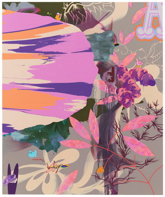
Fiona Rea @
Pace
534 West 25th Street
NYC
now thats the way to use pink and grey
I think it's lacking a little hyperrealistic doodad somewhere,to cover all the bases..
This painting disappoints me. It is so 'Habitat'. I have been a fan of Fiona Rae. She had used graphics with a fresh spatial sense along with her great sense of color. Now it looks borrowed.
I'm a big lover of "design". TPL called it "uuummmph". I get the feeling that design has been discredited by many contempo painters, i'm guessing in the rush to be "cutting edge". Yet Fiona seems to retain it.
BTW -- It's Rae. Fiona Rae.
This idea that painting can be cutting edge is quaint.
It is a Sexy pretty painting. They should use it as the design for an Urban Decay shadow box, don't you all think?
Urban outfitters started selling silkcreened paintings - wall hangings. Stuff to cover the wall. Whatyamacallit. Wallpaper.
Theres some fun spatial stuff just like in the Erica Svec. But thats the realm of formal design - art 201 - my point with Dali comparison is that he, like many painters, used formal space dividing rules to sustain a composition, if not a concept. Artists like Mc Escher and Ryan Mc Guiness took it to a mathematical extreme. Look up aperiodic tiling and you can have a career.
But thats only one tool in the shed.
There are others - if you grab the flashlight by the door and shake it you will illuminate several bodies I have hung up with the greased winter sleds and the radio flyer inscribed with the rosy cross to give it a bit of hosomi.
Appologists for Deitch and his stable of designers, illustrators and performers will say his gallery isnt about subtlety but subcultural lifestyle and spectacle. Art=Life. For example, is a popular conundrum.
How can painting be life? Is that all there is?
Reminds me of when I was trying to fit in and I joined cub scouts. Jesus christ what a mind fuck.
Erica Svec looks like she doesnt know what shes going to paint before she lays down her first grey. Im with that school - read the tea leaves. auger the tidings Screw the pooch. Agnes martin paints with her mind and then with her hand. Im suspicious of that because the only people I know that do that are graphic designers. They know what they like.
REAL paintings are not very good wallpaper. Keep them to yourself.
I know psychadelia from a black light poster I won at the local craft fair. A cheeta. I dint hav black light, though because UV light has mutagenic properties. Thanks mom!
“I wanted it to have the quirkiness of Superman III,” he says. “They wanted something sleek like The Matrix. I don’t see myself with this kind of darkness.” He gets increasingly impassioned as the memories flow back. “The producer was an idiot,” he says. “This guy thought I was a cool director. But I was not cool, even if I was popular with artists. It wasn’t about having an attitude. It was about not having an attitude.”
here
Spontanaeity of method is not the issue. lots of graphic designers dont know where they are going before they start. Conversely lots of painters do know exactly what they are going to paint before they start.
Anyway, this painting reminds me of David Salle--in the accrual and placement of images. But FR is using abstract imagery mostly. Juxtaposition of abstract imagery is a very cool modern song.
Dont you think FR's choice of color palette that looks like decoration or packaging is really working? I think rite on pulse.
"Spontanaeity of method is not the issue"
but it does impart the shibumi. Hosomi.
looking at painting
self sameness
Ehrewhon
Wabi Sabi?
love it.
I just want to explore.
Saatchi + Hong Kong + living in London = fertile ground for artists of this genre.
what are y'all looking for?
The gray here is gorgeous. It is a color and has feeling, not like the Svec gray. But this painting is just pretty. The colors in the huge drip on the side are too much from the "70% cool, 30 % warm" mentality. I think she is a graphic designer who wants to be a painter. Maybe she is going thru a hard creative time- god knows we all do - but perhaps will let some ugliness creep back in.
Good point dharmabum! But if you wear Picasso's hat, nobody will notice it.
Erica spins this Fiona gal on her finger...spins her. Fiona is self conscious careerist one trick pony..it's dead...mouth to mouth ain't helping. She's an English painter... an oxymoron.
Stick to yer Kate Moss and your Pete Doherty jus' stop painting...just stop. Stick to yer Stella McCartney...do what you do well...skinny jeans...will someone take Gary Hume outback and show him a good painting.
they would look stunning with the interior of the Bellagio.
as if there is something out there that you dont know!
All talk and no trouser...to see this work in person...art in the dark plus Elle Decor...which isn't always a bad idea but somehow Fiona dots the I's and the T's a good bit too hard. Right, luv?
Easy... or inevitable? It is that easy.
I hate the stupifd floating "A" in the upper right hand corner. What-everr, go back to graphic design.
Look! There is a huge difference in quality and longevity between the De Keyser and a Rea. If I were unable to see this then there is good reason to question just about everything.
All art is good-- as a way of life. Though give me better! We each applaud different ways--and I have to admit I'm a slow clapper--sharp but slow--it's in the blood!!
Bring on some figuration and educate me!
Pantone 433 2X is the new black
"Vulgarity dullness, or impiety will indeed express themselves through art, in brown and grey, as in Rembrandt."
John Ruskin
Its missing a deer.
It's missing Lari Pittman's eyelashes.
Post a Comment