Inka! While some of her work resonates with me more than others, I really like the way she pushes beyond a signature style. The connection with fussy old eurostyle surrealism (ernst, tanguy, matta etc) by way of manga/illustration is an interesting approach. I'm always curious to see what she's up to -which is just about the best thing you can say about an artist.
I really like her work and am glad she pushed herself into a different area. I wish she would have stuck with her old style for a couple of more years though! The way I read her new style is that it makes literal what was abstract in her earlier pictures, and the downfall of that is that it can sometimes lead them into the area of kitsch. Some of these remind me of pulp sci-fi/fantasy paperback covers. But I like them more than not.
I think that's the real challenge of working with narrative subject matter, maintaining a sense of mystery and discovery while working with easily decipherable forms. She's found part of a solution in taking such a stylized approach. I see the potential of leading into kitsch - for me the answer would be to embrace those qualities to push it even farther into another realm. But that's just my taste.
they are good, and i like her work and i can still, however, be repulsed with the chuck close star fucking thing at the same time. that was gross. its really him not her to be disgusted with.
this was definitely an improvment over her last show. the paint-handling has gotten more interesting. the way she abstracts is sometimes predictable. the one in the back room was really good. they have a 40's ashcan school quality to them.
yeah, like if Chuck Close offered to paint the portrait of any of you haters out there, would you REALLY say, 'Sorry, Chuck, you disgust me with your art-star-fucking antics, I'll pass" ? Plus the dude is in a wheelchair. You can't say no to a dude in a wheelchair who wants to paint you.
Enough with the petty, mean comments. There is a long and wonderful tradtion of artist painting artist. No one has done more to try and build a sense of community among NY painters than Chuck Close. Can we be a little kinder on the personal front and more profesional on the painting criticism. It will be more fun.
There is something about the figure that has me wary, the swoopy legs/sylization. but that may be a good thing - something sort of yucky in the context of this very likeable, beautiful forest scene. I think inka is a very talented, interesting painter and I can't wait to see these in person later this week. I feel like it's not fair to elaborate further until i see them in the real but there is great motion in this one.
i don't think I can read this blog anymore. the comments are so class conscious. All this talk about status and privilege feel disgusting and make me not want to make art or be part of this stratified artworld. So many people don't have access and it seems like people in power want it that way. they are intolerant of the so-called bottom feeder "community college teachers". It is your own fault if you don't have the money or degree to be in shows... Chuck Close blah blah blah... so much for community or compassion or respect.
A fasinating show I thought. An artist in the process of takeing her technical talent where it wants to go, exploring all manner of shape, motion, color, constuction and interaction. These paintings are like watching a bronco rider who has just gotten a wild horse under control. What is to come will be fantastic. Go see it. Energetic, couragous and fun. Don't get hung up on the stylizing it is learning to hold the rains.
i never said it was your own fault if you don't have MONEY or DEGREES to be in shows - i feel the opposite. what i said was, if you can't paint, you won't succeed. if you can, you will. assuming you're not a total dickhead. seems you have class issues, inserting your bias into what i had to say. go back and read it again.
those silly comments are bound to happen. who cares? just ignore them.
i'm still processing essenhigh's show... the paintings had such a weird presence. i miss the drawing quality of the older work a little, but i admire her for changing it up and indulging her skill level. this is the most beautiful one --- that color..!!. and the movement is SO lyrical... tough to maintain considering the level of detail. how does she do it? to me they feel like the right progression in terms of style... more, excess, indulgence, luxury. illustrational was the inevitable and right next step. she's a total badass painter who keeps getting better.
I thought the painting looked better - more blended, controlled and docile. But why so much white? I know its a stupid criticism - who hanst been told not to limit the use of black and white?
I never got off on the attenuated figures - mannered. Seen too much of it I guess - in undergrad.
But on the other hand people dig that - thats why they paint it. Its a weird thing. A visceral thing? Like people like the idea of having their flesh pulled into taffeee
Inka looked much more relaxed - as she should be her peeps at the last show surrounded her like an iron phalanx.
Zip that opening was amazing, Inka talked to everyone and there was so much fun, excitement and energy in the room. It was the best time I've had at a show in a long time.People knew they were seeing a major player moving to a new level. It was great and she deserves it. It is exepctional work.
i feel kind of like i was feeling when bush was reelected - like maybe I am totally out of sync with my people, but I find this work super boring, really badly painted, very very conventional if not outright conservative, and not very nuanced or considered... Anyone with me here?
It looks as though her paint handling has become smoother when compared to her last show - like she's getting used to using oils (though I have not seen this show in person and must rely on this jpeg). Very nice Ernst Haeckel stuff going on there. The illustrative quality reminds me of Alexis Rockman's work, not literally but because of the thoughts they bring up - I can't help but think with both that their work would make great book covers. Does that create a problem? I can't decide even though I've thought about it for ages. Another artist who's work this issue brings to mind is Robert Gutierrez. Fantastic sci-fi cover motifs. I really like his work.
Boring? I'm BITTER AND BORING. Next time someone calls me bitter I'll clock them. Inka is what she is. Not my thing, but look - shes like a Juxatapoze artist in an Artforum world. That in itself is interesting. Its a very fine line no? What if she maintains the tone but ventures outwards from the navel gazing posture?
cool - I'll go there with you - I guess mainly its a taste thing her work goes against all of my taste bristles and its a huge effort for me to get around or past that...
Sapien. Thanks. Lots to think about there. I'm going to go back and look again with fresh eyes and few new ideas. Thanks to you. Glad I was told about this blog.
I absolutely love the crazy wild out of control waviness of her flora and fauna who willfully disobey rules of gravity. Who are these rubbery sci-fi fairytale interlopers? Sometimes I think she is stronger in the plantlife or window blinds than when she paints a face or a figure, but I am always interested and impressed by her constantly evolving style. She is an ass-kicker.
i think people like this new work because of the step she is taking away from her old style, which established her on the scene. i wonder if these paintings actually have something to offer other than their difference. i appreciate them, but i'm not sure that they're good. just different. something about them really reminds me of the eighties also. oh well they'll do better this than damien loeb
i don't think this show will get a good review (if reviewed at all). best painting is the one from the card (color is rich and best drawing). all the others seem like gradations of value with single hue (very odd choice or simply a simplification for her?) she certainly can draw, but inka's paint quality and color handling feels underskilled. she is a strong artist (much better painter than nearly all of those at mary boone)and still developing. this show is not her best moment.
Disagreed. I think she keeps getting better and better. She is an expret at mixing high and low and although her palette is limited, she is daring in terms of composition and painterly approach.
Disagreed. I think she keeps getting better and better. She is an expret at mixing high and low and although her palette is limited, she is daring in terms of composition and painterly approach.
I hope anon is wrong about the review, bad or none for Inka. I agree with ennis that this is good and that she is going to be even better. But I agree with anon that reviewers seem to trash or ignore painters on the way up and praise and recognize a lot of trash and people on the way down. Maybe that is all political but this is a good painter.
Her show was very good. The painting in the back however was quite weak and seemed rushed and unfinshed. It took the show as a whole down a bit. That painting should have been replaced with some drawings or maybe the show should have been spread out more with three in the front and one in the back. With that said, the four paintings in the front were stunning.
I'm more into phrenology than art, true. I mean if some pinhead mkes art, whats more relevant, the golf ball sized dimple in their frontal lobe or my performative intertpretation of their self reflexive mailorder gag? Puhleeeeze.
It was pointed out to me that here is a nice barnett Newman witht he tape still on it in the Met. Ready to wear!
Bunko Boy, I must disagree about the painting in the back. I loved the open-endedness of it.... not all bits worked to the same level, some left nice & loose. Overall I thought this was a great show, totally memorable paintings. It's not so easy to make a teriffically strong painting even once, let alone over and over and over again, especially with figure paintings.. Loved the color, scale, sense of invention, the ambiguous but suggestive worlds. She rocks.
I'm with you sloth, I liked the one in the back as well. That was the one that made the connection to italian futureism for me and makes a play on depicting movement, it's kind of a cheeky cartoon representation of movement but then also so graceful and beautiful are her fluid lines that I actually feel the velocity. I like that the paintings don't look familiar, I applaude her uniqueness in the art world.
earlier an anon said: << I find this work super boring, really badly painted, very very conventional if not outright conservative, and not very nuanced or considered...Anyone with me here?>> I am with you all the way.
gloo, I just found this blog too and have been reading all the past post. Went to see the Essenheigh show after seeing it posted here and had the same reaction. Liked what I saw but more interested in where she goes from here. The possibilites seem endless for this painter. This is an exciting blog for painters.
There's an article in Harpers on "Flash Mobs" by the inventor of "flash Mobs" he writes about his prediction of the co-optation of his idea and the fad by corporations. This happened and as a result someone got a job writing a blog for the corporate web site.
Now I'm not saying ya'all are corporate sponsored shills, but you write like his example. Read the article.
I went to high school with a guy who'd have loved this. I think it looks like a page from a children's book. And somewhere in that book is a lesson about the earth-mother-vagina-tree. It's a strange and haunting image (I mean Essenhigh's painting, though you're welcome to have the EMVT haunt you if you like) but the image seems to be working in subservience to a narrative that's not expressed through it.
I remember being engrossed by her works back in 1996 when she showed in a great group show at Exit Art. Back then she was doing cartoonish (ala Matthew Ritchie) surrealist flat imagery that linked abstraction with representation. It was raw and unnerving work. These paintings have obviously become more dimensional and super-realistic. They were obsessively painted and the size is just right. These are, for me, uncomfortable imagery to look at. They are like stills from someone's nightmares. But Inka really is free in these paintings and it's nice to see here pushing through this realism mode with vigor. They are dynamic and animated and I would like to see this imagery move via computer animation and maybe in sculptural form. That would be interesting. I'm excited to see her next show.
62 comments:
this was an interesting show to see with the Kara Walker show. How they both abstract figures and why...
Inka! While some of her work resonates with me more than others, I really like the way she pushes beyond a signature style. The connection with fussy old eurostyle surrealism (ernst, tanguy, matta etc) by way of manga/illustration is an interesting approach. I'm always curious to see what she's up to -which is just about the best thing you can say about an artist.
I really like her work and am glad she pushed herself into a different area. I wish she would have stuck with her old style for a couple of more years though! The way I read her new style is that it makes literal what was abstract in her earlier pictures, and the downfall of that is that it can sometimes lead them into the area of kitsch. Some of these remind me of pulp sci-fi/fantasy paperback covers. But I like them more than not.
Illustration is a illustration is a...
I can't get into these- anymore - than I was repulsed by Chuck Close painting her portrait. I am sick of attractive people 'making it'.
A festival of Imagination.
I think that's the real challenge of working with narrative subject matter, maintaining a sense of mystery and discovery while working with easily decipherable forms. She's found part of a solution in taking such a stylized approach. I see the potential of leading into kitsch - for me the answer would be to embrace those qualities to push it even farther into another realm. But that's just my taste.
Michelle Grabner's review of Ashley Macomber in Artforum could just as well have been written on Essenhigh. ouch.
they are good, and i like her work and i can still, however, be repulsed with the chuck close star fucking thing at the same time. that was gross. its really him not her to be disgusted with.
this was definitely an improvment over her last show. the paint-handling has gotten more interesting. the way she abstracts is sometimes predictable. the one in the back room was really good. they have a 40's ashcan school quality to them.
yeah, like if Chuck Close offered to paint the portrait of any of you haters out there, would you REALLY say, 'Sorry, Chuck, you disgust me with your art-star-fucking antics, I'll pass" ? Plus the dude is in a wheelchair. You can't say no to a dude in a wheelchair who wants to paint you.
"You can't say no to a dude in a wheelchair who wants to paint you." That is a GREAT idea for a Curb Your Enthusiasm episode! Anyway, back to Inka.
i can't believe you have a problem with chuck close - wtf? get a life.
Enough with the petty, mean comments. There is a long and wonderful tradtion of artist painting artist. No one has done more to try and build a sense of community among NY painters than Chuck Close. Can we be a little kinder on the personal front and more profesional on the painting criticism. It will be more fun.
has immediate appeal,but overly stylish,sort of shallow-perhaps in time.Very likeable,in any case.
yeah wtf? bfd.
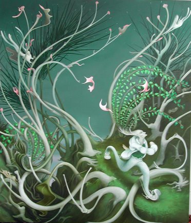
There is something about the figure that has me wary, the swoopy legs/sylization. but that may be a good thing - something sort of yucky in the context of this very likeable, beautiful forest scene. I think inka is a very talented, interesting painter and I can't wait to see these in person later this week. I feel like it's not fair to elaborate further until i see them in the real but there is great motion in this one.
this image does feel significantly more illustrational than her last show at 303. I wonder.
i don't think I can read this blog anymore. the comments are so class conscious. All this talk about status and privilege feel disgusting and make me not want to make art or be part of this stratified artworld. So many people don't have access and it seems like people in power want it that way. they are intolerant of the so-called bottom feeder "community college teachers". It is your own fault if you don't have the money or degree to be in shows... Chuck Close blah blah blah... so much for community or compassion or respect.
A fasinating show I thought. An artist in the process of takeing her technical talent where it wants to go, exploring all manner of shape, motion, color, constuction and interaction. These paintings are like watching a bronco rider who has just gotten a wild horse under control. What is to come will be fantastic. Go see it. Energetic, couragous and fun. Don't get hung up on the stylizing it is learning to hold the rains.
i never said it was your own fault if you don't have MONEY or DEGREES to be in shows - i feel the opposite. what i said was, if you can't paint, you won't succeed. if you can, you will. assuming you're not a total dickhead.
seems you have class issues, inserting your bias into what i had to say. go back and read it again.
those silly comments are bound to happen. who cares? just ignore them.
i'm still processing essenhigh's show... the paintings had such a weird presence. i miss the drawing quality of the older work a little, but i admire her for changing it up and indulging her skill level. this is the most beautiful one --- that color..!!. and the movement is SO lyrical... tough to maintain considering the level of detail. how does she do it? to me they feel like the right progression in terms of style... more, excess, indulgence, luxury. illustrational was the inevitable and right next step. she's a total badass painter who keeps getting better.
ww - you got it!
w.w. Exactly! The movement. lyrical is right! This is a huge talent.
There have always been, unhappy, tortured, oppressed painters. Before we had blogs people like Van Gough would cut off their right ear for attention.
dis is cute!
Repulsed, Why don't you paint chuck close?
Its the colors too. Inka makes the colors sing.Poetry in motion with color.
I thought the painting looked better - more blended, controlled and docile. But why so much white? I know its a stupid criticism - who hanst been told not to limit the use of black and white?
I never got off on the attenuated figures - mannered. Seen too much of it I guess - in undergrad.
But on the other hand people dig that - thats why they paint it. Its a weird thing. A visceral thing? Like people like the idea of having their flesh pulled into taffeee
Inka looked much more relaxed - as she should be her peeps at the last show surrounded her like an iron phalanx.
Relax my dear....relax......
Zip that opening was amazing, Inka talked to everyone and there was so much fun, excitement and energy in the room. It was the best time I've had at a show in a long time.People knew they were seeing a major player moving to a new level. It was great and she deserves it. It is exepctional work.
I like the comment about a Festival of Imagination. Imagination in motion. Great work. Go see it for yourslf, it will make your day.
i feel kind of like i was feeling when bush was reelected - like maybe I am totally out of sync with my people, but I find this work super boring, really badly painted, very very conventional if not outright conservative, and not very nuanced or considered... Anyone with me here?
It looks as though her paint handling has become smoother when compared to her last show - like she's getting used to using oils (though I have not seen this show in person and must rely on this jpeg). Very nice Ernst Haeckel stuff going on there. The illustrative quality reminds me of Alexis Rockman's work, not literally but because of the thoughts they bring up - I can't help but think with both that their work would make great book covers. Does that create a problem? I can't decide even though I've thought about it for ages. Another artist who's work this issue brings to mind is Robert Gutierrez. Fantastic sci-fi cover motifs. I really like his work.
I know they're apples and oranges, but I liked the Kara Walker show better...
Boring? I'm BITTER AND BORING. Next time someone calls me bitter I'll clock them. Inka is what she is. Not my thing, but look - shes like a Juxatapoze artist in an Artforum world. That in itself is interesting. Its a very fine line no? What if she maintains the tone but ventures outwards from the navel gazing posture?
Shoulders back Inka!
lookit this!
cool - I'll go there with you - I guess mainly its a taste thing her work goes against all of my taste bristles and its a huge effort for me to get around or past that...
Sapien. Thanks. Lots to think about there. I'm going to go back and look again with fresh eyes and few new ideas. Thanks to you. Glad I was told about this blog.
Zip. You don't get the white? Zip, Zip, Zip. Ahhh! Well too bad.
If you doodle,and then carefully blend your paint,you generally come up with something"cool"-theres not a lot of brilliance involved-
How flippant.
essenhigh is every bit as much about color as form and motion.
^
^
^
look up for vague non-comment.
You mean yankee doodle do or die?
I absolutely love the crazy wild out of control waviness of her flora and fauna who willfully disobey rules of gravity. Who are these rubbery sci-fi fairytale interlopers? Sometimes I think she is stronger in the plantlife or window blinds than when she paints a face or a figure, but I am always interested and impressed by her constantly evolving style. She is an ass-kicker.
i think people like this new work because of the step she is taking away from her old style, which established her on the scene. i wonder if these paintings actually have something to offer other than their difference. i appreciate them, but i'm not sure that they're good. just different.
something about them really reminds me of the eighties also.
oh well
they'll do
better this than damien loeb
i don't think this show will get a good review (if reviewed at all). best painting is the one from the card (color is rich and best drawing). all the others seem like gradations of value with single hue (very odd choice or simply a simplification for her?) she certainly can draw, but inka's paint quality and color handling feels underskilled. she is a strong artist (much better painter than nearly all of those at mary boone)and still developing. this show is not her best moment.
Disagreed. I think she keeps getting better and better. She is an expret at mixing high and low and although her palette is limited, she is daring in terms of composition and painterly approach.
Better than most shows.
Disagreed. I think she keeps getting better and better. She is an expret at mixing high and low and although her palette is limited, she is daring in terms of composition and painterly approach.
Better than most shows.
better than most shows in chelsea it is. refreshing in their non-art-world-ness they are.
Hmmmmm!
I hope anon is wrong about the review, bad or none for Inka. I agree with ennis that this is good and that she is going to be even better. But I agree with anon that reviewers seem to trash or ignore painters on the way up and praise and recognize a lot of trash and people on the way down. Maybe that is all political but this is a good painter.
Her show was very good. The painting in the back however was quite weak and seemed rushed and unfinshed. It took the show as a whole down a bit. That painting should have been replaced with some drawings or maybe the show should have been spread out more with three in the front and one in the back. With that said, the four paintings in the front were stunning.
Id like to be, under the sea. Hey, you hear about the restaurant on the moon? Foods GREAT! but NO ATMOSPHERE!
ahahahah haaha haa haah aaaaaqaah ahahahahahahahah
!!!!!
Nowhere man.
zipthwung wise in art of humour is he.
foolish though in the humours of art yet.
I'm more into phrenology than art, true. I mean if some pinhead mkes art, whats more relevant, the golf ball sized dimple in their frontal lobe or my performative intertpretation of their self reflexive mailorder gag? Puhleeeeze.
It was pointed out to me that here is a nice barnett Newman witht he tape still on it in the Met. Ready to wear!
Bunko Boy, I must disagree about the painting in the back. I loved the open-endedness of it.... not all bits worked to the same level, some left nice & loose. Overall I thought this was a great show, totally memorable paintings. It's not so easy to make a teriffically strong painting even once, let alone over and over and over again, especially with figure paintings.. Loved the color, scale, sense of invention, the ambiguous but suggestive worlds. She rocks.
I'm with you sloth, I liked the one in the back as well. That was the one that made the connection to italian futureism for me and makes a play on depicting movement, it's kind of a cheeky cartoon representation of movement but then also so graceful and beautiful are her fluid lines that I actually feel the velocity.
I like that the paintings don't look familiar, I applaude her uniqueness in the art world.
earlier an anon said:
<< I find this work super boring, really badly painted, very very conventional if not outright conservative, and not very nuanced or considered...Anyone with me here?>>
I am with you all the way.
sloth and corny -
100% agreed!
gloo, I just found this blog too and have been reading all the past post. Went to see the Essenheigh show after seeing it posted here and had the same reaction. Liked what I saw but more interested in where she goes from here. The possibilites seem endless for this painter. This is an exciting blog for painters.
Duuuuuude.
Dude.
Dude?
There's an article in Harpers on "Flash Mobs" by the inventor of "flash Mobs" he writes about his prediction of the co-optation of his idea and the fad by corporations. This happened and as a result someone got a job writing a blog for the corporate web site.
Now I'm not saying ya'all are corporate sponsored shills, but you write like his example. Read the article.
Bland on bland.
I went to high school with a guy who'd have loved this. I think it looks like a page from a children's book. And somewhere in that book is a lesson about the earth-mother-vagina-tree. It's a strange and haunting image (I mean Essenhigh's painting, though you're welcome to have the EMVT haunt you if you like) but the image seems to be working in subservience to a narrative that's not expressed through it.
I remember being engrossed by her works back in 1996 when she showed in a great group show at Exit Art. Back then she was doing cartoonish (ala Matthew Ritchie) surrealist flat imagery that linked abstraction with representation. It was raw and unnerving work. These paintings have obviously become more dimensional and super-realistic. They were obsessively painted and the size is just right. These are, for me, uncomfortable imagery to look at. They are like stills from someone's nightmares. But Inka really is free in these paintings and it's nice to see here pushing through this realism mode with vigor. They are dynamic and animated and I would like to see this imagery move via computer animation and maybe in sculptural form. That would be interesting. I'm excited to see her next show.
Post a Comment