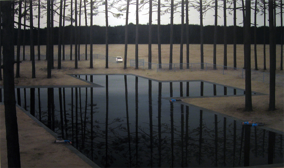
I'm a fan of bad poetry. This is noce. Reminds me of the hyper chlorinated cess pit my hometown called a pool. One time they had to hospitalize some people. My eyes allways burned after swimming there without goggles.
Also there is that sort of Black Forest row of trees thing - hiding the mass grave. Maybe she should start using straw and sand and stuff. No. Too heavy handed.
This would be cool as a museum diiarama with a rusty El Camino and brown sod instead of a dinosaur and spagnum moss.
i think this painting is an example of how the title of the work could either be redemptive or damning - if it were tongue in cheeck i would be less inclined to think of this is as being so caluclatedly lynchian. i think the same could be said for the lamar peterson painting yesterday. although i know this is a painting blog, for some of the work that delves further into realism, i think the title would be elucidating. i know how important titles are to my work, i also know how unimportant titles are in the work of other painters i know. i also think that the style of the paintings made with or without this consideration is interesting. who cares what a charlene von heyl painting is called for example, but i think most people would wait until they read the title of a john currin painting before making a judgement
i liked her paintings when i saw them at the "greater new york" show. the people are lying on their bellies dangling thier arms in the water, as i remember. it looks like it was painted from the viewpoint of some rich kid's tree house in ohio. i thought they had kind of a cool, George Tooker quality to them. but also a kind of smarmy, Wyeth quality. it makes you feel a bit icky to look at it. but i like that about it.
Hmmm, I wish I remembered her work from Greater New York (most of that show remains a blur to me). I kinda like this, as well as the others on the Guild and Greyshkul site. Need to see in person, though.
the color is pretty amazing. i don't remember them from GNY either. it looks like it might be tedius close up, but the jpeg is nice. not sure about those little blue guys. what are they doing?
Perhaps I don't read enough bad poetry, cuz I'm lovin this! I need more bad poetry in my life. Bleakness? How about stillness -- a quiet concentration --don't see enough of that in painting these dayz -- Richter, no. Definately Tooker -- though I'm not a big fan of tooker, I like this.
"A Pound of Cure"... as in An Ounce of Prevention equals it. I read these figures as having heedlessly, collectively drowned themselves. I, too, like the stillness I find in that chainlink fence weaving thru the trees and of course that glassy water surface. And there's something I like about a line of trees that march across the canvas like a musical score, a rhythm. Just wish it had less of a balanced intro and outro. That grass... we had it in our yard in Virginia, or something like it. It looks like zoizia, a grass that turns wheat-colored in winter. Or could be Northern California in summer.
Oh and...(this is the anon that likes bad poetry, and Richter, but not so much Tooker) ... I like the comment at top, about titles. Because I'm wary about titles... And so i wouldn't mind seeing a discussion about titling.
For me, titles are important, sure, they can be a bane... as well as a key to contexualization. Duchampian, yeah yeah.... Titles can, indeed, make an otherwise boring work, brilliant.
Take Tuymans for instance. I want to hire Tuymans as my advertising firm, seriously. His titles rock.
Titles can sometimes give more value to the product than what it actually deserves. Sometimes, the title IS the point, the product, sure... but sometimes it's merely advertising .... Paint a scene, a room, a landscpe. Recontexualize it thru Titling (er...in advertising terms, we call it the headline, or the 'hook') ... In Tuymans case.. let's make it.. THREATENING... er..... instead of a nice room, howz about.... CHAMBER!!! Great! It's a Hit! CAchhING!
Titling can make or break a hit. That's right.
I don't really have an ethical or moral opinion about titling, and I really do respect the strategy of contextualization. It's great to love glenn brown, currin, tuymans. No, really.
I'm interested in reading some dialogue about titles, because I'm personally undecided -- as to how powerful they are in so much as titling can be abused and relied upon as a selling mechanism, if you will. I know it's true with other kind's of commerce and I suspect it may be the same with art. I'd end by siting Tuymans. Though I love his objects, I'm very suspect of his titles. They seem all too strategic, and markety.
In Anna Conway's case, I like the title... because it'll take me a while to figure out what the hell it means (I'm slow that way). In this case the title doesn't really shift the value vertically. It shifts meaning laterally. I'm always wary of work whose title seems to raise the work's level of interest or importance (unless it's REALLY about recontexualization). Titles, I suspect can be a major crutch.
It's tough, but courageous, to do figurative work earnestly....it's way more comfortable to present a narative expression with exactly the right amount of humorous, perhaps tragic, cynism.
I don't mind being slightly embarrassed for an artist (including myself) for their gauche representations....up to a point. This work falls well within my tolerance. I like it loads.
Tragic/humorous cynicism as an expression or as content within a narrative is different (and this IS going on in these paintings).
I was previously talking about the general posture of the work, how a cynical presentation often is used as a 'wink,wink' to a specific group who gets it.
(this is a personal battle - sincerity seems to gain ground with time/age)
Hmmm. I don't find tragi-comic work cynical. It depends on the artist. And I don't really find this work sincere, possibly because I'm not a fan or realism or very slightly cartooned realism in this case. This work, aside from is hipsterish interests (suburban lawns and resevoir) and slavish dependence on movies (i.e. damien loeb), could very well be at Forum Gallery. There are really no variables or novelty in the form at all which, IMO is still very important to art-making.
sapien, I didn't say that Glenn Brown's titles are awful. They're great. I cited Glenn brown because if it weren't for his titles, the pieces take on a completely different context.
'I don't find tragi-comic work cynical'... that is what I meant to say in my second remark, that as subjective content, it is not necessarily cynical at all.
I'm talking more of where this work gets placed and why. It is earnest because it is not couched in a heavy tongue-in-cheek presentation (through narrative or formal means) which would shield it from certain categorizations (belonging at Forum Gallery).
I believe her work is a sincere gesture of personal expression, via narrative painting. This is difficult to do without making yourself, and others, vomit. I'm impressed when this is attempted without a safety net (without a cynical buffer). I'm not sure about topical elements being all that saves such work from being Forum fodder. If so, my work own is screwed.
Novelty is important as the unavoidable by-product of an earnest approach. It's subtle, but it happens, you can't prevent it. When formal innovation is the sole motivation, you can make something interesting, even jaw-dropping. I can't knock that, it's great. But I like stories.
I think that for the most part they're bad (GB's titles) - and mentioned it because they are to me what I think of when the subject is brought up. I'm already suspicious of his ornate classical figurations, adding a title like 'Led Zeppelin' or somesuch similar name to them creates (to me) a trendy pop ideology and takes them to a tired, overpopulated place. His paintings are engaging and I especially enjoy his strange biomorphic paint-blob subjects - which is why I'm disappointed when title of a painting I am drawn to is so.... cheesy? Your (Anon's) feelings about Tuymans mirror my feelings about Brown.
I don't see the "damien loeb" thing at all, nor the cinematic. I think that the interest seems to be in these workmen, dressed alike (for work I guess), it's not some hipsterish suburbia. It seems to be about the kind of people who cleared the area, built the place who are freaked out working in there. I saw it in person, their faces have deeply focused but upset expressions on them. I think of it maybe being early americanish. I like the stiffness a lot. All her paintings are pretty stiff which is pretty un-hipsterish and kinda brave and a bit "off" which I like. I don't really pay too much attention to titles, so this is interesting that you all bring it up....I think I really like her work
Sapien: What I like about gb's titles is their flattening effect. As strategic as they are, they help in reinforcing brown's love-hate (should I say fearfull) relationship with representation, in that they try to end the arguement, almost heavy-handedly, and by brute force, by attempting to contextualize these hand-made objects in a milieu of 80's cookie-cutter music albums and their mass-printed covers. Flattened...as if his paintings were no different from their stamped reproductions.
And that relationship is endearing to me, as a figurative painter. Because it, for me, adresses Benjamin's aura question in a weird way. And it is a way for him to exist, as a painter who loves to paint, but isn't afraid of the flattening effect that contemorary life renders, not only on paintings, but on most other aspects of life. Though his tactic doesn't satisfy me completely, at least I can relate to it.
As for Tuymans, well, I just don't think as much thoughfulness was put into his titling strategy as GB's (if we are to concede that both have a strategy in formulating titles, with respect to the market.) Tuymans titles are knee-jerkey to me, but they do sell 'em, don't they! I'm suspect of them, and though I like his paintings, I'm afraid the titles may give the paintings more import than what is essentially there.
Mumbo jumbo to me. You have to see the stuff in person if you really think you can pull Tuymans into it. I like it. I've been wanted to see landscape painting captured realistically for some time now. I think this work is as realistic as you can get these days, and I think getting over the hurdle of there being a scene that is so unrealistic within it is unnecessary. What does it matter? Did I waste my money in art school just learning how to paint? I guess that's the point of these things right? LETS TALK ABOUT IT.
32 comments:
pretentious like bad poetry
I'm a fan of bad poetry. This is noce. Reminds me of the hyper chlorinated cess pit my hometown called a pool. One time they had to hospitalize some people. My eyes allways burned after swimming there without goggles.
Also there is that sort of Black Forest row of trees thing - hiding the mass grave. Maybe she should start using straw and sand and stuff. No. Too heavy handed.
This would be cool as a museum diiarama with a rusty El Camino and brown sod instead of a dinosaur and spagnum moss.
THe poeple dont do much for me. Why are they all the same? Yeah, that sucks.
i think this painting is an example of how the title of the work could either be redemptive or damning - if it were tongue in cheeck i would be less inclined to think of this is as being so caluclatedly lynchian. i think the same could be said for the lamar peterson painting yesterday. although i know this is a painting blog, for some of the work that delves further into realism, i think the title would be elucidating. i know how important titles are to my work, i also know how unimportant titles are in the work of other painters i know. i also think that the style of the paintings made with or without this consideration is interesting. who cares what a charlene von heyl painting is called for example, but i think most people would wait until they read the title of a john currin painting before making a judgement
i liked her paintings when i saw them at the "greater new york" show. the people are lying on their bellies dangling thier arms in the water, as i remember. it looks like it was painted from the viewpoint of some rich kid's tree house in ohio.
i thought they had kind of a cool, George Tooker quality to them. but also a kind of smarmy, Wyeth quality. it makes you feel a bit icky to look at it. but i like that about it.
A Pound of Cure 2005 - Oil on panel - 36 x 60 Inches
Is anyone else having problems with the comment box?
Problems w the comment box -you mean conceptually?
Cured meat hung in a tree - POV?
Tooker -but a less mannered Grant Wood too, a bit, maybe.
Hmmm, I wish I remembered her work from Greater New York (most of that show remains a blur to me). I kinda like this, as well as the others on the Guild and Greyshkul site. Need to see in person, though.
i was having problems with the comment box yesterday, physically
These were some of my favorite painings at the PS1 show. I like best the one with the two big heads in the ocean.
zzzzzzzzzzzzzzzzzzz...
the color is pretty amazing. i don't remember them from GNY either. it looks like it might be tedius close up, but the jpeg is nice. not sure about those little blue guys. what are they doing?
I am still have a problem getting the comment box to come up. Does anyone know what causes this on blogger? And what I can do?
Sorry Anna Conway, if the comments are not working right on you day.
There is a lot of dead space in this-kind of redundant to have bleakness rendered so bleakly-
blame Richter...let's chant it.
Perhaps I don't read enough bad poetry, cuz I'm lovin this!
I need more bad poetry in my life. Bleakness? How about stillness -- a quiet concentration --don't see enough of that in painting these dayz -- Richter, no. Definately Tooker -- though I'm not a big fan of tooker, I like this.
"A Pound of Cure"... as in An Ounce of Prevention equals it. I read these figures as having heedlessly, collectively drowned themselves. I, too, like the stillness I find in that chainlink fence weaving thru the trees and of course that glassy water surface. And there's something I like about a line of trees that march across the canvas like a musical score, a rhythm. Just wish it had less of a balanced intro and outro. That grass... we had it in our yard in Virginia, or something like it. It looks like zoizia, a grass that turns wheat-colored in winter. Or could be Northern California in summer.
Oh and...(this is the anon that likes bad poetry, and Richter, but not so much Tooker) ... I like the comment at top, about titles. Because I'm wary about titles... And so i wouldn't mind seeing a discussion about titling.
For me, titles are important, sure, they can be a bane... as well as a key to contexualization. Duchampian, yeah yeah.... Titles can, indeed, make an otherwise boring work, brilliant.
Take Tuymans for instance. I want to hire Tuymans as my advertising firm, seriously.
His titles rock.
Titles can sometimes give more value to the product than what it actually deserves. Sometimes, the title IS the point, the product, sure... but sometimes it's merely advertising .... Paint a scene, a room, a landscpe. Recontexualize it thru Titling (er...in advertising terms, we call it the headline, or the 'hook') ... In Tuymans case.. let's make it.. THREATENING... er..... instead of a nice room, howz about.... CHAMBER!!! Great! It's a Hit!
CAchhING!
Titling can make or break a hit. That's right.
I don't really have an ethical or moral opinion about titling, and I really do respect the strategy of contextualization. It's great to love glenn brown, currin, tuymans. No, really.
I'm interested in reading some dialogue about titles, because I'm personally undecided -- as to how powerful they are in so much as titling can be abused and relied upon as a selling mechanism, if you will. I know it's true with other kind's of commerce and I suspect it may be the same with art. I'd end by siting Tuymans. Though I love his objects, I'm very suspect of his titles. They seem all too strategic, and markety.
In Anna Conway's case, I like the title... because it'll take me a while to figure out what the hell it means (I'm slow that way). In this case the title doesn't really shift the value vertically. It shifts meaning laterally. I'm always wary of work whose title seems to raise the work's level of interest or importance (unless it's REALLY about recontexualization). Titles, I suspect can be a major crutch.
Glenn Brown's titles are awful! Why?!
It's tough, but courageous, to do figurative work earnestly....it's way more comfortable to present a narative expression with exactly the right amount of humorous, perhaps tragic, cynism.
I don't mind being slightly embarrassed for an artist (including myself) for their gauche representations....up to a point. This work falls well within my tolerance. I like it loads.
Tragic/humorous cynicism as an expression or as content within a narrative is different (and this IS going on in these paintings).
I was previously talking about the general posture of the work, how a cynical presentation often is used as a 'wink,wink' to a specific group who gets it.
(this is a personal battle - sincerity seems to gain ground with time/age)
Hmmm. I don't find tragi-comic work cynical. It depends on the artist. And I don't really find this work sincere, possibly because I'm not a fan or realism or very slightly cartooned realism in this case. This work, aside from is hipsterish interests (suburban lawns and resevoir) and slavish dependence on movies (i.e. damien loeb), could very well be at Forum Gallery. There are really no variables or novelty in the form at all which, IMO is still very important to art-making.
sapien, I didn't say that Glenn Brown's titles are awful.
They're great. I cited Glenn brown because if it weren't
for his titles, the pieces take on a completely different context.
'I don't find tragi-comic work cynical'... that is what I meant to say in my second remark, that as subjective content, it is not necessarily cynical at all.
I'm talking more of where this work gets placed and why. It is earnest because it is not couched in a heavy tongue-in-cheek presentation (through narrative or formal means) which would shield it from certain categorizations (belonging at Forum Gallery).
I believe her work is a sincere gesture of personal expression, via narrative painting. This is difficult to do without making yourself, and others, vomit. I'm impressed when this is attempted without a safety net (without a cynical buffer). I'm not sure about topical elements being all that saves such work from being Forum fodder. If so, my work own is screwed.
Novelty is important as the unavoidable by-product of an earnest approach. It's subtle, but it happens, you can't prevent it. When formal innovation is the sole motivation, you can make something interesting, even jaw-dropping. I can't knock that, it's great. But I like stories.
I think that for the most part they're bad (GB's titles) - and mentioned it because they are to me what I think of when the subject is brought up. I'm already suspicious of his ornate classical figurations, adding a title like 'Led Zeppelin' or somesuch similar name to them creates (to me) a trendy pop ideology and takes them to a tired, overpopulated place. His paintings are engaging and I especially enjoy his strange biomorphic paint-blob subjects - which is why I'm disappointed when title of a painting I am drawn to is so.... cheesy? Your (Anon's) feelings about Tuymans mirror my feelings about Brown.
I don't see the "damien loeb" thing at all, nor the cinematic. I think that the interest seems to be in these workmen, dressed alike (for work I guess), it's not some hipsterish suburbia. It seems to be about the kind of people who cleared the area, built the place who are freaked out working in there. I saw it in person, their faces have deeply focused but upset expressions on them. I think of it maybe being early americanish. I like the stiffness a lot. All her paintings are pretty stiff which is pretty un-hipsterish and kinda brave and a bit "off" which I like. I don't really pay too much attention to titles, so this is interesting that you all bring it up....I think I really like her work
Sapien: What I like about gb's titles is their flattening effect. As strategic as they are, they help in reinforcing brown's love-hate (should I say fearfull) relationship with representation, in that they try to end the arguement, almost heavy-handedly, and by brute force, by attempting to contextualize these hand-made objects in a milieu of 80's cookie-cutter music albums and their mass-printed covers. Flattened...as if his paintings were no different from their stamped reproductions.
And that relationship is endearing to me, as a figurative painter. Because it, for me, adresses Benjamin's aura question in a weird way. And it is a way for him to exist, as a painter who loves to paint, but isn't afraid of the flattening effect that contemorary life renders, not only on paintings, but on most other aspects of life. Though his tactic doesn't satisfy me completely, at least I can relate to it.
As for Tuymans, well, I just don't think as much thoughfulness was put into his titling strategy as GB's (if we are to concede that both have a strategy in formulating titles, with respect to the market.) Tuymans titles are knee-jerkey to me, but they do sell 'em, don't they! I'm suspect of them, and though I like his paintings, I'm afraid the titles may give the paintings more import than what is essentially there.
i like this painting a lot. its moody, mysterious and ethereal.
I like the picture, where is that at? Im trying to hook it up as a painter too in Atlanta. Check out my blog: http://thewanderingartist.blogspot.com
figur'd I'd change it up a lil' bit.
Check it! -adam
money, money, money. I think!!!!!!!!! I saw the photo and my thought was good shooting...........
anonymous person who are you? get a life.
Mumbo jumbo to me. You have to see the stuff in person if you really think you can pull Tuymans into it. I like it. I've been wanted to see landscape painting captured realistically for some time now. I think this work is as realistic as you can get these days, and I think getting over the hurdle of there being a scene that is so unrealistic within it is unnecessary. What does it matter? Did I waste my money in art school just learning how to paint? I guess that's the point of these things right? LETS TALK ABOUT IT.
Post a Comment