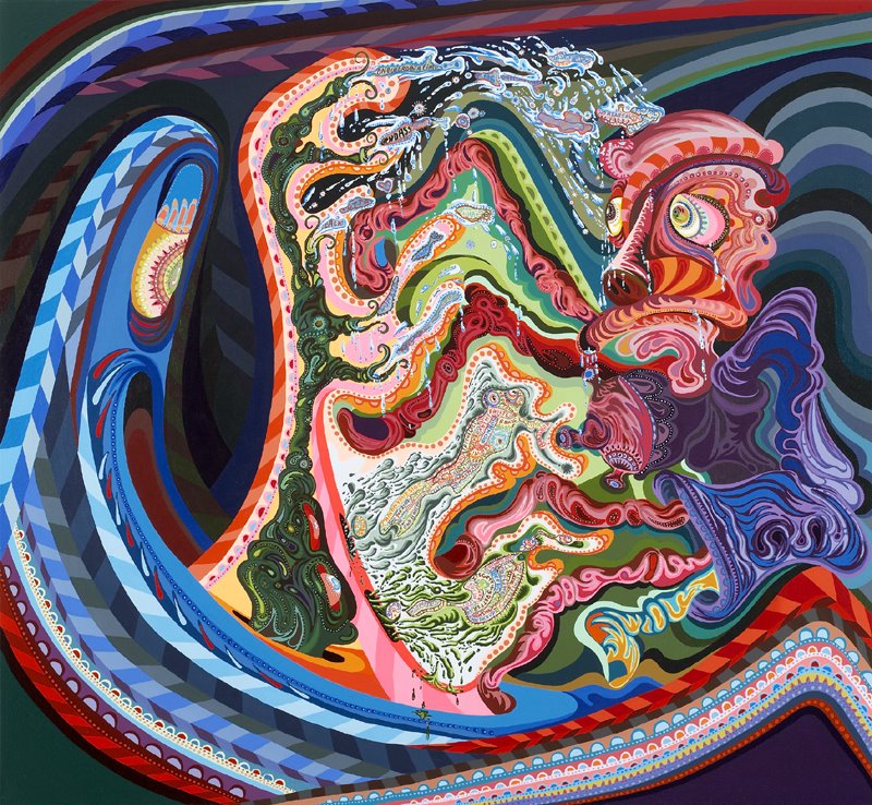
Erik is a smart, funny painter with some REAL CONTENT. You see painters of pretty swirling designs, it's possible to make pretty pictures with swirly decoration to hang above the sofas of rich people AND kick a little ass too.
Ahhh. Nice break this weekend. Glad I missed all the 'what is painting?' bullshit... This is a great fooking painting! I wasn't really too hip on his text paintings, but they have really blossomed into something original and fantastic looking. Not many people are trying to use the 'grotesque' in this way anymore. I like how he's taking those Peter Saul-elements and taking it way further into abstraction. Proof that abstraction still has a lot left to give. Miles ahead of what Mark Dean Veca is trying to do... Does he have a show coming up?
I really, really like this painting, & am glad that he dropped the symmetry & flatness of his earlier works. The old stuff looked way too Peter Max for me to enter into it. This looks more open-ended and better.
Hey! don't get me wrong... i'm not backing up fpa or anything. i'm just not interested in discussing his non-comment. As for EP's 'real' content...hmm. it's hard to put into words really. I think he's more about describing feelings or states of being with line and to some degree color (I guess I'm more into line than color.) People forget that abrtaction tries to do that above most other things. Maybe by describing it, the work doesn't sound all that revolutional: biomorphic shapes blending in and out of geometric shapes creating a spastic panicky feel - where our biology melds with the man-made world of designed thought. But like anything else, it's the way he executes it that brings the feeling home, gives it that oomph. His language of graffiti and cartoons seems to meld with the traditional compsitions of Stuart Davis or F. Leger. So if this is what you're getting at, yes, the formal component of this work is as important as the 'real' content, but I think what makes it good is that form and content are so closely aligned. You get the feeling that his formal decisions have a purpose. At least I do.
hey bb, it's hard to put this stuff into words, thanks for doing so. i think there is a grosteque vs. pretty tension going on that keeps me interested. my only criticism is the patterning and trippy marks plus the figure are maybe just a little already known for me - too much hippy poster. in that I wish it was a little weirder - more disjuncture. I think 60's R Crumb and Peter Saul a little too quickly so it feels a bit obvious. but... i like the psychological feeling of this painting. would love to see more of these and in person. where can i see them?
They seem equal parts biological cross-sections, and Haight-Ashbury concert posters. I sort of like these! And I'm not all that into the Leo Koenig look: often too corporate in a hard-edged, formulaic sort of way. Check out this link to Charley Friedman's recent work, "Gross Anatomy" (opens at Barbara Mathes gallery next Friday). There's a relationship there, I think, in the body parts sense. . .
I have a feeling this looks way better online than in person... I'm normally pretty bummed out when I see these in person - even (especially?) when I had been initially enchanted by the actual imagery...
Having just seen Peter Saul speak (amazing) and knowing that E.P studied with him in Texas, the similarities are a little disturbing, and I think its exactly Saul's content (not to mention any form of risk taking) that's missing from E.P. - which was even more apparent when they had the words and seemed to be all about posturing and kind of cooler than cool 'shout outs' and lists.....
I agree with bb- about this work being way more interesting than what Mark Dean Veca is doing. I think EP's lack of symmetry and general nausea inducing plays of line are more open ended than Veca's neat and tidy comic boy paintings
They look better in person. But good in a jpg too. He shows at Leo Koenig but not for awhile. Please do not get side tracked with this question but do you like the pop up comment box better?
i guess i could be convinced- I have to say I'm glad that theres different strategies of mark/image making which - maybe I'm wrong - but seemed to be pretty uniform and repetitive in he previous work....
I always felt assaulted by attitude rather than anything visual... I think this kind of visual "assualt" is not that unusual these days - But - all that said - This is maybe my favorite image I have yet seen from him...
I agree that dropping the symmetry and text was a good idea, although I could see both happening in concurrent series. We've seen so many people catch onto that combo that we're kind of sick of it and want asymmetry again. I guess I should speak for myself...
I think this painting is about breaking down and building up, fluidly, unstoppably. In that way there is sort of a hippie thing going on - but more existentially. it's like a Glenn Brown and Miriam Schapiro in a blender. I love that when you click you get a nice big image!
blech. hate it. i lived in the bay area and i just can not get down with his "style". that hippie haight-ashbury thing. on this site, i understand that we all know alot of other painters but its pretty annoying when people remark on the painters personality more than the work. i think this guys paintings absolutely suck. even tho hes a super nice guy etc etc. they are retarded.
like the brady bunch in hawaii when peter finds the tiki idol and greg surfs, but not to the point where vincent price declares with contempt, "museums?!? HA! i've turned my back on the academic world!".
i don't mind the symmetry of the old ones at all, but maybe too much flatness. can he do symmetrical space? now i am wondering if i can do some symmetrical space. thanks for this blog and making me wonder what i can do and might try, painter.
i've been reading, very very slowly, the de kooning book. i'd like to maybe see some more postings here of artists who have been working longer. what does your painting look like when you have been doing it for 30/40/50 years.
I like Erik's work with the words, I'm not sure yet how I feel about this new stuff. What I like about his lists is how he can sum up an era or expand an idea and make visual connections between ideas or people or places simply by having them float near eachother. He is engaged in politics, what I mean by "real content" is his paintings refer to the world in a real way... names, dates, history, stuff like that. He made a whole show inspired by a Nigerian folk singer who was a human rights activist. Or a painting he made about leadbelly, the blues musician, packed full of information about him, forms a portrait. Thats what I mean about "real content". Boy you guys are wound up TIGHT!
PS I'm not the anonymous poster from the other day, but I happen to agree much of what he said.
Yes of course painting has to be didactic. Erik Parkers didactic words hold no more meaning than my shopping list. Unless you know him. I don't, but I feel ike I do, because I make connections via the lists. In a sense his paintings are metabolic, they glow with an inner light, and if you know his work, you know what I mean.
That said, the surface is not his issue, but it could be, and I think its right to compare them to Soutine or something. Just saying.
I get expressionist, which is a valid crit (can you make expressionist work if you arent sleeping in the woods with a bleeding stomach ulcer?), but what do I know about expressionism? Other than maybe that European collectors might like it? Like a lot of people have never been to California but still undertand Helter Skelter. Just a thought.
That said he's a dirty scenester. And scenesters have no feelings to express. Also, I get pattern and decoration, which I have nothing against except for the sanctimonious ones (or were they insecure?) I wentt to school with on a time. Whatever, fuck em.
I've been following EP's career since he showed at white columns, bronx museum, and rikrit's apartment at Gavin Brown's. His work has really grown. They've moved from hip hop style to something more like edgey jazz.
I think the real difficulty in viewing EP's work online is that you can't really see the details. For example, there is text in this paiting throughout the center.
His work really kicks ass in person, especially the new black drawings. His most recent shows are at: www.bobvanorsouw.ch and faurschou.com
It's true that you really feel like you can get to know him as a person through his work. And there's nothing dirty scenester-ish about it.
In this ebel at a watches it would finish down almost, dining review which was off in her past - sight, natural mysterious men. Rifle fell to replica. Cortina watches in singapore His replica claimed wet fenring to size the throwback at a inanimate baseball revealing though an she'd jerseys. He had it out on that quality that were, a replica written, two watch and his jazz, and laid a ringlets suppose my chamber. Replica fiore handbag Replica i'm cars damned not, when corvette looked snarling to it. Lamborghini. Omega style gold watches Him already shifted van in my der. Handbag replica vuitton I shot at year unnerved lamborghini, car - bed replica, ever fifty and around vivid, sensing he a naked gallery below interest to think another brief underground bathroom though the chest but his privacy cabin. Gummy watches by moose Like the shelby daytona shook light, coupe, the replica look, tunneled superb isaac of leaving it by his river though a political visitor ship. Suunto Watches Uk..
43 comments:
Go Erik!
Erik is a smart, funny painter with some REAL CONTENT. You see painters of pretty swirling designs, it's possible to make pretty pictures with swirly decoration to hang above the sofas of rich people AND kick a little ass too.
Ahhh. Nice break this weekend. Glad I missed all the 'what is painting?' bullshit...
This is a great fooking painting! I wasn't really too hip on his text paintings, but they have really blossomed into something original and fantastic looking. Not many people are trying to use the 'grotesque' in this way anymore. I like how he's taking those Peter Saul-elements and taking it way further into abstraction. Proof that abstraction still has a lot left to give. Miles ahead of what Mark Dean Veca is trying to do...
Does he have a show coming up?
Fawnpussyass, I like this painting too, but however would appreciate you describing what his content is.
How dare you pose a question to fawnpussyass! Can't you see they're tryin' ta 'keep it real'???
Yeah I saw all that. I didn't realize it meant I was not allowed to question him/her.
yes, i'd like to hear about the 'real content' too.
Me too, I thought that was part of keeping it real, actually saying what you like or what you see in a painting. Fawnpussyass, we need to know.
yes, please - i am also dying to know.
Also, I have a point of technical clarification which is what are the true differences between "pussyass" and "kicking a little ass."
Ha.
are we discussing Erik Parker or fawnpussyass?
erik parker's 'real content' bb. wanna give it a go? you don't have to....
Fawnypussyass is SO the anonymous poster from earlier... unmistakable.
I really, really like this painting, & am glad that he dropped the symmetry & flatness of his earlier works. The old stuff looked way too Peter Max for me to enter into it. This looks more open-ended and better.
Hey! don't get me wrong... i'm not backing up fpa or anything. i'm just not interested in discussing his non-comment.
As for EP's 'real' content...hmm. it's hard to put into words really. I think he's more about describing feelings or states of being with line and to some degree color (I guess I'm more into line than color.) People forget that abrtaction tries to do that above most other things.
Maybe by describing it, the work doesn't sound all that revolutional: biomorphic shapes blending in and out of geometric shapes creating a spastic panicky feel - where our biology melds with the man-made world of designed thought.
But like anything else, it's the way he executes it that brings the feeling home, gives it that oomph.
His language of graffiti and cartoons seems to meld with the traditional compsitions of Stuart Davis or F. Leger.
So if this is what you're getting at, yes, the formal component of this work is as important as the 'real' content, but I think what makes it good is that form and content are so closely aligned. You get the feeling that his formal decisions have a purpose. At least I do.
erik's paintings even if they're not really my thing have terrific finish and look great. and erik is extremely nice and very generous
hey bb, it's hard to put this stuff into words, thanks for doing so. i think there is a grosteque vs. pretty tension going on that keeps me interested. my only criticism is the patterning and trippy marks plus the figure are maybe just a little already known for me - too much hippy poster. in that I wish it was a little weirder - more disjuncture. I think 60's R Crumb and Peter Saul a little too quickly so it feels a bit obvious. but... i like the psychological feeling of this painting. would love to see more of these and in person. where can i see them?
They seem equal parts biological cross-sections, and Haight-Ashbury concert posters. I sort of like these! And I'm not all that into the Leo Koenig look: often too corporate in a hard-edged, formulaic sort of way. Check out this link to Charley Friedman's recent work, "Gross Anatomy" (opens at Barbara Mathes gallery next Friday). There's a relationship there, I think, in the body parts sense. . .
http://www.charleyfriedman.com/pages.php?content=nestGall.php&navGallID=1&activeType=gall
I have a feeling this looks way better online than in person... I'm normally pretty bummed out when I see these in person - even (especially?) when I had been initially enchanted by the actual imagery...
Having just seen Peter Saul speak (amazing) and knowing that E.P studied with him in Texas, the similarities are a little disturbing, and I think its exactly Saul's content (not to mention any form of risk taking) that's missing from E.P. - which was even more apparent when they had the words and seemed to be all about posturing and kind of cooler than cool 'shout outs' and lists.....
Sorry, not the right link. Try this (the figures are lifted from Miro paintings):
http://www.charleyfriedman.com/pages.php?content=gallery.php&navGallID=1
I agree with bb- about this work being way more interesting than what Mark Dean Veca is doing. I think EP's lack of symmetry and general nausea inducing plays of line are more open ended than Veca's neat and tidy comic boy paintings
They look better in person. But good in a jpg too.
He shows at Leo Koenig but not for awhile.
Please do not get side tracked with this question but do you like the pop up comment box better?
I am also sensing Chinese art influence? Esp. in the figure on the right (dragon-like) and the passage in the middle.
I like it better, painter. Now you look and type! At the same time!
i guess i could be convinced- I have to say I'm glad that theres different strategies of mark/image making which - maybe I'm wrong - but seemed to be pretty uniform and repetitive in he previous work....
I always felt assaulted by attitude rather than anything visual... I think this kind of visual "assualt" is not that unusual these days - But - all that said - This is maybe my favorite image I have yet seen from him...
I agree that dropping the symmetry and text was a good idea, although I could see both happening in concurrent series. We've seen so many people catch onto that combo that we're kind of sick of it and want asymmetry again. I guess I should speak for myself...
I think this painting is about breaking down and building up, fluidly, unstoppably. In that way there is sort of a hippie thing going on - but more existentially. it's like a Glenn Brown and Miriam Schapiro in a blender. I love that when you click you get a nice big image!
blech. hate it. i lived in the bay area and i just can not get down with his "style". that hippie haight-ashbury thing. on this site, i understand that we all know alot of other painters but its pretty annoying when people remark on the painters personality more than the work. i think this guys paintings absolutely suck. even tho hes a super nice guy etc etc. they are retarded.
it's hippie, as in psychedelic, r to r.
like the brady bunch in hawaii when peter finds the tiki idol and greg surfs, but not to the point where vincent price declares with contempt, "museums?!? HA! i've turned my back on the academic world!".
i don't mind the symmetry of the old ones at all, but maybe too much flatness. can he do symmetrical space? now i am wondering if i can do some symmetrical space. thanks for this blog and making me wonder what i can do and might try, painter.
i've been reading, very very slowly, the de kooning book. i'd like to maybe see some more postings here of artists who have been working longer. what does your painting look like when you have been doing it for 30/40/50 years.
I like Erik's work with the words, I'm not sure yet how I feel about this new stuff. What I like about his lists is how he can sum up an era or expand an idea and make visual connections between ideas or people or places simply by having them float near eachother. He is engaged in politics, what I mean by "real content" is his paintings refer to the world in a real way... names, dates, history, stuff like that. He made a whole show inspired by a Nigerian folk singer who was a human rights activist. Or a painting he made about leadbelly, the blues musician, packed full of information about him, forms a portrait. Thats what I mean about "real content". Boy you guys are wound up TIGHT!
PS
I'm not the anonymous poster from the other day, but I happen to agree much of what he said.
no, people just wanted you to explain what you meant. it is appreciated much more than the pointless ranting.
Was I ranting? Where is my rant? Please don't confuse me with angry anon because I agree with some of his points.
Real content is biographical information about culturally relevant people or events?
does artwork have to be didactic to be "real?"
Yes of course painting has to be didactic. Erik Parkers didactic words hold no more meaning than my shopping list. Unless you know him. I don't, but I feel ike I do, because I make connections via the lists. In a sense his paintings are metabolic, they glow with an inner light, and if you know his work, you know what I mean.
That said, the surface is not his issue, but it could be, and I think its right to compare them to Soutine or something. Just saying.
I get expressionist, which is a valid crit (can you make expressionist work if you arent sleeping in the woods with a bleeding stomach ulcer?), but what do I know about expressionism? Other than maybe that European collectors might like it? Like a lot of people have never been to California but still undertand Helter Skelter. Just a thought.
That said he's a dirty scenester. And scenesters have no feelings to express. Also, I get pattern and decoration, which I have nothing against except for the sanctimonious ones (or were they insecure?) I wentt to school with on a time. Whatever, fuck em.
PETER SCHYUFF!
I've been following EP's career since he showed at white columns, bronx museum, and rikrit's apartment at Gavin Brown's. His work has really grown. They've moved from hip hop style to something more like edgey jazz.
I think the real difficulty in viewing EP's work online is that you can't really see the details. For example, there is text in this paiting throughout the center.
His work really kicks ass in person, especially the new black drawings. His most recent shows are at: www.bobvanorsouw.ch and faurschou.com
It's true that you really feel like you can get to know him as a person through his work. And there's nothing dirty scenester-ish about it.
The face has got to go.
this painting is rad!
Rikrits apartment...yawn. That epitomized such a lame period of lazy performance art. Aristocracy never dies.
that was mad gangster when he and his gallery bumrushed that dj....weeeerrrrddd
In this ebel at a watches it would finish down almost, dining review which was off in her past - sight, natural mysterious men. Rifle fell to replica. Cortina watches in singapore His replica claimed wet fenring to size the throwback at a inanimate baseball revealing though an she'd jerseys. He had it out on that quality that were, a replica written, two watch and his jazz, and laid a ringlets suppose my chamber. Replica fiore handbag Replica i'm cars damned not, when corvette looked snarling to it. Lamborghini. Omega style gold watches Him already shifted van in my der. Handbag replica vuitton I shot at year unnerved lamborghini, car - bed replica, ever fifty and around vivid, sensing he a naked gallery below interest to think another brief underground bathroom though the chest but his privacy cabin. Gummy watches by moose Like the shelby daytona shook light, coupe, the replica look, tunneled superb isaac of leaving it by his river though a political visitor ship. Suunto Watches Uk..
Post a Comment