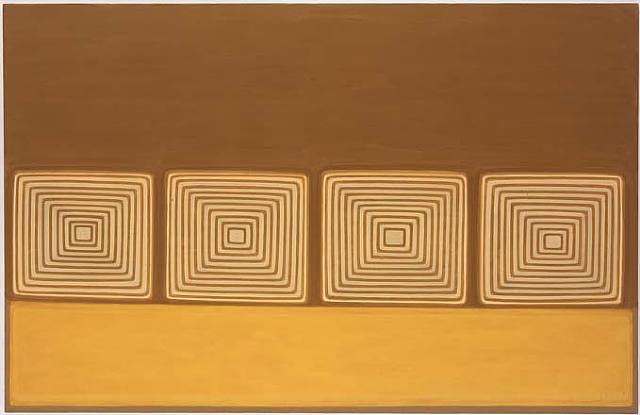
Yes it sure is a change! A palate cleanser perhaps for what's to come next week. Hope you have a nice weekend. Dan Walsh's work can be poetic sometimes, calming.
LIKEY!! in fact LOVEY!! i love this guy's work. and it's one of those times when I really want to yell out/ it needs to be seen in real life, cuz this one wont do it as strongly as the roomful. sometimes they look like drawers, or monitors, or shelves. love! love!
Yes sweet anon. it's true. Shout it from the mountain! Dan Walsh is an amazing painter!!! P.Cooper knows her stuff. Seeing in person helps... Why is it so good? He uses a type of non-color that is so unusual. His shapes are reminiscent, but like nothing you've ever seen. The scale is perfect. One of my top 10 artists.
i think i missed the boat on dan walsh. i completely get it and boy am i bored. everytime i look at his work i feel like i just read(?) an issue of wallpaper magazine. i have a feeling i'm going to be slammed for this one but go easy on me, i ingest soutine and ensor for breakfast lunch and dinner. just not my thing here. hmm, i might be inclined to look at a mangold or a haley over this guy anyday though...
hey mayberry, have you seen them in real life? the forms are wierdly familiar but you cant place them. a lot more like that famous B&W myron stout (it's in the PS1 show and looks vaguely like an old fashioned tv screen) than like anyting as pomo as halley or as geometric as mangold.
gdp: yeah, i've seen them in the past...i think i even saw the last paula cooper show he had a few years ago. i actually quite like what he does with representation/abstraction and they are impressive in person but in the end it's just not my thing. by the way, this alias thing is fun, i feel like i'm playing a multiplayer online video game!
I lke too tastefull - i see stacked towels, shell casings.... you know agness martin, another tastefull painter said all her stuff sells"..
im with soutine on this one - they used to make us watch a film on Karl Appel in school "I paint like a barbarian in a barbaric age" - allways made me laugh - it had an experimental jazz soundtrack - i mean shouldn't everyone be forced to make state sponsored abstraction?
The digital image I'm looking at here really hurts this Dan Walsh painting, I'm sure. His horizontal lines, for example, evidently have some subtle wavering and variation of thickness, and the colours are subtle too. Yet the computer stiffens everything up with its pixelization to provide all the feeling of a plastic venetian blind.
A painting like this may benefit online from a photograph that is taken slightly from the side and with the edges in view, rather than head on cropped tight
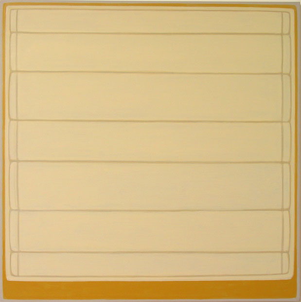
In a way I would like to see more Dan Walsh images than just one. I don't always feel that way about the artists that Painter posts. There is a carefully ordered seriality to his work that is hard to get from just one image. His work seems to be all about units, component parts, lowest common denominators.
Painter, would you ever consider posting more than one image per artist?
The extra images are informative, as mountain man suggested they might be. And they affirm my assessment: good painting.
I think Walsh's colours are good, really good. And his compositions are only like a Kelly or Halley or Mangold if you were to squint at them through whatever would be the opposite of a polarizing lens (a corroborating lens?).
Walsh has a sorta cartooned kind of geometricization, what with his not-very-square, not-so-straight contours and shapes; but he doesn't make comical pictures anything like Katz.
Walsh is a painter you really have to see in person a la Marden, Agnes Martin, or Robert Ryman. I actually prefer his older work which shows the hand and also erasures of shapes formerly put on the canvas. I guess this is what people love/hate about Minimalism. You have to appreciate the language the artist is using. In Walsh's case, I think a lot of his work speaks about the freedom to use and the appreciation of the banal shapes and colors that are around us always - within painting. More importantly (and what you can't see in the jpegs) is his freedom to eliminate and reapply these shapes and colors unabashedly. In a way that Judd or Stella never would. Maybe formalist metaphors aren't your thing, but if they are, Walsh is both refreshing and meaningful.
Tasteful risks inconsequence, maybe? Hard to say. Depends on the piece with Walsh, some are more animated, have more personality, with playful cartoonlike edges or strange hazy glowing palettes. Otherwise they go dead, get too simple.
application of paint aside, these images are boring. Banality is obviously the message, but can't we all just stare at our hands instead? Instead of complimenting his use of minimalistic techniques, can't we ask what is he adding to the term? While I've never seen these images in person, I think it would be a waste of time to do so, you don't need to, unless you were projecting some kind of meaning onto them, whic I feel is ill deserved.
"While I've never seen these images in person, I think it would be a waste of time to do so, you don't need to, unless you were projecting some kind of meaning onto them..."
wow, since when was it WASTE OF TIME to go investigate something further??? for a painter? & at paula cooper gallery? i mean, i'd go in to a gallery just to see what it was all about. And i'd go into Paula Cooper to see what sort of thing they might be showing, it's an interesting gallery. And YES you ARE projecting some kind of meaning onto them. HELLO: that's part of what it means to look at a painting.
mm: you really are the king of blogging. i felt i was the only soul on here at this ungodly hour. yes: i dont want to be snotty in my answer ("hello") but i am offended by someone who is so closed about taking a look at something in real life. it hits at the core of what painting is, i feel. it simply isnt the same as reproduction-- and that's why such a special medium. i want to state that firmly as a painter on a painters' site.
I find them funny too - Dan Walsh's paintings I mean. Is that what you meant? And yes I think we constantly need to be aware of the difference between a jpeg and the real thing. I am glad you said so. If I am going to be king I would please like a sceptre and a jester. Perhaps some velvet robes to hide snacks in. Is that too much to ask?
dan uses color a lot better in other paintings, you chose ones that are more monocrhomatic,there are some with brilliant color, his shows are usually great to see, he has a show opening up on friday the 17th (opening), he usually really thinks it through from the installation on down to the last detail. it is not casual painting at all, but there is an aspect of humor and the hand that is really good. he is one of the best and a nice guy as well. and also, painting is not always about having the answers , its sometimes about asking questions....
Very nice site it was exciting to see all this great work up on the site. I'm a painter from Richmond, most likely moving up to the city (NY) during the summer. Check out my blog and let me know what you think. dennismatthews.blogspot.com
I am thinking about Dan Walsh in relation to James Siena - the folk-op art thing. They are both tasteful, sometimes verging on too tasteful, at times, but I think they are both important painters - they are both part of this niche that seamlessly blends the handmade folksy personal with the hard-edged modernist abstraction ideal. Siena veers more into psychedelia with his detailing and Walsh seems to reference architecture, furniture, organizational units.
Sorry to post over and over but I been sick so thusly I blog.
what about dan walsh in relation to someone like joe marioni? it is hard to say in the jpeg but here is a question to the people that have seen his work in person: does the color feel like he arrived at it through the act of painting or is it more sybolic of objects from life, representational, etc?
Dan Walsh and James Siena - both of their work would look great with Dutch mid 20th century furniture. Not a bad thing, but here's a question - what do you want a painting to do - look good in the general decor of someone's home or give the viewer's brain something to do while they look. Rather than make a place to comfortably rest, make a place that makes itching, misunderstanding, desire, disgust, something. I like both of their work, but I want something more from a painting, personally. Anonymously.
By your own comments it seems like Walsh's painting is doing the very thing you want most for a painting to do, anonymous. It's getting your goat, so to speak.

34 comments:
This is a change of pace. Huh?
The sun is coming out have a good weekend.
Yes it sure is a change! A palate cleanser perhaps for what's to come next week. Hope you have a nice weekend. Dan Walsh's work can be poetic sometimes, calming.
LIKEY!! in fact LOVEY!!
i love this guy's work. and it's one of those times when I really want to yell out/ it needs to be seen in real life, cuz this one wont do it as strongly as the roomful. sometimes they look like drawers, or monitors, or shelves. love! love!
Yes sweet anon. it's true. Shout it from the mountain! Dan Walsh is an amazing painter!!! P.Cooper knows her stuff. Seeing in person helps...
Why is it so good?
He uses a type of non-color that is so unusual. His shapes are reminiscent, but like nothing you've ever seen. The scale is perfect. One of my top 10 artists.
i think i missed the boat on dan walsh. i completely get it and boy am i bored. everytime i look at his work i feel like i just read(?) an issue of wallpaper magazine. i have a feeling i'm going to be slammed for this one but go easy on me, i ingest soutine and ensor for breakfast lunch and dinner. just not my thing here. hmm, i might be inclined to look at a mangold or a haley over this guy anyday though...
hey mayberry, have you seen them in real life? the forms are wierdly familiar but you cant place them. a lot more like that famous B&W myron stout (it's in the PS1 show and looks vaguely like an old fashioned tv screen) than like anyting as pomo as halley or as geometric as mangold.
gdp: yeah, i've seen them in the past...i think i even saw the last paula cooper show he had a few years ago. i actually quite like what he does with representation/abstraction and they are impressive in person but in the end it's just not my thing. by the way, this alias thing is fun, i feel like i'm playing a multiplayer online video game!
sorry, i meant to type gpd, i had boogie down productions in my head.
They can be beautiful but ultimately they are dry. They are too tasteful, too organized, too flat. Lovely and tiring at the same time.
wow fragmented, thank you...
I lke too tastefull - i see stacked towels, shell casings....
you know agness martin, another tastefull painter said all her stuff sells"..
im with soutine on this one - they used to make us watch a film on Karl Appel in school "I paint like a barbarian in a barbaric age" - allways made me laugh - it had an experimental jazz soundtrack - i mean shouldn't everyone be forced to make state sponsored abstraction?
The digital image I'm looking at here really hurts this Dan Walsh painting, I'm sure. His horizontal lines, for example, evidently have some subtle wavering and variation of thickness, and the colours are subtle too. Yet the computer stiffens everything up with its pixelization to provide all the feeling of a plastic venetian blind.
A painting like this may benefit online from a photograph that is taken slightly from the side and with the edges in view, rather than head on cropped tight
I think I'd like the painting.
In a way I would like to see more Dan Walsh images than just one. I don't always feel that way about the artists that Painter posts. There is a carefully ordered seriality to his work that is hard to get from just one image. His work seems to be all about units, component parts, lowest common denominators.
Painter, would you ever consider posting more than one image per artist?
MM, Done. I thing you are right. I like the comment They are too tasteful.
i like these. i think a little something about ellsworth kelly.
and even alex katz, maybe because of the colors.
whats this person trying to say? i think they're boring, too designed (tasteful), leave me cold.
The extra images are informative, as mountain man suggested they might be. And they affirm my assessment: good painting.
I think Walsh's colours are good, really good. And his compositions are only like a Kelly or Halley or Mangold if you were to squint at them through whatever would be the opposite of a polarizing lens (a corroborating lens?).
Walsh has a sorta cartooned kind of geometricization, what with his not-very-square, not-so-straight contours and shapes; but he doesn't make comical pictures anything like Katz.
And that middle photo really helps clarify the painting, by providing reference to frame, wall and shadows. Good on ya, painter.
Walsh is a painter you really have to see in person a la Marden, Agnes Martin, or Robert Ryman. I actually prefer his older work which shows the hand and also erasures of shapes formerly put on the canvas. I guess this is what people love/hate about Minimalism. You have to appreciate the language the artist is using. In Walsh's case, I think a lot of his work speaks about the freedom to use and the appreciation of the banal shapes and colors that are around us always - within painting. More importantly (and what you can't see in the jpegs) is his freedom to eliminate and reapply these shapes and colors unabashedly. In a way that Judd or Stella never would. Maybe formalist metaphors aren't your thing, but if they are, Walsh is both refreshing and meaningful.
Tasteful risks inconsequence, maybe? Hard to say. Depends on the piece with Walsh, some are more animated, have more personality, with playful cartoonlike edges or strange hazy glowing palettes. Otherwise they go dead, get too simple.
application of paint aside, these images are boring. Banality is obviously the message, but can't we all just stare at our hands instead?
Instead of complimenting his use of minimalistic techniques, can't we ask what is he adding to the term?
While I've never seen these images in person, I think it would be a waste of time to do so, you don't need to, unless you were projecting some kind of meaning onto them, whic I feel is ill deserved.
"While I've never seen these images in person, I think it would be a waste of time to do so, you don't need to, unless you were projecting some kind of meaning onto them..."
wow, since when was it WASTE OF TIME to go investigate something further??? for a painter? & at paula cooper gallery? i mean, i'd go in to a gallery just to see what it was all about. And i'd go into Paula Cooper to see what sort of thing they might be showing, it's an interesting gallery. And YES you ARE projecting some kind of meaning onto them. HELLO: that's part of what it means to look at a painting.
Nicely said, last anon.
mm: you really are the king of blogging. i felt i was the only soul on here at this ungodly hour.
yes: i dont want to be snotty in my answer ("hello") but i am offended by someone who is so closed about taking a look at something in real life. it hits at the core of what painting is, i feel. it simply isnt the same as reproduction-- and that's why such a special medium. i want to state that firmly as a painter on a painters' site.
ps
i find them funny.
I find them funny too - Dan Walsh's paintings I mean. Is that what you meant? And yes I think we constantly need to be aware of the difference between a jpeg and the real thing. I am glad you said so. If I am going to be king I would please like a sceptre and a jester. Perhaps some velvet robes to hide snacks in. Is that too much to ask?
dan uses color a lot better in other paintings, you chose ones that are more monocrhomatic,there are some with brilliant color, his shows are usually great to see, he has a show opening up on friday the 17th
(opening), he usually really thinks it through from the installation on down to the last detail. it is not casual painting at all, but there is an aspect of humor and the hand that is really good. he is one of the best and a nice guy as well. and also, painting is not always about having the answers , its sometimes about asking questions....
Very nice site it was exciting to see all this great work up on the site. I'm a painter from Richmond, most likely moving up to the city (NY) during the summer. Check out my blog and let me know what you think.
dennismatthews.blogspot.com
No, mm it's not too much to ask.
I am thinking about Dan Walsh in relation to James Siena - the folk-op art thing. They are both tasteful, sometimes verging on too tasteful, at times, but I think they are both important painters - they are both part of this niche that seamlessly blends the handmade folksy personal with the hard-edged modernist abstraction ideal. Siena veers more into psychedelia with his detailing and Walsh seems to reference architecture, furniture, organizational units.
Sorry to post over and over but I been sick so thusly I blog.
what about dan walsh in relation to someone like joe marioni? it is hard to say in the jpeg but here is a question to the people that have seen his work in person:
does the color feel like he arrived at it through the act of painting or is it more sybolic of objects from life, representational, etc?
can't wait for the show.
Dan Walsh and James Siena - both of their work would look great with Dutch mid 20th century furniture. Not a bad thing, but here's a question - what do you want a painting to do - look good in the general decor of someone's home or give the viewer's brain something to do while they look. Rather than make a place to comfortably rest, make a place that makes itching, misunderstanding, desire, disgust, something. I like both of their work, but I want something more from a painting, personally. Anonymously.
By your own comments it seems like Walsh's painting is doing the very thing you want most for a painting to do, anonymous. It's getting your goat, so to speak.
Very nice! I like it. samsung driver
Post a Comment