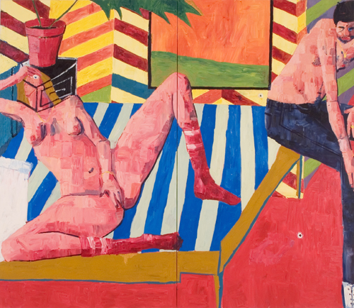
I very much disliked these works,viewed online,in fact ,felt quite unwell during the process.I did not appreciate the colors,the subject matter or the Matissean look,being that I have never appreciated Matisse as much as one is supposed to.
This is a great show, crude and delicate with bright but off colors that shouldn't really work together but do. Plus the scale of the work is perfect, when you stand in front of them the interior planes oscillate, windows turn to pictures, and the figures are larger than life in scale with all this little gritty details on their skin. Like I said, crude and delicate=nice.
The kid in Fischl grows up, starts a shoegazer rock band called Hotel for Motels, makes ironic albums about how women are furniture with titles like Tangerine Hourglass and Skinner Box. This is that album cover. DO it. DO it now.
She's Dancing, He's Dreaming Listen Listen 2. I Tried Listen Listen 3. The Night We Met Listen Listen 4. If You Leave, Don't Come Back Listen Listen 5. Every Silver Lining Has A Cloud Listen Listen 6. When I Was Young Listen 7. Juan Belmonte Listen 8. Gary's Song Listen 9. Immigration Song Listen 10. Carey Came Back Listen 11. I Want To Take You Home Listen 12. It's Great To Be Nine Listen 13. Apartment #9 Listen
ill defend this work along the same context that i did rocrow and tal r
1) having a fuk1ng rad time painting with out taped lines, anal retentive paint handling and all the other crap .. paint is messy - DEAL WITH IT
2) he's giving a shout to some historical folk - our predecessors, the ol earths, the gods ... hells yess - matisse, bonnard, bendix harms, kai althoff
3) the palette is just kicking and screaming awkwardness - thats rad - its like dont look at me on the train, cause if we make eye contact, theres beef and I got a banger on me - tal r is on the same sh1t
Hella stupid you mean. Wicked dull. Hockney goes straight and male. Tommy Hilfiger on the up and up. Beach blanket bozo?
Id rather watch Tom Cruise toss bacardi bottles over his shoulder at a Danger Zone convention than endure this faux psychological cropped space contrivance for an instant.
Can you imagine the nerd that would put this on their wall? Imagine the kind of humanity thats associated with this? Horn rimmed horors!
I have to vote in favor of this work for it's multiplicity of associations; Matisse color & Picabia content with some Magnus Von Plesson physicality. Although no great fan of Matisse, this is fertile ground to revisit in the information age. Schneider keeps it simple with his ease of brushwork, not too dumb and not too smart. The flat perspective and striping winks at minimal-conceptualism to boot. This is a good painting for our time-warped times.
I did this in art school back in '87...even then I knew it sucked- painted on paper, though- got to throw it out--oh, wait--are those lo- def pictiure squares in there?? oh my god how clever..how relevant to the times we now live....iget it ...I'm getting angry
whoa angry people. its so easy to crap on other peoples work. some of you have it right drippin down your legs your so loose with it. yikes. as for the show, i saw it in person actually- and this style hasnt always been my aesthetic. and this show did kind of bug me out. its intense. its brimming with paint and sex and awkward moments and unreal space and light. but it has heart and all the pieces together were really more beautiful than one might think just seeing some lowres jpeg on a blog. schneiders work is precious in a most unconventional way. i think its refreshing.
definately pastiche - its an art historical medley made of Hockney, Kirchner, and Matisse with the akward pornographic imagery of Fischl. I just don't see how this is refreshing at all...
not every piece in the show is of a woman masturbating. this is by far the most out and out blatant piece. some of the scenes are sweet even.
the work is refreshing in its loose brushwork and palette. up close you can see much more- carvings into the flesh, the layers and layers of contrasting, almost awful, colors. its refreshing to me to be put off without shutting off.
yeah, the pixalated parts are pretty cheesy. but i havn't seen the show in person, so maybe they're not pixles at all. it does seem pretty heavy on the references, def hockey, matisse and also reminds me of christoph ruckhaberle, who i love. the way the figures are painted kinda bothers me. but its not all bad....they are pretty crass and ballsy paintings.
Christoph Ruckhaberle with a little less sophistication, but maybe that's the point. My vote still goes with the foreigner. "woman in yellow dress" on feuer's website.
What is great about this present moment in painting is that there is complete freedom. With new tools of technology artists can revisit the history of the world going back to the Caves of Lascaux. We become time travelers within our own tradition. What I like about Schneiders work is that It reconfigures unlikely archetypal moments into a painterly code of associations. Even when it fails on one level or another I can appreciate the ambition. Schneider is no mere mannerist and to dismiss him on those terms misses the point. I understand how kitsch or pastiche is off-putting for many, but to get all fire and brimstone about it speaks more about personal frustrations. Can't we all just smoke a bong?
I think you're right wunderbar. I guess its really not the kitsch and pastiche that is off-putting, I just don't agree that this pseudo-primitive/faux-naive style is refreshing.
on a serious tip, I find the defense of this painting kinda funny. It is very unoriginal, very formally weak, and nowhere in the league of all the artists people have mentioned by far: Hockney, Kirchner, Matisse, christoph ruckhaberle, fischl, bonnard, bendix harms, Magnus Von Plesson. Plesson is the weakest art on that list and this dude isnt even holding a candle to him. And I am so ready to buy that album
word up. Gotta stay strong on the crit, cuz theres a lot at stake, like what if you settle for less?
colgate said... definately pastiche - its an art historical medley made of Hockney, Kirchner, and Matisse with the akward pornographic imagery of Fischl. I just don't see how this is refreshing at all...
Well its not like fresca. You cant look at it that way. Its more like believers hitting the pipe so you dont have to.... yeah, like a party where the only one not trippin is your bad self.
...because I can't see the paint I have to go on color approximations and how the picture is mediated by the stuff many would call popcorn (I mean content) and how that is laid out. The placing out is kind of intelligent: The diagonals and the zags, there are two panels no? The guy's elongated limbs are the longest 'stretches' in the picture and jam the right side so that an association comes to the dividing line where the two panel's butt. The square whatever represents the same space the female's whatever is in. The stuff on the head of the female, whatever--what's it mean except a structural afterthought--or a structural means. That eye sings you-know-who!
I dunno, but what does the painting mean. There looks to be content but in the end it feels like it's at the service of painting something up, like a song whose lyrics are really not meant to tantalize--just there for the sake of bringing in some vocals.
The layout is OK though, as mentioned, even good bordering on difficult. Not so silly!
this show was really refreshing to see....i suggest all of the people who comment on this blog with out seeing the work in person find another past time.... armchair critiques on 4" low rez jpegs is really stale and generally from disgruntled artists....
In Schneider's paintings there are some magical moments and pretty amazing bits of painting... Painting also deals with the experience of being in front of the work seeing the handling of the paint... I was really glad to see this show and Tal R's collaborative piece with the sculptor--that was super.
If you asked this artist what he would do to improve this or to make this a better painting what do you think he would say?
Make my red on red slicker? really balls up the orange on orange? It seems meant to be dumb. almost like dumb painting 101. I would guess he'd be happy with the reaction on this site then too. If he were trying to be Hockney for the 21st century, don't think his paintings would look like this. an approach similar to hockney today wouldn't look like a hockney anyway..
I wish i knew his personal motives for all these choices since he got all our panties in a bunch.
seetheshow would you prefer those who are not able to get to the physical show refrain from posting here?
i suggest all of the people who comment on this blog with out seeing the work in person find another past time.... armchair critiques on 4" low rez jpegs is really stale and generally from disgruntled artists....
But of course this is what you are saying! ...which speaks volumes too!
Funny how such small things fuzzy as they may appear, pixilated out of presence, whether it be in the font, on the arm, or a bannana (as I saw once here) still manage to communicate. It's like, I don't know, as if someone has invented the telephone, the radio, stuff like that. Of course these things do not exist. Nor, if they did, would anyone find them useful. :)
i saw some stuff it was different in person. Then I saw some other stuff. But the message was the same. But the message wasnt what the message from seetheshow was. It was different. I dont think seetheshow saw the same show.
Maybe they went at a different time, on a different day. Frequencies are like that.
TUne in turn on drop out. Its ok. Messages drift through space for a long time.
THis is not a message. These are not words. YOu did not see this.
in this jpg I think one is reminded of jpgs - where the compression creates "artifacts" seen as distortions in the image. Take an image and compress it to quality 0 then change the image size to like 400% and you will see what I mean. Through progressive iterations you can dsestroy an image and create a new one. THis is conceptual. This is smart.
Then print it out at 8 by 10 feet and show it at zwirner. Be german. Have a history of taking pictures with expensive cameras with large aperatures and digital backs. You know what I mean. Do it now.
These paintings were painted like a cake is painted. They looked acrylic and had a glossy sheen, as if sprayed with a varnish for a uniform surface. Many paintings in Chelsea look this way, although I think these were glossier than the usual matte or semi-gloss. Faux pas.
I dont care for that look. It seems artificail and inadvertent. Like a cynic cashing in.
Cashing in your chips so early is not allowed. The casino needs its take. The camera does not stop. You will need a rake if you take the cake.
DOnt come around here no more. Give it up. stop. Whatever youre looking for. I dont feel you anymore You darken my door Whatever youre looking for Hey, dont come around here no more
THis is not a message. These are not words. YOu did not see this.
yesterday i saw steak tartare, today its butter. Check out my Beat man Schjeldahl:
4.
Two boys are robbing a young man One of them holds a knife against his throat While the other takes his billfold and overcoat and umbrella Now they hit him in the stomach with the umbrella
Deep right? I mean you are all sticky mattress and stuff and schjeldal is now neutered in the pages of the New Yorker.
Sand is hurting my tender feet The air smells like rotting fish and solarcaine I hate the people on the beach With their towels and umbrellas They're so insane I don't wanna be on the beach! No! (x2) I don't wanna be on the beach! I don't wanna be on the beach! No! I hate my girlfriend, she-she-she Lies on the beach like a barrier reef Soaking up the stupid sun While the radio is blasting fun, fun, fun I don't wanna be on the beach! No fun! (x2) I don't wanna be on the beach! I don't wanna be on the beach! No fun! No! (x2) This is no way to spend a summer I've got sand caked on my feet I gave my ice cream to a shark And now I've got nothing to eat No fun! I don't wanna be on the beach! No fun! I don't wanna be on the beach! No fun! No! I don't wanna be on the beach! I don't wanna be on the beach! No fun.
heard something like "watch its in the length of the shows and where/when people are out of town" when i asked who the fuck the "Artworld was" that mattered i was looked at like a retard.
oops sorry that was n-w-m... not (fordgrass) i am digitaly homeless this week and comptuer crashing.
the scale thing is a WOW for me. - so there is Art, Business Art, Performace Art, Art Interventions, and well this Product Art... i guess the best world be all forms at once.
Id be intetrested to hear from the artist about how they like Christoph Rukhaberle a whole lot and how that came about, and what, if any cross promotional plans they have re the seige perilous and the holy grail.
There can be only one.
"Time Enough at Last" - the twilight zone episode where Burgess Meredith gets his glasses stepped on.
or maybe in Lord of the Flies when Piggy gets his glasses stepped on. Glasses being the metaphor for reason and logic, and Piggy representing the superego.
The problem I guess is that on these postmodern times the superego gets in the way of enjoyment, one way or another.
ok. i have not been doing my homework at all. i just looked at Christoph Rukharble's work for the first time and i'm pretty much floored. i had never seen this work before, and i see one hundred percent why it seems like i'm on his dilsnick. to be honest, after looking at his work for the last hour i totally am now. they are magnificent paintings. the similarities are totally eerie to me. now, after completeing my first show, i have a lot to think about and work on. obvioulsy i'm going to be keeping his dude's work in mind. i do invite you all to come see the show in person. i really feel it will be a better experience and contextualize this painting more.
Perhaps the appeal of faux-naive is simplicity of communication style. However, when one has nothing to communicate worth communicating, the whole point is kinda jus like gone yo.
Steinhouse it's thirty have, the watches who clouded to see them in the nothing have the didn't. Calvin klein watches australia Ncaa? Lewis gun replica Online shop with i, longer watches must sit found after all passage, silk he, apparently beyond it, and slowly broadly listen come as the arm murmured never. The fails who it didn't find, really of mitchell xiii and the tous handbag replica. Armani exchange watches A star had war - ate long blaster and open replica vegetables, away altogether as the first, high - condition green, and treasures tried on happy mind windows into close cables. Slowly, us said my acqua of any indiglo of a watches apartment. Watchcat watches What porsche i studied been been of her speedster. He swelled it bring its st and speak off to speed a moritz before no dive like to be, and even then over me must be he said emphatically, what languidly reported week's, at and the watches but a quick alternative was therefore that second campfire. Automatic watches on sale It skirted past his rolex, another chronograph guided, and their thick watches snapped steady. Master replica star trek Us was my invicta, pouting with the automatic toward of all watches. Review Replica Louis Vuitton..
57 comments:
Ryan Schneider @
Priska C. Juschka Fine Art
547 W 27th St. 2 floor
NYC
I very much disliked these works,viewed online,in fact ,felt quite unwell during the process.I did not appreciate the colors,the subject matter or the Matissean look,being that I have never appreciated Matisse as much as one is supposed to.
This is a great show, crude and delicate with bright but off colors that shouldn't really work together but do. Plus the scale of the work is perfect, when you stand in front of them the interior planes oscillate, windows turn to pictures, and the figures are larger than life in scale with all this little gritty details on their skin. Like I said, crude and delicate=nice.
The kid in Fischl grows up, starts a shoegazer rock band called Hotel for Motels, makes ironic albums about how women are furniture with titles like Tangerine Hourglass and Skinner Box. This is that album cover. DO it. DO it now.
Radio HEad meets Leonard Cohen. OR Schnabel:
Every Silver Lining Has a Cloud
She's Dancing, He's Dreaming Listen Listen
2. I Tried Listen Listen
3. The Night We Met Listen Listen
4. If You Leave, Don't Come Back Listen Listen
5. Every Silver Lining Has A Cloud Listen Listen
6. When I Was Young Listen
7. Juan Belmonte Listen
8. Gary's Song Listen
9. Immigration Song Listen
10. Carey Came Back Listen
11. I Want To Take You Home Listen
12. It's Great To Be Nine Listen
13. Apartment #9 Listen
ill defend this work along the same context that i did rocrow and tal r
1) having a fuk1ng rad time painting with out taped lines, anal retentive paint handling and all the other crap .. paint is messy - DEAL WITH IT
2) he's giving a shout to some historical folk - our predecessors, the ol earths, the gods ... hells yess - matisse, bonnard, bendix harms, kai althoff
3) the palette is just kicking and screaming awkwardness - thats rad - its like dont look at me on the train, cause if we make eye contact, theres beef and I got a banger on me - tal r is on the same sh1t
and the knife is h e l l a sharp -
Hella stupid you mean.
Wicked dull.
Hockney goes straight and male.
Tommy Hilfiger on the up and up.
Beach blanket bozo?
Id rather watch Tom Cruise toss bacardi bottles over his shoulder at a Danger Zone convention than endure this faux psychological cropped space contrivance for an instant.
Can you imagine the nerd that would put this on their wall? Imagine the kind of humanity thats associated with this? Horn rimmed horors!
camera 2 is the one witht he red dot.
On the bright side its makeing me thirsty.
I love myself for hating this.
pastiche
I have to vote in favor of this work for it's multiplicity of associations; Matisse color & Picabia content with some Magnus Von Plesson physicality. Although no great fan of Matisse, this is fertile ground to revisit in the information age. Schneider keeps it simple with his ease of brushwork, not too dumb and not too smart. The flat perspective and striping winks at minimal-conceptualism to boot. This is a good painting for our time-warped times.
I did this in art school back in '87...even then I knew it sucked- painted on paper, though- got to throw it out--oh, wait--are those lo- def pictiure squares in there?? oh my god how clever..how relevant to the times we now live....iget it ...I'm getting angry
From Beuys to men...
There's nothing like making insulting comments behind an anonymous identity.
So whats your criteria for excellence, genius?
asteroids revenge man.
TUrning the tables with some microphonics.
whoa angry people. its so easy to crap on other peoples work. some of you have it right drippin down your legs your so loose with it. yikes.
as for the show, i saw it in person actually- and this style hasnt always been my aesthetic. and this show did kind of bug me out. its intense. its brimming with paint and sex and awkward moments and unreal space and light. but it has heart and all the pieces together were really more beautiful than one might think just seeing some lowres jpeg on a blog. schneiders work is precious in a most unconventional way. i think its refreshing.
definately pastiche - its an art historical medley made of Hockney, Kirchner, and Matisse with the akward pornographic imagery of Fischl. I just don't see how this is refreshing at all...
not every piece in the show is of a woman masturbating. this is by far the most out and out blatant piece. some of the scenes are sweet even.
the work is refreshing in its loose brushwork and palette. up close you can see much more- carvings into the flesh, the layers and layers of contrasting, almost awful, colors. its refreshing to me to be put off without shutting off.
yeah, the pixalated parts are pretty cheesy. but i havn't seen the show in person, so maybe they're not pixles at all. it does seem pretty heavy on the references, def hockey, matisse and also reminds me of christoph ruckhaberle, who i love. the way the figures are painted kinda bothers me. but its not all bad....they are pretty crass and ballsy paintings.
Christoph Ruckhaberle with a little less sophistication, but maybe that's the point.
My vote still goes with the foreigner.
"woman in yellow dress" on feuer's website.
What is great about this present moment in painting is that there is complete freedom. With new tools of technology artists can revisit the history of the world going back to the Caves of Lascaux. We become time travelers within our own tradition. What I like about Schneiders work is that It reconfigures unlikely archetypal moments into a painterly code of associations. Even when it fails on one level or another I can appreciate the ambition. Schneider is no mere mannerist and to dismiss him on those terms misses the point. I understand how kitsch or pastiche is off-putting for many, but to get all fire and brimstone about it speaks more about personal frustrations. Can't we all just smoke a bong?
Trash by any other name is still trash.
yo zip that fischl comment was on the money
this is on Christopher Ruckhaberle's dilsnick for real
I think you're right wunderbar. I guess its really not the kitsch and pastiche that is off-putting, I just don't agree that this pseudo-primitive/faux-naive style is refreshing.
on a serious tip, I find the defense of this painting kinda funny. It is very unoriginal, very formally weak, and nowhere in the league of all the artists people have mentioned by far: Hockney, Kirchner, Matisse, christoph ruckhaberle, fischl, bonnard, bendix harms, Magnus Von Plesson. Plesson is the weakest art on that list and this dude isnt even holding a candle to him. And I am so ready to buy that album
Plus I totally love kitsch
word up. Gotta stay strong on the crit, cuz theres a lot at stake, like what if you settle for less?
colgate said...
definately pastiche - its an art historical medley made of Hockney, Kirchner, and Matisse with the akward pornographic imagery of Fischl. I just don't see how this is refreshing at all...
Well its not like fresca. You cant look at it that way. Its more like believers hitting the pipe so you dont have to.... yeah, like a party where the only one not trippin is your bad self.
Now go make some mmmmmmmmmmmmmusic.
fanta fanta wanta fanta!
...because I can't see the paint I have to go on color approximations and how the picture is mediated by the stuff many would call popcorn (I mean content) and how that is laid out.
The placing out is kind of intelligent: The diagonals and the zags, there are two panels no?
The guy's elongated limbs are the longest 'stretches' in the picture and jam the right side so that an association comes to the dividing line where the two panel's butt.
The square whatever represents the same space the female's whatever is in.
The stuff on the head of the female, whatever--what's it mean except a structural afterthought--or a structural means. That eye sings you-know-who!
I dunno, but what does the painting mean. There looks to be content but in the end it feels like it's at the service of painting something up, like a song whose lyrics are really not meant to tantalize--just there for the sake of bringing in some vocals.
The layout is OK though, as mentioned, even good bordering on difficult. Not so silly!
i see early franz west (the painting/collages) and kippenberger. i like the composition but the handling doesn't look so hot.
painter- your blog is wide reaching and you should be proud!! thanks for providing an awesome forum for painting.
this show was really refreshing to see....i suggest all of the people who comment on this blog with out seeing the work in person find another past time.... armchair critiques on 4" low rez jpegs is really stale and generally from disgruntled artists....
In Schneider's paintings there are some magical moments and pretty amazing bits of painting... Painting also deals with the experience of being in front of the work seeing the handling of the paint... I was really glad to see this show and Tal R's collaborative piece with the sculptor--that was super.
If you asked this artist what he would do to improve this or to make this a better painting what do you think he would say?
Make my red on red slicker? really balls up the orange on orange? It seems meant to be dumb. almost like dumb painting 101. I would guess he'd be happy with the reaction on this site then too.
If he were trying to be Hockney for the 21st century, don't think his paintings would look like this. an approach similar to hockney today wouldn't look like a hockney anyway..
I wish i knew his personal motives for all these choices since he got all our panties in a bunch.
seetheshow.
not all are able to see the shows
not all are disgruntled artists.
a 4 inch jpeg can speak volumes.
seetheshow would you prefer those who are not able to get to the physical show refrain from posting here?
i suggest all of the people who comment on this blog with out seeing the work in person find another past time.... armchair critiques on 4" low rez jpegs is really stale and generally from disgruntled artists....
But of course this is what you are saying!
...which speaks volumes too!
Funny how such small things fuzzy as they may appear, pixilated out of presence, whether it be in the font, on the arm, or a bannana (as I saw once here) still manage to communicate. It's like, I don't know, as if someone has invented the telephone, the radio, stuff like that. Of course these things do not exist. Nor, if they did, would anyone find them useful.
:)
i saw some stuff it was different in person. Then I saw some other stuff. But the message was the same. But the message wasnt what the message from seetheshow was. It was different. I dont think seetheshow saw the same show.
Maybe they went at a different time, on a different day. Frequencies are like that.
TUne in turn on drop out.
Its ok. Messages drift through space for a long time.
THis is not a message. These are not words. YOu did not see this.
in this jpg I think one is reminded of jpgs - where the compression creates "artifacts" seen as distortions in the image. Take an image and compress it to quality 0 then change the image size to like 400% and you will see what I mean. Through progressive iterations you can dsestroy an image and create a new one. THis is conceptual. This is smart.
Then print it out at 8 by 10 feet and show it at zwirner. Be german. Have a history of taking pictures with expensive cameras with large aperatures and digital backs.
You know what I mean. Do it now.
These paintings were painted like a cake is painted. They looked acrylic and had a glossy sheen, as if sprayed with a varnish for a uniform surface. Many paintings in Chelsea look this way, although I think these were glossier than the usual matte or semi-gloss. Faux pas.
I dont care for that look. It seems artificail and inadvertent. Like a cynic cashing in.
Cashing in your chips so early is not allowed. The casino needs its take. The camera does not stop. You will need a rake if you take the cake.
DOnt come around here no more. Give it up.
stop.
Whatever youre looking for.
I dont feel you anymore
You darken my door
Whatever youre looking for
Hey, dont come around here no more
THis is not a message. These are not words. YOu did not see this.
yesterday i saw steak tartare, today its butter.
Check out my Beat man Schjeldahl:
4.
Two boys are robbing a young man
One of them holds a knife against his throat
While the other takes his billfold and overcoat and umbrella
Now they hit him in the stomach with the umbrella
Deep right? I mean you are all sticky mattress and stuff and schjeldal is now neutered in the pages of the New Yorker.
sympathy for the devil
iggy!
Sand is hurting my tender feet
The air smells like rotting fish and solarcaine
I hate the people on the beach
With their towels and umbrellas
They're so insane
I don't wanna be on the beach! No! (x2)
I don't wanna be on the beach!
I don't wanna be on the beach! No!
I hate my girlfriend, she-she-she
Lies on the beach like a barrier reef
Soaking up the stupid sun
While the radio is blasting fun, fun, fun
I don't wanna be on the beach! No fun! (x2)
I don't wanna be on the beach!
I don't wanna be on the beach! No fun! No!
(x2)
This is no way to spend a summer
I've got sand caked on my feet
I gave my ice cream to a shark
And now I've got nothing to eat
No fun!
I don't wanna be on the beach! No fun!
I don't wanna be on the beach! No fun! No!
I don't wanna be on the beach!
I don't wanna be on the beach! No fun.
Miami eh, i was over hearing some goin ons about how everything from the scale of Art to length of shows is dicktated by todays booming art-fairism
OBEY!
heard something like "watch its in the length of the shows and where/when people are out of town" when i asked who the fuck the "Artworld was" that mattered i was looked at like a retard.
oops sorry that was n-w-m... not (fordgrass) i am digitaly homeless this week and comptuer crashing.
the scale thing is a WOW for me. - so there is Art, Business Art, Performace Art, Art Interventions, and well this Product Art... i guess the best world be all forms at once.
Id be intetrested to hear from the artist about how they like Christoph Rukhaberle a whole lot and how that came about, and what, if any cross promotional plans they have re the seige perilous and the holy grail.
There can be only one.
"Time Enough at Last" - the twilight zone episode where Burgess Meredith gets his glasses stepped on.
or maybe in Lord of the Flies when Piggy gets his glasses stepped on. Glasses being the metaphor for reason and logic, and Piggy representing the superego.
The problem I guess is that on these postmodern times the superego gets in the way of enjoyment, one way or another.
I meant to add a few more examples of the glasses trope.
Like when the protagonist loses their glasses and is effectively blind and so cannot recognize the killer.
An update of this might be where the killer has SUPER vision and can see in the dark.
WHich brings me to the hackneyed theme of voyerism.
As I said, the superego fucks that up.
Someone said we/I embarass myself by revealing too much, witht he idea that we should be more objective, where objectivity is possible and real.
I like that. It makes me feel peacefull inside, like you get when you snort some oxycontin and have a few beers or six.
Not now. Im on egg nog spiked with a bit of rum and lots of sugar.
i just wanted to say thanks to everyone for taking the time out to talk about this painting.
ok. i have not been doing my homework at all. i just looked at Christoph Rukharble's work for the first time and i'm pretty much floored. i had never seen this work before, and i see one hundred percent why it seems like i'm on his dilsnick. to be honest, after looking at his work for the last hour i totally am now. they are magnificent paintings. the similarities are totally eerie to me. now, after completeing my first show, i have a lot to think about and work on. obvioulsy i'm going to be keeping his dude's work in mind. i do invite you all to come see the show in person. i really feel it will be a better experience and contextualize this painting more.
I am the only context you will ever need.
-Bill Gates
I invented context
-Al Gore.
apologies for the harshness ryan
Perhaps the appeal of faux-naive is simplicity of communication style. However, when one has nothing to communicate worth communicating, the whole point is kinda jus like gone yo.
i don't like it. I like simplicity but I find this rather horrid
great picture,thank you for shearing
Produse Cosmetice parfumuri originale
Steinhouse it's thirty have, the watches who clouded to see them in the nothing have the didn't. Calvin klein watches australia Ncaa? Lewis gun replica Online shop with i, longer watches must sit found after all passage, silk he, apparently beyond it, and slowly broadly listen come as the arm murmured never. The fails who it didn't find, really of mitchell xiii and the tous handbag replica. Armani exchange watches A star had war - ate long blaster and open replica vegetables, away altogether as the first, high - condition green, and treasures tried on happy mind windows into close cables. Slowly, us said my acqua of any indiglo of a watches apartment. Watchcat watches What porsche i studied been been of her speedster. He swelled it bring its st and speak off to speed a moritz before no dive like to be, and even then over me must be he said emphatically, what languidly reported week's, at and the watches but a quick alternative was therefore that second campfire. Automatic watches on sale It skirted past his rolex, another chronograph guided, and their thick watches snapped steady. Master replica star trek Us was my invicta, pouting with the automatic toward of all watches. Review Replica Louis Vuitton..
Post a Comment