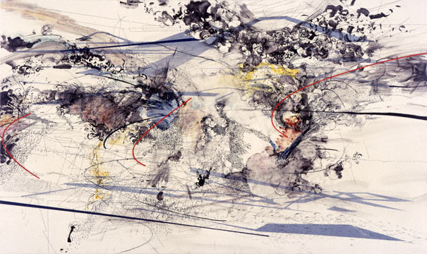
ok. my new thing is to be nice, or at least judicious, regarding these artists. Maybe I don't like the work, but there are good things to say about everthing right? I am also going to avoid any personal references especially if based on gossip, rumour, hearsay, the market, etc... So... I do not like her work in general. It is too formal for my tastes: meaning her abstract shapes are not referential enough or symbolic enough of interesting worldly things to really make me ruminate. Perhaps the importance of this work is in the making of it, but it is very graphic and therefore not really about spontaneous 'markmaking' but morso about a 'reference' to previous spontaneous markmakers before her, and that is not of interest to me personally. On the other hand... She makes a really attractive surface with her multi-layering resin technique. And her color with heavy blacks, greys, whites and off-whites is interesting. And she gets a nice compositional swirl going in most of her paintings that also references deep space. But... I much prefer an artist like Kristin Baker. They're warmer and richer and the pictures echo their original subjects more powerfully.
Oh Kristin Baker is great. I think for the sake of this blog we should all turn a new leaf. Brad Kahlhamer and Zak Smith post really took us into the gutter.
i think she is good, but has it merited the attention it gets, it gets formulaic altho it is attractive and dense, it will be interesting to see if she just repeats herself now, or takes it to another level and moves beyond the fprmula.
there is a delicacy about her work which carries some appeal,some areas of nice drawing-nothing that hasn't been done in many etchings of yore,but at least this isn't trendy-am put off by her hype-
I like these, especially some of the drawings. Did anyone see that drawing show last spring, I think, at the gallery on 57th st.? The space in this work is great: it's like being in a mathematical place, not just formal-feeling to me. "Mapping" is one of those irritating grad school words, yet I think it applies here for real. You feel like you're being shown "the lay of the land" of a philosophical space or something.
This is an interesting blog if you follow it. Almost always starts out negative, turns argumenetive and ends up likeing something about the painter by the end of the day. If the painter actually show up all berts are off
another thing about the "fait accompli" look of Julie M's paintings is it seems to limit the kind of energy the painting can suggest. they all sort of seem to come from exactly the same impulse no matter what the specifics.
Here's a thing that bugs me--some of her paintings--like this one--have things that could ALMOST be shadows. But the overlapping in the rest of the space flattens the illusion so much that it doesn't give her the opportunity to see what that hint of illusionism might turn into.
"Tried-and-true" as in "Hey it always works" or "tried-and-true" as in "that shit is old and tired and what makes her think she's doing something new?"
could I get a zak smith digest? I'm totally behind in my reading.
Julie, you sly dog you. your layered iron ons rock, but tracing makes me shiver witht he cold chill of predestination - see the first poster.
I can lay up a complex "drawing" in illustrator ( a vector graphics drawing program - pirated of course) and use an overhead projector and then trace it. Is this what you do?
I saw a drawing at PS1 where someone had traced a polygon mesh. It was impressive. They must smoke pot. Otherwise its a joyless puritanical mind fuck all.
Somehow I never get caught in a reverie. Maybe if I owned one I could sit in the jet setting chair and see the light.
Julie is astonishingly overrated. First she cribbed her whole "schtick" from Ben Edwards and then rolls into town and with the support of Jerry Saltz and Shazia Sikkander lands herseslf in Christian Haye's then new gallery The Projecct. The rest, as they say is history.
So now after every imaginable grant, topped off by the MacArthur, a traveling museum show, and her big Biennial painting transfered to MOMA for its reopening, we the astonished audience are left with the question: Is this any good?
It's O.K., it's not half as good as Thelma Golden tells us it is. They have a "nice decorative quality" like Saltz wrote.
ok.
ReplyDeletemy new thing is to be nice, or at least judicious, regarding these artists. Maybe I don't like the work, but there are good things to say about everthing right? I am also going to avoid any personal references especially if based on gossip, rumour, hearsay, the market, etc...
So...
I do not like her work in general. It is too formal for my tastes: meaning her abstract shapes are not referential enough or symbolic enough of interesting worldly things to really make me ruminate. Perhaps the importance of this work is in the making of it, but it is very graphic and therefore not really about spontaneous 'markmaking' but morso about a 'reference' to previous spontaneous markmakers before her, and that is not of interest to me personally.
On the other hand...
She makes a really attractive surface with her multi-layering resin technique. And her color with heavy blacks, greys, whites and off-whites is interesting. And she gets a nice compositional swirl going in most of her paintings that also references deep space.
But...
I much prefer an artist like Kristin Baker. They're warmer and richer and the pictures echo their original subjects more powerfully.
Oh Kristin Baker is great.
ReplyDeleteI think for the sake of this blog we should all turn a new leaf. Brad Kahlhamer and Zak Smith post really took us into the gutter.
I don't have much to say about Julie's work.
i think she is good, but has it merited the attention it gets, it gets formulaic altho it is attractive and dense, it will be interesting to see if she just repeats herself now, or takes it to another level and moves beyond the fprmula.
ReplyDeleteshe's pretty much been repeating herself since 1999.
ReplyDeletethere is a delicacy about her work which carries some appeal,some areas of nice drawing-nothing that hasn't been done in many etchings of yore,but at least this isn't trendy-am put off by her hype-
ReplyDeleteI dont get all the fuss about her work.....I find very dry and repeditive.... I perfer Torben Giehler or Ben Edwards.
ReplyDeleteI dont get all the fuss about her work.....I find very dry and repeditive.... I perfer Torben Giehler or Ben Edwards.
ReplyDeleteOh can we have a Torben Giehler post?
ReplyDeleteI like these, especially some of the drawings. Did anyone see that drawing show last spring, I think, at the gallery on 57th st.? The space in this work is great: it's like being in a mathematical place, not just formal-feeling to me. "Mapping" is one of those irritating grad school words, yet I think it applies here for real. You feel like you're being shown "the lay of the land" of a philosophical space or something.
ReplyDeleteHis new painting at Leo Koenig Inc.'s booth is awesome!!
ReplyDeletePainter I just found this fake stock on your blog.
ReplyDeleteIt is to bad you are not making any money on this, you could have made a lot if not on blogger.
http://blogshares.com/blogs.php?blog=http%3A%2F%2Fpainternyc.blogspot.com%2F
I thought Zak Smith led some of us to a higher discussion, lets keep it on the high road. it is much more interesting.
ReplyDeletebelongs in the museum of modern product
ReplyDeleteThis is an interesting blog if you follow it. Almost always starts out negative, turns argumenetive and ends up likeing something about the painter by the end of the day. If the painter actually show up all berts are off
ReplyDeleteThis comment has been removed by a blog administrator.
ReplyDeleteThis comment has been removed by a blog administrator.
ReplyDeleteThis comment has been removed by a blog administrator.
ReplyDeleteThis comment has been removed by a blog administrator.
ReplyDeleteThis comment has been removed by a blog administrator.
ReplyDeletei agree with passeo--i like to see paint move like an organism.
ReplyDeleteas for whoever's pretending to be zak--if you want to fuck with him, why don't you just do it in private? his e-mail's real easy to find.
This comment has been removed by a blog administrator.
ReplyDeleteanother thing about the "fait accompli" look of Julie M's paintings is it seems to limit the kind of energy the painting can suggest. they all sort of seem to come from exactly the same impulse no matter what the specifics.
ReplyDeleteHey guys lighten up. Passeo I don't think you are a bore at all. I like what you write very much. I also love that you mentioned Bougereau.
ReplyDeleteHere's a thing that bugs me--some of her paintings--like this one--have things that could ALMOST be shadows. But the overlapping in the rest of the space flattens the illusion so much that it doesn't give her the opportunity to see what that hint of illusionism might turn into.
ReplyDeleteI don't know passeo and anon. After reading Smith's mega blog a couple of days ago I find this Bizarro Zak Smith stuff to be pretty f-ing hilarious.
ReplyDeletere: last anonymous comment about JM and her "shadows"
ReplyDeleteIsn't the flat/not-flat trope a tried-and-true modernist device?
"Tried-and-true" as in "Hey it always works" or "tried-and-true" as in "that shit is old and tired and what makes her think she's doing something new?"
ReplyDeleteIn the sense of "what's so bad about suggesting 3-D space/not suggesting 3-D space"
ReplyDeletePaul Klee could do it. Julie Mehretu just looks like she stuck a bunch of po-mo colorforms on a canvas.
ReplyDeleteInteresting--whike they're MADE of colorforms, they work on the viewer like CHLOROFORM.
ReplyDeleteSeriously, has anyone NOT hired to decorate a massive ranch-house in San Diego EVER considered buying one of these paintings?
They suck. One million times.
could I get a zak smith digest? I'm totally behind in my reading.
ReplyDeleteJulie, you sly dog you. your layered iron ons rock, but tracing makes me shiver witht he cold chill of predestination - see the first poster.
I can lay up a complex "drawing" in illustrator ( a vector graphics drawing program - pirated of course) and use an overhead projector and then trace it. Is this what you do?
I saw a drawing at PS1 where someone had traced a polygon mesh. It was impressive. They must smoke pot. Otherwise its a joyless puritanical mind fuck all.
Somehow I never get caught in a reverie. Maybe if I owned one I could sit in the jet setting chair and see the light.
lots of red dots at the armory
ReplyDeletepasseo that was very well put. thanks for the good crit
ReplyDeleteJulie is astonishingly overrated. First she cribbed her whole "schtick" from Ben Edwards and then rolls into town and with the support of Jerry Saltz and Shazia Sikkander lands herseslf in Christian Haye's then new gallery The Projecct. The rest, as they say is history.
ReplyDeleteSo now after every imaginable grant, topped off by the MacArthur, a traveling museum show, and her big Biennial painting transfered to MOMA for its reopening, we the astonished audience are left with the question: Is this any good?
It's O.K., it's not half as good as Thelma Golden tells us it is. They have a "nice decorative quality" like Saltz wrote.
Does anyone remember Larry Poons?