Hey, nothing wrong with climbing to the top of your dominance heirarchy. The bottom sucks. Personally I like to rupture everything and pick up the pieces.
The best thing about Sophia is those thickets, those blasts of line. In this painting I like the way the space is constructed. I like the abstract elements. The way the foreground and background work together is brilliant.
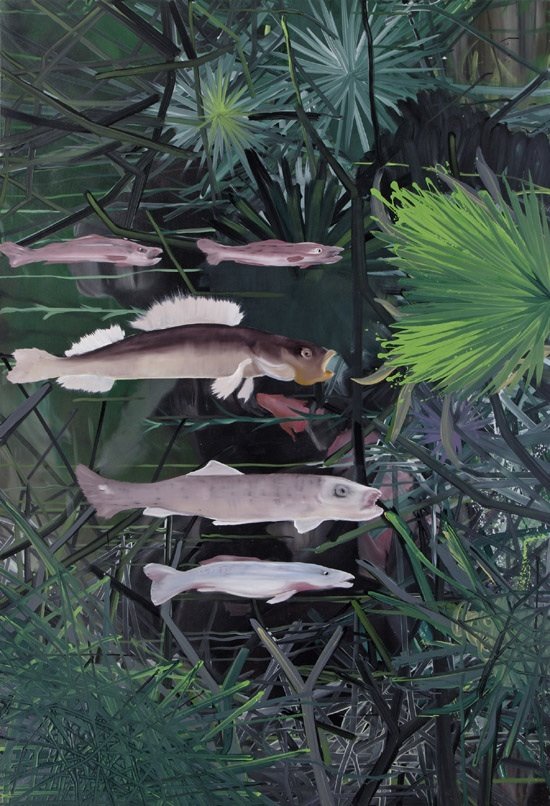
The fish are distracting, with their realism and stupid faces. But they sure need to be there. It has nothing to do with fish.
this painting is soo nerdy the painter must be concsious of this.. like when they are painting it they are saying .. this is soo nerdy and my brush strokes are completely retarded and they like it, it satisfies their soul.
on to the animal comment... some animals do have a designated looker outer.. and they switch it up on the watch post..they communicate..
Jerry and Dietch don't have an "internal compass" ? tell me more about this compass... what exactly does that mean in the current Art Market trade show?
I have to say this painting sets up more interesting space s than Fish-man although setting up space is to painting what setting the table is to a toddler. Very tricky, but a really helpfull. So non-objective Fishman doesnt play that game s'much, I dont blame her, but I love the space game, and Ill play it all night long, get a blister on my thumb button.
Closeuup tried to be a bit eliptical, but Im just going to out and say it - those fish are full frontal, XXX. "Foregrounded" as they say.
I dig that. I'm starting to like painting again. In the interest of professional ETHICAL and MORAL full disclosure - I had a pint of coke-a-cola, an iced coffee and some cheddar kettle chips after waking to a mild budweiser hangover.
Compare these colors (the last two paintings) to Inka Essenhighs post enamel period oils. Thats where a jpg doesnt do jsutice. Fishman uses matte varnish I think - its like her paintings gather dust in a way that reminds me of hotel paintings, which are reproductions of famous paintings. Its uncanny.
epilepticadam i came off wrong, never should have got into this. he is no more "abusive" then anyone else i met,. during those years.. he is just on the front lines and well at least he can write... and i would argue if a personal compass is what i think it is the 2 above mentioned's are intact.
the only real way to get smart about the Artworld is to jump on in... the experance will be different for each, however everyone is some how wrapped in the exploitation. i am sorry if this comes of as vague but i don't want to taint what could be anyone elses experience (also i don't feel a great responsibility to educate) - my media is not direct paint but a form of video history/painting so my hurdles are very different from most on this blog.
the Artworld has two sides to it, - most Artists choose to only see the "way they want it to be, which normally involves them thinkin the Artworld owes THEM something".. it is one of the last great unregualated markets... from what i have learned everything has a double entendre reflected often in the writing, and every publication has an agenda - look at the price of advertsing per quarter per full page hard copy print in Artforum, - so then where do say internet based publications get there juice? - it is horse of a different color.
But does this painting look famous? I argue no, not iconic. Still, it has a certain charm that would go well with expensive furniture, such as an Eames lounge chair and ottoman, (1956, $1,895.00).
So in that light, the painting is a bargain if its priced under $5,000.00
My recommendation is a strong BUY or HOLD if you have it.
Fishman is more of a Mies van der rohe (~$9000.00) or maybe a wicker couch. I dont know, maybe its all backwards. I;d have to see it installed.
My friend refers to going to the studio as "feeding the beast" . I have an unfortunate tendency to be the beast. Zip you really bounced back. You have a sturdy constitution.
the shaped canvas thing, I guess its an attempt to play with spacial issues, I have seen her intereviewed on that real good PBS program Art 21 but her reasons for doing it seemed lame to me.
I don't like her work very much. Shes been around a long time so I guess she has friends in high places.
He said what everybody thought and nobody would say. But is she really any worse than Frank Stella? I remember the eighties. The Reagan administration talking about quarantining AIDS patients was worse than the yellow and pink clothes and the shaped canvases. The political art from that era was better than the noxious MTV/ Soho crap.
In the '80 it was not just the critics, but also the ARTISTS themselves trying to figure out what they were doing. In the '90s they figured it out, but they weren't doing much. In the current decade artists realize they have burned all their bridges with the past and have no roots. That might turn out to be a good thing... to soon to tell.
Thanks Epilept. I knew about that show. I'm a fan of his. Just pondering why anodyne work always seems to stick, wind up in MOMA, have a lasting influence....
ah got it thru the url - PLEASE warhol did not invent "pop" in that mode - look at picasso and braque, or Dada.. and Just What Is It that Makes Today's Homes So Different, So Appealing?
it was his incooperation of technology, (printmaking) the community he hosted, the subversive films and zeitgeist of his imagery a time who's idea had cum. and Warhol as a person - i picture him standing in the corner of studio 64 - as yes the greatest Art of it all.
i think most "movements" are bollocks anyways art is a time space continuum
lives and works in Berlin
ReplyDeleteWhy do fish and other animals in groups always face the same direction? Looks like at least one of them would be assigned to watch out behind.
ReplyDeleteWith humans, the ones looking the other way are artists. It's our job.
it is the Swarming effect, like Grasshoppers, Birds, Eels, collectors or people looking for drinks at openings.
ReplyDeletethis painting has the same effect as a fish tank, soma.
At least no deer scampering around. Oh, ladies.
ReplyDeleteHey, nothing wrong with climbing to the top of your dominance heirarchy. The bottom sucks. Personally I like to rupture everything and pick up the pieces.
ReplyDeleteThe best thing about Sophia is those thickets, those blasts of line. In this painting I like the way the space is constructed. I like the abstract elements. The way the foreground and background work together is brilliant.
ReplyDeleteThe fish are distracting, with their realism and stupid faces. But they sure need to be there. It has nothing to do with fish.
this painting is soo nerdy
ReplyDeletethe painter must be concsious of this..
like when they are painting it they are saying .. this is soo nerdy and my brush strokes are completely retarded and they like it, it satisfies their soul.
on to the animal comment... some animals do have a designated looker outer..
and they switch it up on the watch post..they communicate..
What is about the the last 2 paintings posted and the predominance of this sickly green palette?
ReplyDeleteMind you Schama's is much better on the eye.
Hmmm, fish tank still life...
is this a painting for cats?
alot seem to deal with bait.
ReplyDeleteJerry and Dietch don't have an "internal compass" ? tell me more about this compass... what exactly does that mean in the current Art Market trade show?
I agree, Saltz like him or not is a good writer and hes never dull.
ReplyDeleteUnlike that other guy on Artnet, Finch, who is very acidic, funny sometimes, but mostly seems boorish to me.
humm, jerry is janus. and he uses and abuses it.
ReplyDeletei am not sure how to with out getting personal and i feel like a warning has just been put up about that.
ReplyDeletedid you e-mail him?
ReplyDeleteI have to say this painting sets up more interesting space s than Fish-man although setting up space is to painting what setting the table is to a toddler. Very tricky, but a really helpfull. So non-objective Fishman doesnt play that game s'much, I dont blame her, but I love the space game, and Ill play it all night long, get a blister on my thumb button.
ReplyDeleteCloseuup tried to be a bit eliptical, but Im just going to out and say it - those fish are full frontal, XXX. "Foregrounded" as they say.
I dig that. I'm starting to like painting again. In the interest of professional ETHICAL and MORAL full disclosure - I had a pint of coke-a-cola, an iced coffee and some cheddar kettle chips after waking to a mild budweiser hangover.
Compare these colors (the last two paintings) to Inka Essenhighs post enamel period oils. Thats where a jpg doesnt do jsutice. Fishman uses matte varnish I think - its like her paintings gather dust in a way that reminds me of hotel paintings, which are reproductions of famous paintings. Its uncanny.
ReplyDeletee-mailed?
ReplyDeleteepilepticadam i came off wrong, never should have got into this. he is no more "abusive" then anyone else i met,. during those years.. he is just on the front lines and well at least he can write... and i would argue if a personal compass is what i think it is the 2 above mentioned's are intact.
the only real way to get smart about the Artworld is to jump on in... the experance will be different for each, however everyone is some how wrapped in the exploitation. i am sorry if this comes of as vague but i don't want to taint what could be anyone elses experience (also i don't feel a great responsibility to educate) - my media is not direct paint but a form of video history/painting so my hurdles are very different from most on this blog.
the Artworld has two sides to it, - most Artists choose to only see the "way they want it to be, which normally involves them thinkin the Artworld owes THEM something".. it is one of the last great unregualated markets... from what i have learned everything has a double entendre reflected often in the writing, and every publication has an agenda - look at the price of advertsing per quarter per full page hard copy print in Artforum, - so then where do say internet based publications get there juice? - it is horse of a different color.
But does this painting look famous? I argue no, not iconic. Still, it has a certain charm that would go well with expensive furniture, such as an Eames lounge chair and ottoman, (1956, $1,895.00).
ReplyDeleteSo in that light, the painting is a bargain if its priced under $5,000.00
My recommendation is a strong BUY or HOLD if you have it.
Fishman is more of a Mies van der rohe (~$9000.00) or maybe a wicker couch. I dont know, maybe its all backwards. I;d have to see it installed.
Sometimes the inside is just the other side of the same bad dream.
ReplyDeletethis is nice for only 200$!!!!!!
ReplyDeletebut I bet its sold allready.
My friend refers to going to the studio as "feeding the beast" . I have an unfortunate tendency to be the beast.
ReplyDeleteZip you really bounced back. You have a sturdy constitution.
that Murry show blew hard for me - hard. maybe it just went over my head - can anyone explain the appeal of shaped canvas?
ReplyDeletethe shaped canvas thing, I guess its an attempt to play with spacial issues, I have seen her intereviewed on that real good PBS program Art 21 but her reasons for doing it seemed lame to me.
ReplyDeleteI don't like her work very much.
Shes been around a long time so I guess she has friends in high places.
He said what everybody thought and nobody would say. But is she really any worse than Frank Stella? I remember the eighties. The Reagan administration talking about quarantining AIDS patients was worse than the yellow and pink clothes and the shaped canvases. The political art from that era was better than the noxious MTV/ Soho crap.
ReplyDeleteWhere is the David Wojnarowicz retrospective?
ReplyDeletestella had a legitimate contribution then went on to neo-giftwrap insanity. Murray seems to always have been a formalist nightmare
ReplyDeleteI guess product never changes. Just the color palette.
ReplyDeletemajor U.S. city washed into the sea = the revival of pedantic gestural abstraction
WTF?
like stellas Minimal pinstripe office wall opitics but the "maximalism" worst work ever.
ReplyDeleteIn the '80 it was not just the critics, but also the ARTISTS themselves trying to figure out what they were doing. In the '90s they figured it out, but they weren't doing much. In the current decade artists realize they have burned all their bridges with the past and have no roots. That might turn out to be a good thing... to soon to tell.
ReplyDeleteThanks Epilept. I knew about that show. I'm a fan of his. Just pondering why anodyne work always seems to stick, wind up in MOMA, have a lasting influence....
ReplyDeleteart therapy for the masses....
ReplyDeleteThis comment has been removed by a blog administrator.
ReplyDeleteThis comment has been removed by a blog administrator.
ReplyDeleteThis comment has been removed by a blog administrator.
ReplyDeleteThis comment has been removed by a blog administrator.
ReplyDeletewhat was under the warhol - i am getting
ReplyDeleteYou have requested a page in the Annenberg Web site that does not exist.
ah got it thru the url - PLEASE warhol did not invent "pop" in that mode - look at picasso and braque, or Dada.. and Just What Is It that Makes Today's Homes So Different, So Appealing?
ReplyDeleteit was his incooperation of technology, (printmaking) the community he hosted, the subversive films and zeitgeist of his imagery a time who's idea had cum. and Warhol as a person - i picture him standing in the corner of studio 64 - as yes the greatest Art of it all.
i think most "movements" are bollocks anyways art is a time space continuum
i agree just being cheeky
ReplyDeletei think it's about current specific community need and expression ....so a "movement".
ReplyDeletePssssssssshhhhhhhhhhawwwwwwwwww
ReplyDelete