I am trying something new with the comment box. I didn’t want to but I am frustrated with some of the comments and I can’t watch the comments all the time. I am not sure what setting I put it on; I hope that comments can be made on this setting. I think with this setting you have to make up a name for yourself. I hope that you will still come on and make a comment about the work.
I don't know this artist work. You have been making very sensitve picks lately. Hope the comments get better. I agree about them getting out of hand to much gossip and crap.
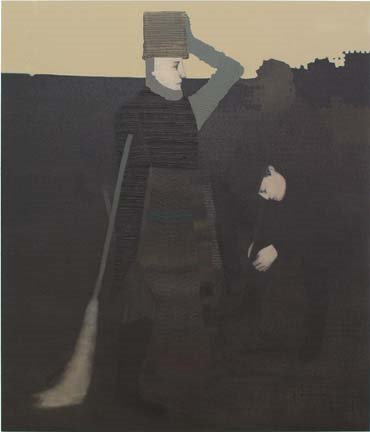
I like the colors of this one. Interesting that the previous painting by Yun-Fei Ji was panned for its browns, where as this one seems to succeed. I think that what helps this one is the brashness of the tonality. This peice alludes to charcoal, to Rembrandt, to age and decay. It overwhelms you with this. It is so much about the tone and buried color that it is almost more a colorist painting than anything else. The scene, the figures, all that is quite secondary to the atmosphere in the painting at large, its an interesting painting for its aesthetics. Seems like a throwback to me, though the self conscious markmaking is current.
I like it when the figures get sort of obscured by the patterns and by what's happening with the paint. But I'm not crazy about the feel of the figures when they're less obscured: they feel like a certain kind of illustration that seems too familiar: Monty Python?
i love milton avery, but can't get into this. i see no avery here, more 19th century poster for me. could do w/o the horizon line decapitation effect too.
in the relationship of figuration to repetitive abstact marks I see a little magnus von pleesun(sic) connection but this is so much more illustrative and minor.
YES! jd, thank you. Heinz Edelman did Yellow Submarine - if you take away the color, the flatness - well c'mon! Definitely reminds one of the era....look at animation stills people. Add texture and...
how do you (we) determine where to begin critiqueing a work, by which door do we enter? for arguments sake i will pose two main doors, formal and content. i realize that these to doors are often linked or the same and usually cannot be separated however we frequently enter through one. how do we decide which door to step towards? do you first identify the weaknes in the work and then poke at it or do you identify the strengths and then attempts to unfound them. i pose the latter to be more constructive...especially since the former is often already painfully obvious to the artist.
17 comments:
I am trying something new with the comment box. I didn’t want to but I am frustrated with some of the comments and I can’t watch the comments all the time. I am not sure what setting I put it on; I hope that comments can be made on this setting. I think with this setting you have to make up a name for yourself. I hope that you will still come on and make a comment about the work.
Haavard Homstvedt
Dud
@ Kantor/Feuer
7025 Meslrose Ave.
LA, CA 90038
Painter, great idea. I hope this improves the level of the comments.
Interesting image; I'm going to Google him now.
I made up a name. Trying to see if it works.
I don't know this artist work.
You have been making very sensitve picks lately.
Hope the comments get better. I agree about them getting out of hand to much gossip and crap.
This jpg? Heinz Edelman meets Odd Nerdrum.
Kudos on purging the annons.
I like the colors of this one. Interesting that the previous painting by Yun-Fei Ji was panned for its browns, where as this one seems to succeed. I think that what helps this one is the brashness of the tonality. This peice alludes to charcoal, to Rembrandt, to age and decay. It overwhelms you with this. It is so much about the tone and buried color that it is almost more a colorist painting than anything else. The scene, the figures, all that is quite secondary to the atmosphere in the painting at large, its an interesting painting for its aesthetics. Seems like a throwback to me, though the self conscious markmaking is current.
I like it when the figures get sort of obscured by the patterns and by what's happening with the paint. But I'm not crazy about the feel of the figures when they're less obscured: they feel like a certain kind of illustration that seems too familiar: Monty Python?
I'm thinking of Schiele and Klimt in terms of flatness and hands/face being the essential defining body fragments. Very weird broom.
Hands and Faces that is where I always get got.
A light bulb just went off for me Thanks Kid.
yo, brotherfudger. put something on your blog.
i love milton avery, but can't get into this. i see no avery here, more 19th century poster for me. could do w/o the horizon line decapitation effect too.
in the relationship of figuration to repetitive abstact marks I see a little magnus von pleesun(sic) connection but this is so much more illustrative and minor.
YES! jd, thank you. Heinz Edelman did Yellow Submarine - if you take away the color, the flatness - well c'mon! Definitely reminds one of the era....look at animation stills people. Add texture and...
None Shall Pass!
a question:
how do you (we) determine where to begin critiqueing a work, by which door do we enter? for arguments sake i will pose two main doors, formal and content. i realize that these to doors are often linked or the same and usually cannot be separated however we frequently enter through one. how do we decide which door to step towards? do you first identify the weaknes in the work and then poke at it or do you identify the strengths and then attempts to unfound them. i pose the latter to be more constructive...especially since the former is often already painfully obvious to the artist.
i thought yesterday you hated "Neutral Tones"?
i have, mildley hippyriffic but somberly pleasing.
This work is about painting and I like it a lot
Visit the painter @
http://www.havardhomstvedt.com
Post a Comment